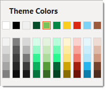
As an internal design project we explored creating custom PowerPoint color schemes (that can also be applied to other Office apps such as Excel and Word). A custom color scheme (this is not a full tutorial) is created by selecting a master slide (if there are multiple master slides in a presentation, each can have their own preset color scheme) and going to DESIGN > VARIANTS > COLORS > CUSTOMIZE COLOR.

For this internal exercise, the design team picked a “classic movie”, found a reference image, and assembled a color scheme that they felt aligned with the movie. The results were so good, we had to share a few of the creations! This is a 6 part blog series, highlighting 6 classic movies (note, “classic movie” as interpreted by our design team!) and the corresponding custom PowerPoint color schemes. And, each will be downloadable 🙂
To start things off, from Christie, is a true classic – the original Wizard of Oz.
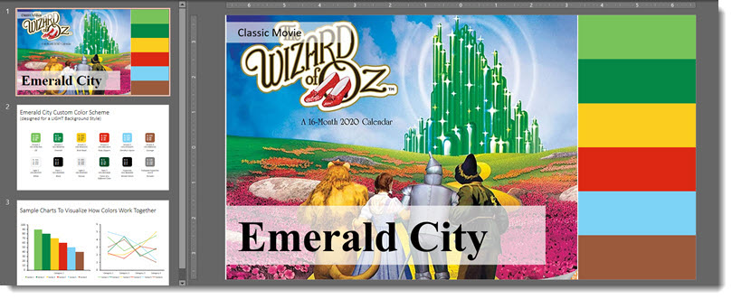
Wizard of Oz: warm saturated tones. Greens and yellow taken from the main focal point of the emerald city and yellow brick road. The reds, blue and brown mainly from Dorothy’s aesthetic, hair, dress, and shoes.
Download the PowerPoint deck with preset color scheme here.