When you first launch PowerPoint 2013, it looks similar and different at the same time.
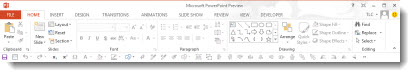
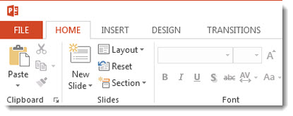
If you look at the ribbon, everything is in the now familiar locations and order.
When viewed more closely, you can see all of the aesthetics are new – in the “Metro” style. The Metro style was developed by Microsoft for the Windows Phone 7 interface. It is a success and has now become the basis for the Windows 8 UI and the Office 2013 UI, plus the MS website and many other interfaces.
Ironically, one of the original design reasons for Metro was “a key design principle of Metro is better focus on the content of applications, relying more on typography and less on graphics.” But, PowerPoint’s interface is definitely icon oriented and where typography is used, it has mixed reviews (ie. all caps for the ribbon tabs).
Also new is the logged in user option (for my Beta install the user is “TLC”). There is a lot of new features around the user account, which are overviewed in upcoming posts.
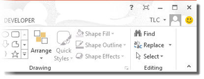
The happy face icon on the far right is a standard feature of Microsoft beta software. Clicking it brings up a dialog box to submit feedback, bug reports, etc. you discover while using the application. The smiley will not be a part of the retail version.
While the new aesthetics are not going to be everyone’s favorite, they are what is coming to a computer near you.
– Troy @ TLC