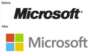
On August 23, Microsoft revealed their new corporate logo, which was originally released 25 years ago.

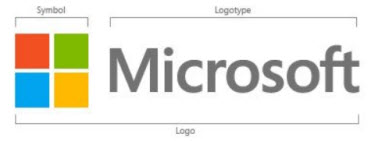
The logo, like virtually every design element coming out of Microsoft right now, is pulled from the Metro style guide. The new design is a modification of the current logo, with boxes (ie. Tiles) that are equilateral and in a symmetrical layout with the four colored boxes forming a single larger box. The type is equally streamlined into the Metro styling with font selection and grey color.

Here is Microsoft’s logo unveiling with its tie ins to the other major Microsoft brands:
[youtube src=”https://www.youtube.com/embed/OzkZWvAJUr0?rel=0″]
– Troy @ TLC
