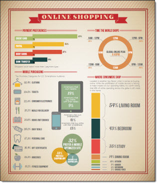
Infographics are something I like to develop. They are the best of presentation design (visual) and print design, and something you can have a lot of fun designing. InternetRetailer.com recently published a story with statistics from the Global Online Shopper Report based on a March survey of 19,000 consumers in 15 countries. The story lists the more interesting statistics; however, they do it in a boring, non-visual, way. Using the article for our source, we created an infographic that pulled out the key data from the article and Global Online Shopper report to create a visual representation of the data. Using icons, bars and charts, the data is now displayed interestingly and informatively.
(original story)
(story converted to infographic)
– Troy @ TLC