Record Studio LED Wall Design
As part of a recent project, I designed the presenter studio backdrop on these beautiful surround LED walls. And yes, it is a single PowerPoint ultrawide slide filling the 4 LED panels! 
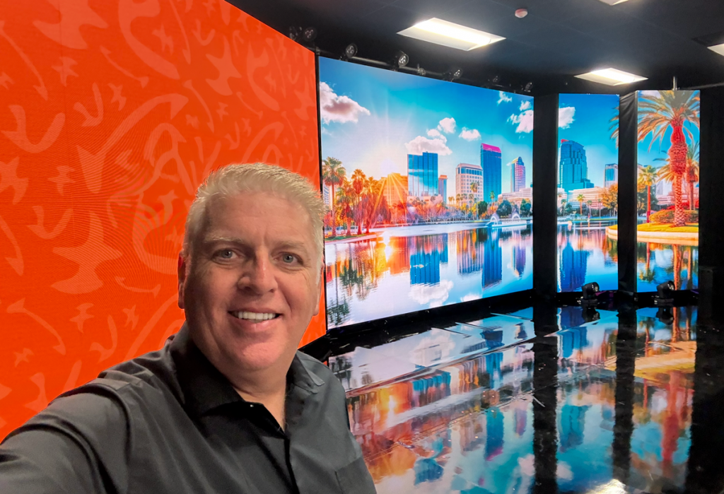
-Troy @ TLC Creative
We’re getting into the Thanksgiving spirit with this fun stop motion animation that Amber from the TLC Creative Presentation Design Team created. She brought a festive message to life using a festive typography-focused design in PowerPoint. Check out the exported animated GIF!

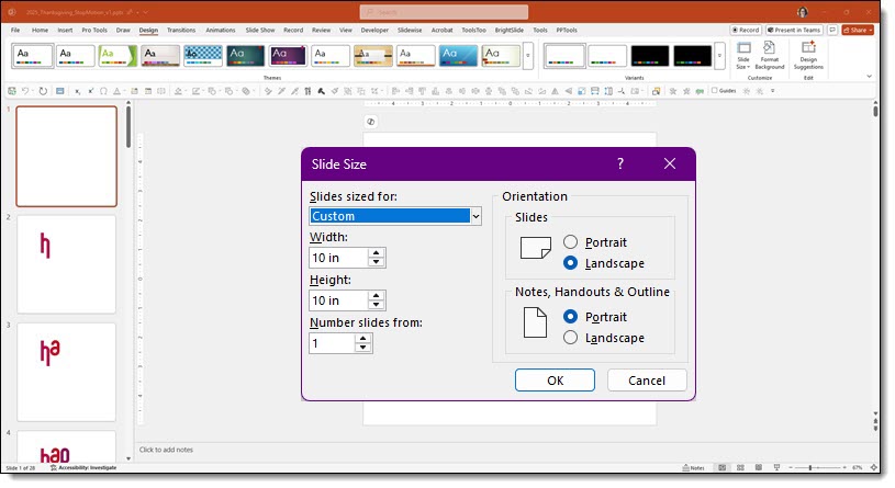
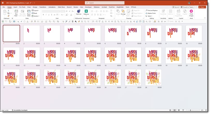
All animation is achieved by hard cuts from one slide to the next.
Run as a slide show to confirm the “animation” effect. Then exported from PowerPoint as an animated GIF. The result is a stop motion style animation that seamlessly loops!
-Amber and The TLC Creative Design Team
Halloween 2025 was last week, and for this week’s Look Back post, we’re jumping to Halloween 2016! We’ll be revisiting a super fun stop-motion animation the TLC Creative design team created for the blog: a 122 frame stop-motion animation!
This Halloween themed stop-motion animated GIF was designed by a member of the TLC design team and everything about it – art and animation – was created entirely in PowerPoint, spread across 122 slides!
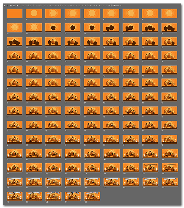
It was time-consuming, but the final result is just amazing!
Want to see it for yourself? Download the final designed slide with all the elements here.
– Troy @ TLC
We are showcasing the slide makeovers of the TLC Creative presentation design team. Everyone was given this slide, with the only design parameters of 30 minutes design time maximum – any color scheme, fonts, graphics and layout.
Client slide:

Amber’s slide makeover:
We are showcasing the slide makeovers of the TLC Creative presentation design team. Everyone was given this slide, with the only design parameters of 30 minutes design time maximum – any color scheme, fonts, graphics and layout.
Client slide:
Christie’s slide makeover:
We are showcasing the slide makeovers of the TLC Creative presentation design team. Everyone was given this slide, with the only design parameters of 30 minutes design time maximum – any color scheme, fonts, graphics and layout.
Client slide:
Mike’s slide makeover:
We are showcasing the slide makeovers of the TLC Creative presentation design team. Everyone was given this slide, with the only design parameters of 30 minutes design time maximum – any color scheme, fonts, graphics and layout.
Client slide:
Jake’s slide makeover:
The Friday “Look Back” series post brought up a slide makeover that was given to the full TLC Creative presentation design team. Amazingly, every one of the slides we created back in 2017 could be used today – good design is timeless (and 16:9 is still the standard aspect ratio).
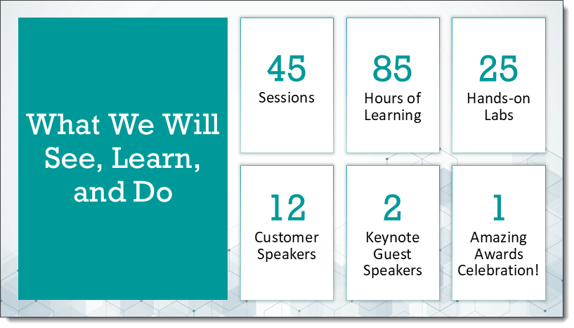
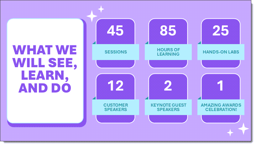
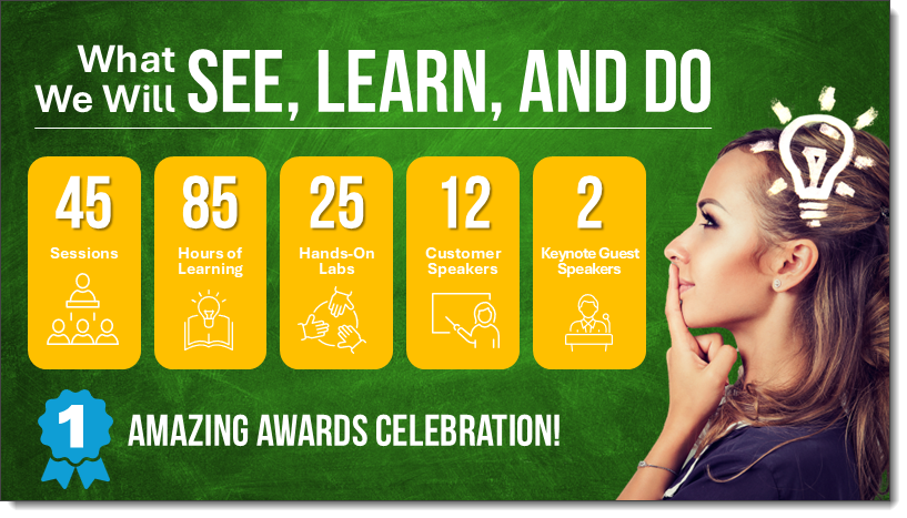
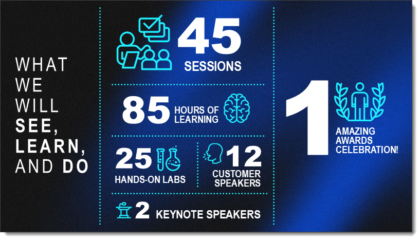
We pulled a recent client slide, which was a really creative idea for opening a multi-day conference. This Learn-See-Do slide was pulled from a client presentation:
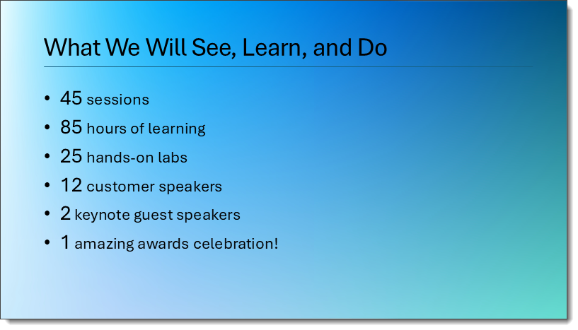
Check back as we have a 5 part series showcasing how the TLC Creative design team took the above slide as a slide makeover project.
-Troy@TLC
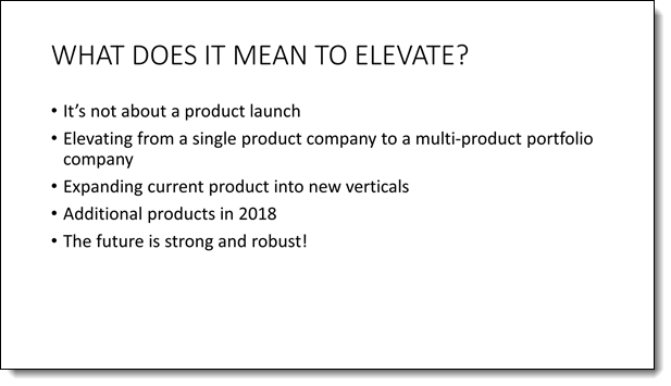
In 2018, the TLC Creative presentation design team had a fun internal challenge developing their version of a client slide. It was our “Month of Groundhog Days.”
Here was the client-provided slide (minus their corporate template background):
And here’s TLC Creative design team makeovers of the slide:
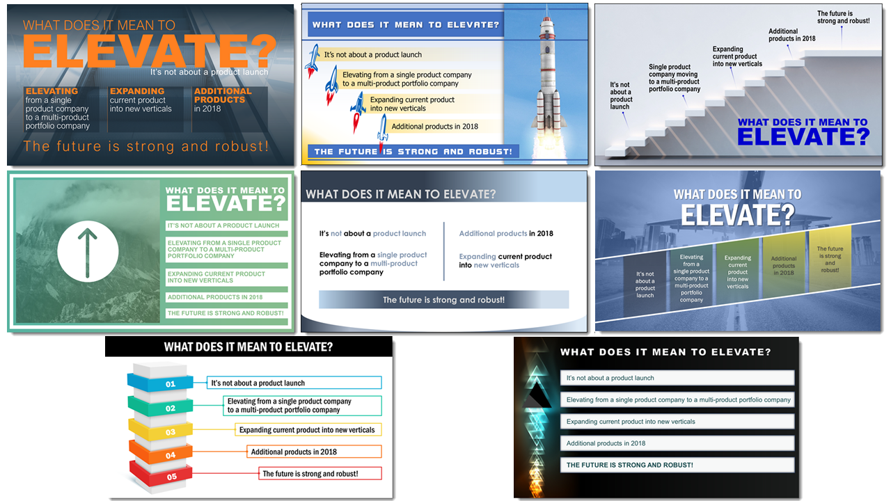
Larger images and more details are in the originals, which start here.
Taking inspiration from our own work, over the next 2 weeks you can expect another slide makeover series, based on another client slide!

During the crazy year that was 2020, we at TLC Creative had several internal design challenges. This particular challenge was to create a dynamic PowerPoint animation – using just 40 lines. The premise was simple: take five slides, integrate exactly 40 lines, and build something visually captivating and animated – in under two hours of design time.

The rules were flexible and open to interpretation to encourage lots of creativity, while keeping the focus of the slideshow on the lines themselves. Each line could vary in color, length, position, arrangement, width, etc. All that mattered was that the 40 lines were the centerpiece of the animation!
The result of the design team’s creations was a mesmerizing two-minute sequence, built entirely within PowerPoint, that showcased the power of simple design elements when thoughtfully animated.
If you go back to the original blog post, the animation from five years ago was rendered in 480p resolution (not certain why – but it was). We remastered it in full 1080p, to bring a fresh level of clarity to the line movements and transitions – along with a fun upbeat music track.
What began as a small challenge turned into a showcase of how a tool like PowerPoint can be pushed to create Adobe-style animations!
This project gave us a reminder that creativity thrives under constraints. Sometimes, setting a few boundaries can create the perfect environment for creative breakthroughs!
-Troy and the TLC Creative Design Team