Have you ever looked at a slide that’s clearly been repurposed and feels unbalanced? Modifying existing slides for new content is a great shortcut and time saver, but step back and look at the slide. Is the layout balanced? Are elements aligned to each other? Does the slide look “correct”?
I had the immediate feeling of looking at a repurposed slide when I stepped into my hotel room (this is really a hotel room I recently stayed in – but no brands or cities named). Instead of noticing all the nice things this hotel is offering, my mind was distracted (like an audience member being distracted by a poorly designed slide):
- Why is the art not centered on the wall?
- Did the room originally have just one bedside table on the right so the bed would be centered under the art when the furniture was centered on the wall?
- Was this just a bad art installation, or was the art here first and a new bed installed later?
- If the art was here first, what was the furniture like before that would make an off-center art piece look good?
- Wait…is there a problem with the wall that it cannot support the art if mounted in the center? Am I safe sleeping under this unstable art!!?
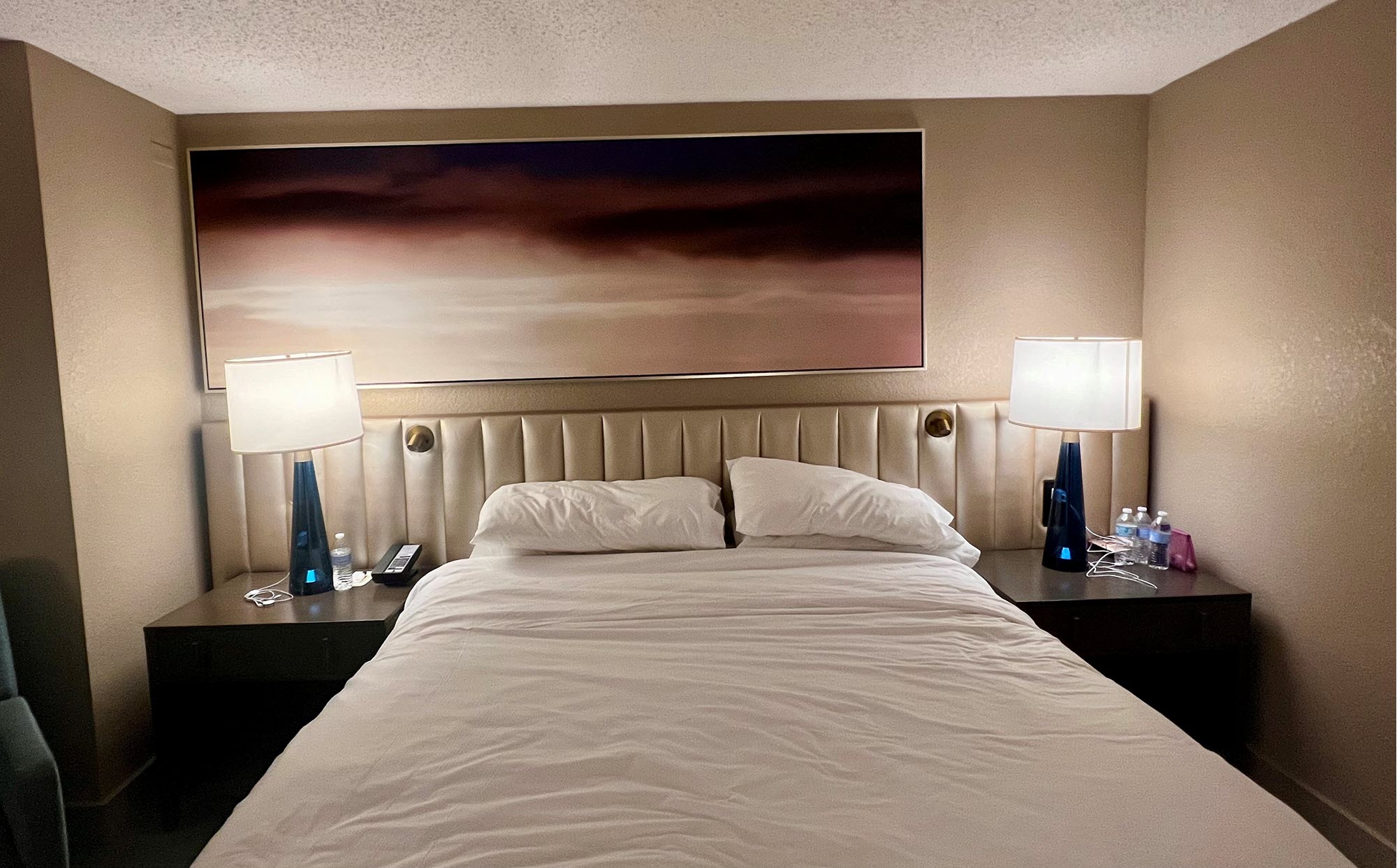
Moral – don’t create slides that let your audience get distracted with formatting questions. And don’t question the hotel room furniture and art choices, you are there for a short stay and will soon forget it (unless you use a photo of it for a blog post and then can be reminded of how odd it was for years-and-years!).
Troy @ TLC