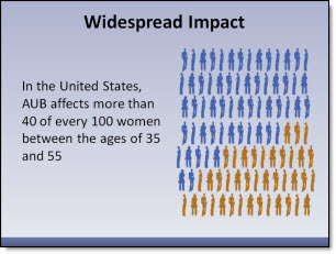
In the original slide there was a nice graphic and the layout was clean and balanced. It did not have bullet points for the text, a small graphic or many other common layout issues.
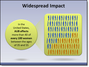
For the presentation makeover a series of colored and slightly beveled shapes were used throughout. Keeping consistency the text was highlighted on the circle, the demographic image on a rounded corner rectangle and the two connected with the gradient (triangle).
– Troy @ TLC