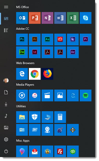
Look at the Microsoft Office Icons – they look great. Okay, I am not commenting on the icons themselves, but the color coding, size and how easy to see and identify.
Now look at the Adobe Creative Cloud icons. All are on the Windows theme color (blue), but small, and there is no difference between Acrobat Distiller and Acrobat Reader…
Other issues are Chrome on the white background, the Hightail app icon has white pixels around it, and Firefox (to me) is the most beautiful of icons I have on my Start Menu.
Troy @ TLC