Looking back through previous posts, I read this one highlighting new chart types introduced to PowerPoint back in 2016 (original post here).
Today, of the 4 chart types introduced in 2016, I cannot recall ever using a Radar chart… and maybe 3-4 times the Treemap chart type. I do recall working on a Sunburst chart and using PowerPoint to create the basic chart, then ungrouping -> converting to shapes -> modifying to the custom styling & sizing needed -> and then producing a fantastic animated series. End result was great, it all started with a native PowerPoint chart. But 4 hours later, it was all custom art elements.
Question: thinking back to 2016, how often do you use these 4 chart types?
How to insert New Chart Types in PowerPoint 2016
New Chart Types where added in PowerPoint 2016. There is bigger news than just some new styles. Microsoft is moving all charting to a new charting engine, and these new charts are coded with this new engine. Eventually, all legacy charts will be ported to the new charting engine, and, fortunately, this is still an in-process engine development (I am certain everyone will encounter a chart limitation depending on their chart data and the way they create charts) – so my take on things is “Yay new charts! But the new charting engine is not fully functional, so some options in the new charts are not fully functional yet.”
The good news is even though only subscription users can create these charts, all versions of PowerPoint (dating back to 2010 and Mac versions) can display chart types – editing and animation is somewhat limited when using previous versions…
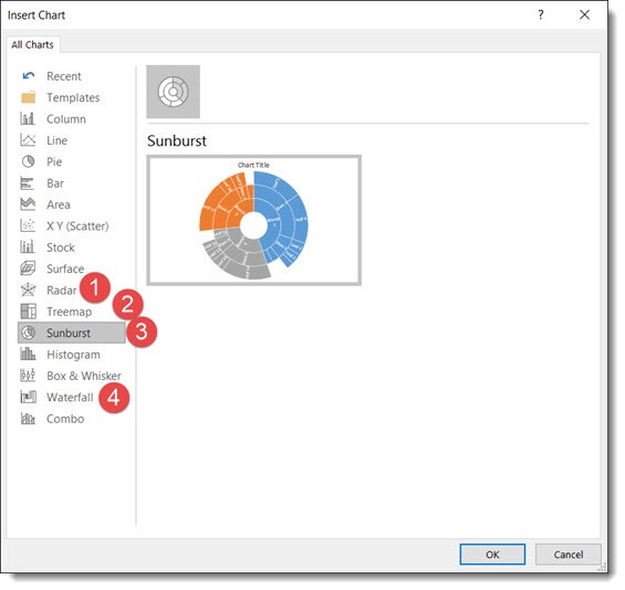
Here are 4 of the new chart types currently available (we will continue to see more chart variations added over time, look for another new chart type in the February updates).
Follow these Steps:
Go to INSERT > CHART
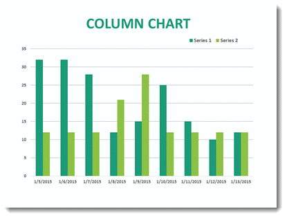
The Column Bar Chart
A standard Chart.
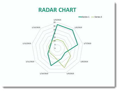
1. Radar Chart
That same data in the Bar Chart can instantly be updated.
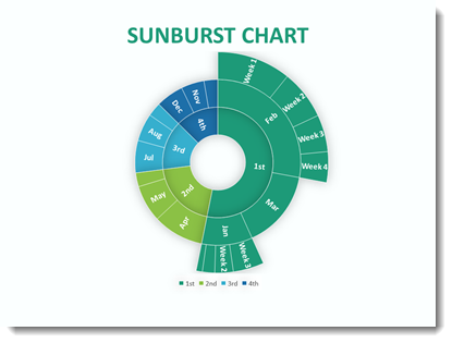
2. Sunburst Chart
This a great addition to the native PowerPoint chart options vs. going to external charting apps to develop.
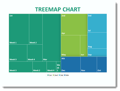
3. Treemap Chart
This Chart is new to PowerPoint 2016 native chart options.
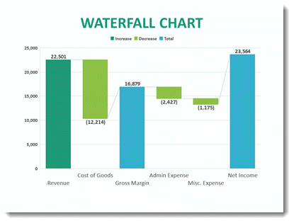
4. Waterfall Chart
This standard Column chart with negative data.
-Troy @ TLC
This is from our Look Back series, rediscovering previous blog posts with relevant PowerPoint tips, tricks and examples. The original post from February 17th, 2016 can be viewed here.