Here is a question for all presentation designers: Can PowerPoint use the newer H.265 video format?
The answer is YES! PowerPoint does recognize the H.265 video format… but there are some gotchas to be aware of at this time.
We successfully tested embedding and playing an H.265 video in PowerPoint. On top of that, we tested playback on all PowerPoint platform options, with verified success across these four:
- Windows desktop PowerPoint
Overall, this is good news for presentation designers, because H.265 offers more efficient compression than the more common (and older!) H.264 video format. It’s only a one-number difference in the name, but there are a LOT of great improvements in that single number change!
In the simplest terms, H.265 videos mean we keep the same video quality and resolution, while having a much smaller video file.
WHAT IS H.265?
H.265, also known as HEVC, is just a newer video codec. H.264 has been the industry standard for almost 2 decades, so it is about time for something new and better!
Let’s step back and talk about video file formats vs video codec format. In simple terms, the video file you get is either an .MP4 or .MOV. Those are the video file FORMATS. Now, HOW the video is created is what the codec is. So, an .MP4 can be created with an H.264 codec or an H.265 codec (or several other options).
Further, the video codec is the process used to compress a video when the file is created, and then uncompress (or DECode) it dynamically for playback. This matters because video files need compression to be practical (eg. keeping a small file size).
The better the compression, the smaller the file size. The better the uncompress process during playback, the smoother performance and higher image quality can be during playback. A more efficient codec makes it possible to compress a video much more, without any visible quality loss.
That is the appeal of H.265: it’s just a more efficient codec. It delivers the same visual quality as the current H.264, but with better compression efficiency.
H.264 VS. H.265
For most presentation designers, the comparison is straightforward. A smaller video file size, at the same quality, is a win.
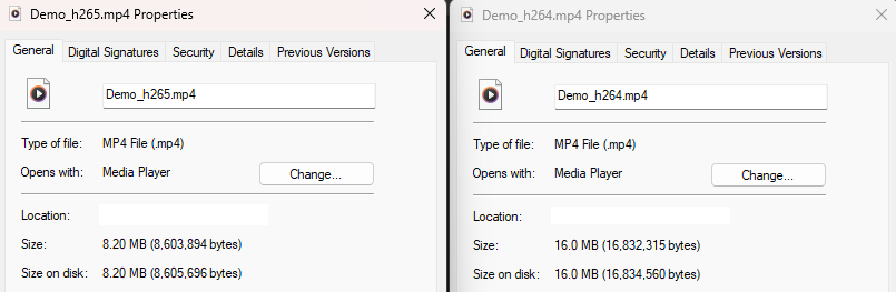
Here is an example. We took the same video and rendered one version as H.264 and another as H.265. Both videos use the same resolution, bit rate, and audio quality. Here are the results; the H.265 version is 8.2 MB. The H.264 version is almost twice as large at 16.0 MB. Using videos that are 45% smaller in file size is better for PowerPoint presentations!
PowerPoint Considerations
Not everything is perfect just yet. Moving to H.265 videos can be done – and TLC Creative is actively using videos in this format for presentation projects. But PowerPoint as a whole is still an H.264 workflow.
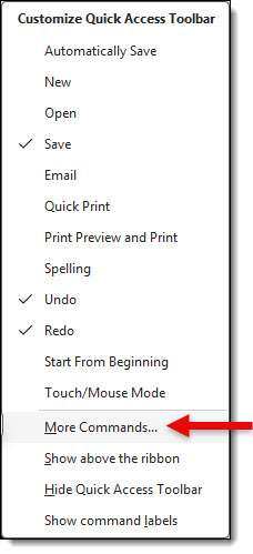
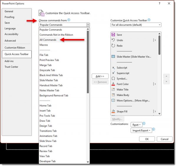
- Using PowerPoint’s built-in video optimization, videos will be converted to H.264, and (this is important) even the shiny new H.265 videos.
- Exporting slides to video creates H.264 format videos. There is no option for PowerPoint to create videos using the improved H.265 yet.
In other words, H.265 is not just a technical format update; it can be a real workflow improvement for PowerPoint users using video in presentations. Just beware using PowerPoint’s built-in video optimization!!
Skyler @ TLC Creative Services