Continuing this month’s theme of Slide Design ideas, this is a before-and-after slide from a project we completed.
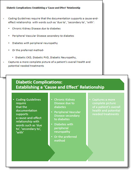
The before is a common slide: title and bullet list as provided by Microsoft’s default template. Our design team reviewed the presentation message and made the recommendation that this list be converted into a 3 column visual layout. The idea is to help the audience group the content to be able to quickly identify the message and focus on the presenter. Ideally, we would like to help the audience further by reducing the amount of text on slide, but for this one the request was to maintain the provided content. The end result, even with the same amount of content, is a much more lively slide designed for the audience.
– Troy @ TLC