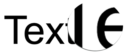
Picking a font style is important. Should it be a “safe” font, a professional font, a bold font, etc.? Any font style needs to display well and anti-aliasing is a big part of that. So, what is anti-aliasing?

The simple description of anti-aliasing is that it makes fonts display with smooth curves and angles, not jagged, low res looking edges. So if “anti-aliased ” is smooth, the opposite, hard edged fonts would make sense to be called “aliased.” However, the better term is “bit-mapped.”
Here’s a visual showing Aliased and Anti-Aliased Text:
Aliased (Jagged, Hard Edges):

Anti-Aliased (Smooth Edges):

The good news is PowerPoint applies anti-aliasing to text (which has not always been the case). But it is applied when in slide show. Objects and text may appear to have jagged edges (aliased) when editing. Anti-aliasing is also applied when printing, but through a different ‘engine’ than when presented. So, when running as a slideshow, everything is smooth, when printing, everything is (almost always smooth), when editing, it may not look as smooth.
In addition, Microsoft Windows OS has its own term and feature for anti-aliasing called ClearType. ClearType is basically Microsoft’s technology for doing anti-aliasing and making fonts have nice smooth curves and angles. ClearType is currently used by web browsers (all web browsers) and the operating system dialogs. But not Microsoft Office at this time.
On PowerPoint, when using the PowerPoint web app it is viewed through a browser for editing and slideshow. So, all text is anti-aliased in both views because the Microsoft ClearType works with all major web browsers.
So, should you be worried about anti-aliasing or smooth fonts with PowerPoint? Yes, it is a concern, but with Windows 10 and PowerPoint 2007-2010-2013-2016 all fonts display anti-aliased in slideshow – and I can attest to being happy with text that is projected 20′ tall is HD is smooth and looks good (with the caveat that there is room for it to be better!).
-Troy @ TLC
