Design principles do not change, and text formatting rules, such as Kerning, remain constant. If there is one huge observation the TLC Creative design team all noted, it was that Kerning controls in PowerPoint have not improved in over 15 years! Here is the post from December 2, 2007 that (unfortunately) has the same interface and options in PowerPoint in 2025…
—
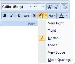
If you have used desktop publishing software you are familiar with the concept of kerning. With (variable width) fonts, different pairs of characters are spaced differently. Kerning is the adjustment of spacing between letters to obtain a more pleasing appearance. The great news is that PowerPoint now has some basic kerning capabilities. Microsoft calls it ‘Character Spacing’ and here is the quick menu.
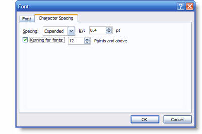
We can also get more fine control over the Character Spacing by opening the Character Spacing dialog window.
Here are a few examples of kerning in use. The top text is the standard, or normal, kerning. The second one is expanded and the third is condensed. All is still editable text and can be applied to select text within a single text box.

– Troy @ TLC
This is from our Look Back series, rediscovering previous blog posts with relevant PowerPoint tips, tricks and examples. The original post from December 3rd, 2007 can be viewed here.