For this presentation, a lot of demographic data was presented. We took the extensive document of bullet points and converted all to visual layouts, putting the content in easily identifiable groupings and adding an icon scheme throughout to tie the data together.
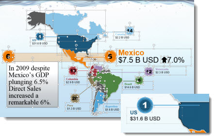
For the map data, everything is editable in PowerPoint. The vector format map was setup so we could fill the color for each country as needed. The callout numbers, lines and text are all PowerPoint elements, which allowed us to minimize design time by using the same elements with new color schemes applied.
– Troy @ TLC