Microsoft is rolling out 5 new fonts and we couldn’t be more excited! All 5 are Microsoft Cloud Fonts, meaning they are available on every endpoint with Microsoft Office. These are available now and we do not have to worry that a client will not have them and fonts will default to some other randomly assigned font. Windows, Mac, IOS, Android, PowerPoint for the web – these fonts will work for everyone.
Besides showcasing 5 great new options to incorporate into our designs and templates, Microsoft is making waves with news of replacing its long-standing default font, Calibri. Since 2007, Calibri has been the default font for all Microsoft programs including PowerPoint. At its inception, Calibri was designed to perform on lower resolution displays to optimize legibility, using technology that the company no longer uses.
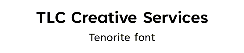
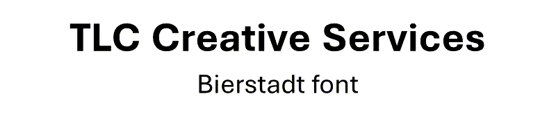
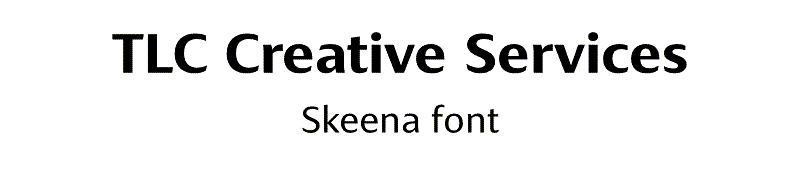
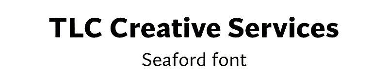
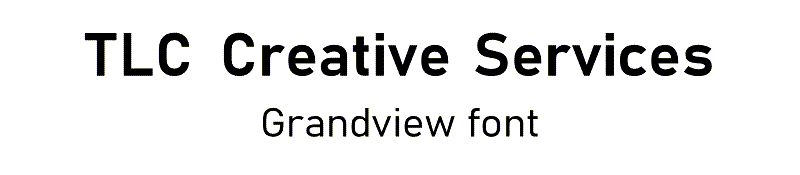
Sample images of each font is below. Each uses the default kerning (space between letters). The top line is with Bold applied, and the lower line with the name of the font is in the standard weight.
Up first on the list is TENORITE, by Erin McLaughlin and Wei Huang. A personal favorite, this font is round and wide, with narrow kerning, making it great for all caps headlines and titles.
Then there is BIERSTADT, by Steve Matteson. A modern take on the mechanical, grid-based style stemming from swiss typography. Tenorite incorporates some organic elements that really makes it stand apart from its institutional roots.
Next up is SKEENA, by John Hudson and Paul Hanslow. With a emphasize on contrast, the font’s distinct variations between thick and thin add a stand-out contender to the list, great for presentations with a lot of copy.
That brings us to SEAFORD, by Tobias Frere-Jones, Nina Stössinger, and Fred Shallcrass. While this the most old-school font of the bunch, there is nothing old about the approach they took designing this font face. Inspired by armchairs, this font is sturdy and worth sitting with for some time.
And last but not least GRANDVIEW, by Aaron Bell. This highly mechanical, German-derived option, is the most rigid of the additions. Grandview retains readability exceptionally compared to it’s ancestors and will be a great option especially when it comes to data visualization.
These fonts are available now and according to the Microsoft press releases, by the end of 2022 one of them will become the default option across all Microsoft programs.
Sara @ TLC