Here is a slide from a recent show that just made me cringe (presentation was supplied, so I had no editing or design input).
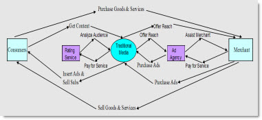
It does show all of the important information. But it does not have a balanced/aligned layout. It is difficult to figure out the message, text is small, and it did not animate to help show the flow. And it was a background slide for over 5 minutes…
– Troy @ TLC