Typography: The art and technique of arranging type to make written language legible, readable, and appealing when displayed.
PowerPoint is a flexible design app. Sometimes it is not easy to accomplish design ideas as in other apps. As example, text kerning. PowerPoint does not use the design industry term “kerning” and the feature is not easily accessed.
For example, here is some simple, all caps, text on a slide.
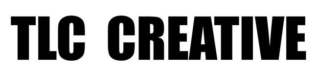
To add some visual design, letter colors are updated to the TLC color scheme (RGB).

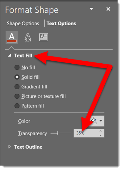
In preparation for the next effect, the opacity is lowered to 
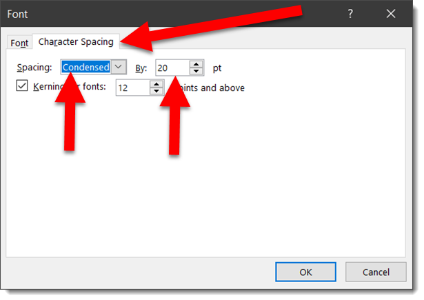
Now the actual kerning, what PowerPoint labels CHARACTER SPACING. Select the text, open the FONT dialog, view the CHARACTER SPACING tab. Change the spacing option to CONDENSED, which essentially is negative spacing (so the 20 pt used is really -20 pt).
The result is the text slightly overlaps and the transparency overlap creates a dynamic visual.

Done. Custom typography styling created all within PowerPoint and remains editable text.
Download the editable slide HERE.
– Troy @ TLC