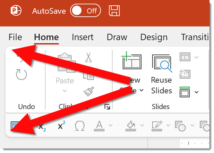
With the Microsoft new office look, there is a generous use of rounded corners, which Microsoft labels “Soft Corners.” But is this good for presentation design?
As example, all four corners of the Ribbon, and in my setup the top of the Ribbon and bottom of my QAT because it is positioned below the ribbon, have a subtle rounded corner styling.
In edit view, the left film strip slide sorter has been changed so all slides have a subtle rounded corner design. Very mobile app and social media inspired. The actual work slide area maintains the full rectangle shape.
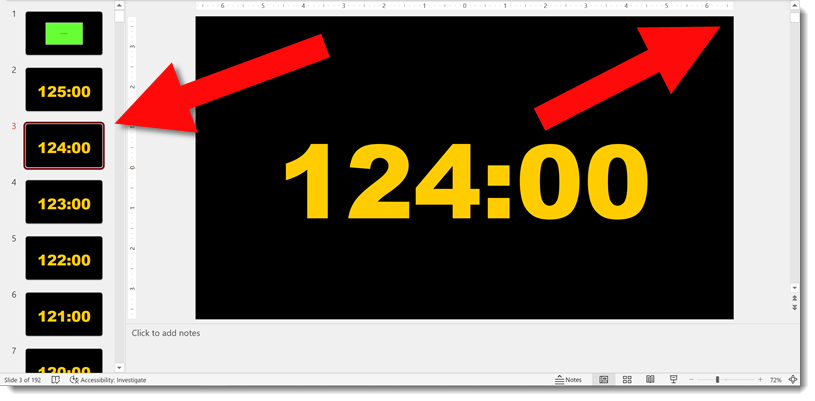
New is not always better. Are rounded corners on the slide sorter better? While I appreciate the creativity the Dev team has implemented, I am voting that this update can impact visual reference of the slide design. As example, this presentation in the full slide sorter view – which also has the rounded corner styling applied.
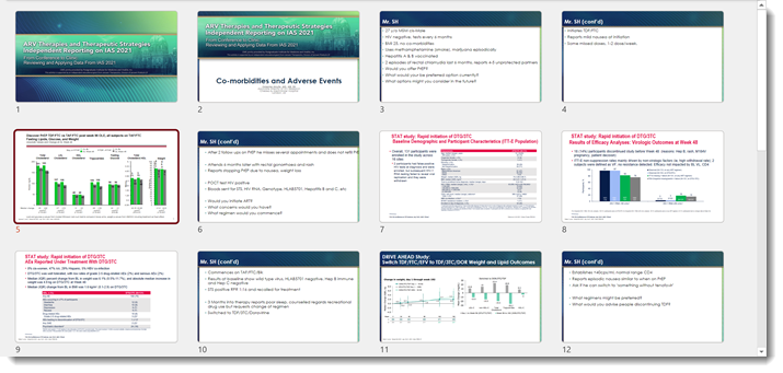
The template, developed here by the TLC Creative design team, has a very linear styling. These newly introduced rounded corners to the slide preview add to, alter, and impact the viewer interpretation of that design. In addition to cutting out (small) portions of the content at each corner. For reference, here is the Title slide layout in full (rectangle) view. I feel the above slide sorter view of the slides and this full slide have very different design aesthetics, even though they are the same slides.

That’s it, just an observation. As an end user we cannot turn off this new view, it is what PowerPoint gives us. The Microsoft PowerPoint team has already received lots of feedback on this aspect of the new Office look and I am hopeful that this specific update revert to the more practical slide shape is what is represented everywhere.
Troy @ TLC