The Selection Pane, introduced in PowerPoint 2007 is a great (and long over due) addition. But I think the dev team was not looking at the feature from a real-world use – and has not been updated yet (sigh…).
Here is my sample slide, that has many items on it. A good example of where the Selection Pane would be used.

To open the Selection Pane: HOME >> EDITING >> SELECT >> SELECTION PANE

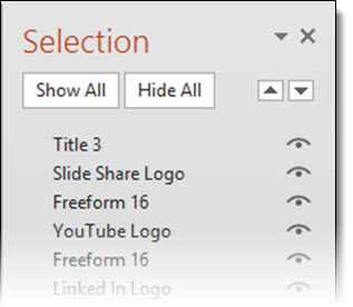
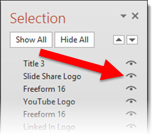
Note the on/off icon is on the right.
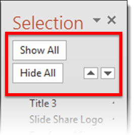
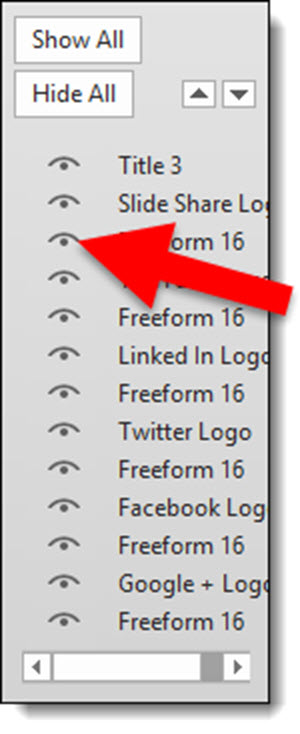
When the Selection Pane is made a smaller width, the tools at the top (Show All, Hide All, Move up/down) wrap nicely to fit the narrower layout.
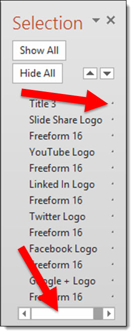
When the Selection Pane is made narrower, the names do not wrap, but the on/off icon is cut off and disappears rendering that feature unusable. At the bottom is a scroller, which does allow access the on/off icon – but it requires so many additional mouse clicks and movements it is not a practical option.
To answer the inevitable question from the MS Dev team – “why would you need to make the Selection Pane so narrow?”. In the real world, we work with different resolutions (please test the Selection Pane at 1024×768 to see how much screen real estate it needs to be functional), have several panes open side-by-side, have dozens of objects on a slide – on and off the slide area – and want to work at the largest viewable size, and many other real situations where the selection pane is in the way when so wide.
So what should the MS Dev team do? Simple: move the on/off icon to the left side and let the names get cut off.
Leave a comment about your experience with the Selection Pane tool (in PPT 2007, 2010, 2013).
– Troy @ TLC
