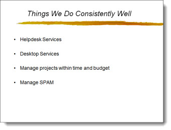
Most every presentation software for the past 15 years has made information as bullet points the default way of visually presenting it. While efficient, and duplicate-able, it is definitely not the most attractive or memorable way to present information. Here is an example of “Bullets vs. Visual Layouts” from a recent project.
Here is the original slide – simple, consistent, boring bullet list:
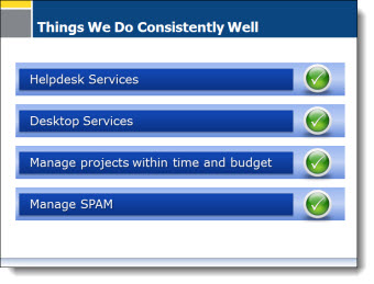
Here is the slide after the presentation makeover project. It has the same information, but has some visual impact with color, shapes, layering, and speaker support animation (obviously not seen in this flat image of the slide):
– Troy @ TLC