Throughout 2025, each Friday’s article has featured a “Look Back” at previous posts – some are from last year, and others are from 20 years ago! Microsoft this month (October 2025) revealed a full visual refresh of the Office suite icons, so, to tie this into our Look Back series, let’s first look at our post about Microsoft’s icons from August 2018, “Windows 10 Start Menu Icons”.
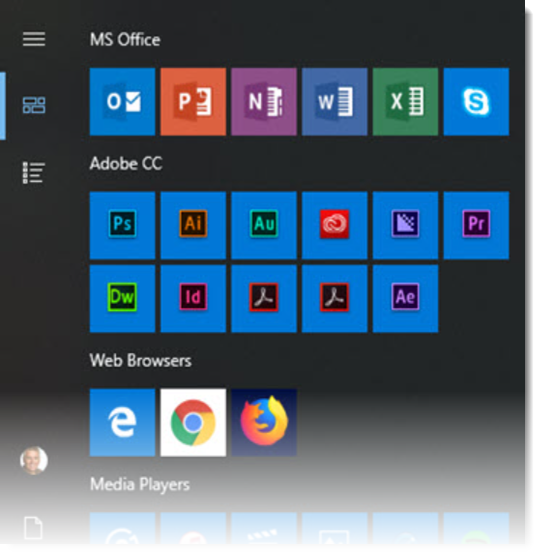
The important note is that this post was not really about the app icons, but rather that the Windows 10 start menu had color-coded the icon “chiclets” with the background of each app color. I liked it and thought it was a nice design unification for the Microsoft Office icons (I did not like that other apps had random styling). Read that post here.
Now in 2025, the Microsoft team describes their visual refresh update as an “evolution, not a revolution”.
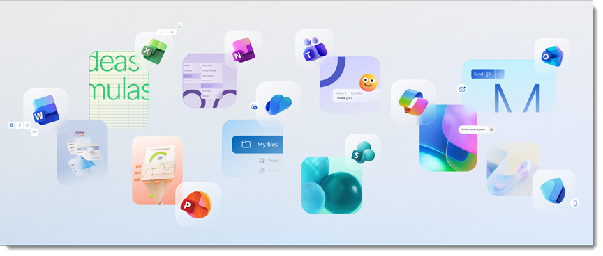
According to the official release article, this new look reflects Microsoft’s broader shift toward “fluid experiences” that connect across devices and platforms. The icon designs use depth, motion, and lighting, and Microsoft notes the updated icons feel more organic, less mechanical, and have shapes that flow rather than sit rigidly in place.
At least the app colors remain constant from the previous versions, although there is now a rich use of blended gradients.
Over time, the Microsoft Office app icons have had several eras of design. We pulled this diagram showing the icon history from the Microsoft website:
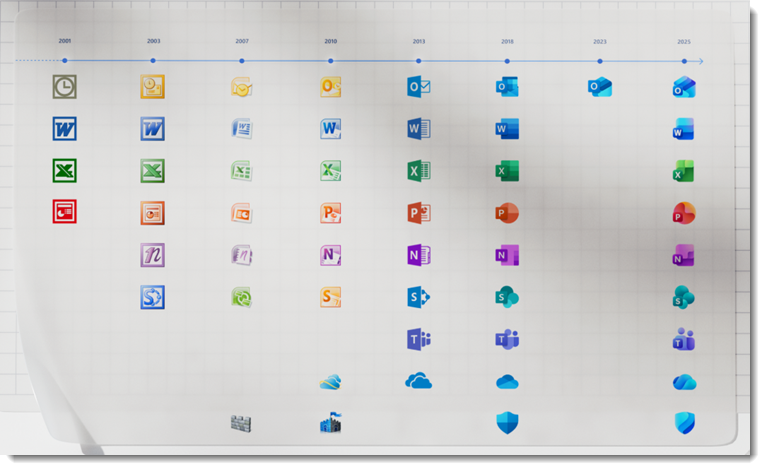
The flat 8-bit compatible icons of 2000 evolved into gradients and then onto more complex shapes, landing on Microsoft’s flatter, “Metro” aesthetic in the 2010s. Then, a subtle repeat of moving back to more complex shapes, to gradients, and now onto a more complex use of gradients and subtle shape consolidation (at least that is my initial thought about the latest evolution in the icons).
In reading about the app icons, Microsoft calls out that every Office icon was rethought to make it easier to recognize immediately, yet when you look at this really nice historical grid of icons, I am not certain the latest set makes it easier to recognize one app from another vs. the previous versions…
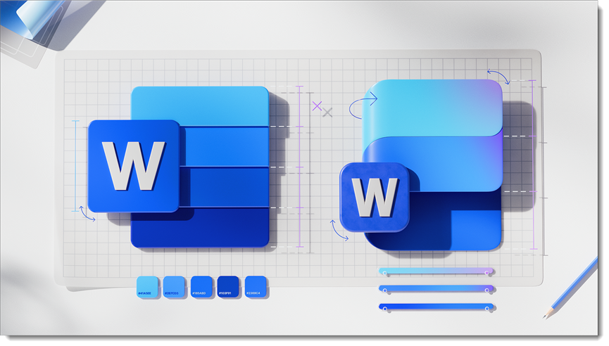
One minor observation: in the Microsoft article, the Word app “before” icon is not quite the icon we see in our Windows 11 OS or SharePoint interface today. It looks great, but it has visible dividers in the gradient bars and a more pronounced drop shadow effect than seen in the actual (current) icon.
All that said, in my opinion, the new icon system is neither a win nor a loss. It is an evolution that I feel is more like a style guide alignment rather than a push towards functionality. Now the question is “when”… When will we see the new version of the Microsoft app icons in our taskbar?
-Troy, Jake, and the TLC Creative design team