Our very creative design team took this week’s highly collaborative challenge and turned it into something incredible! Not only did they communicate and collaborate efficiently and effectively, but they took the idea of a bar chart to a new dimension (or perspective)!
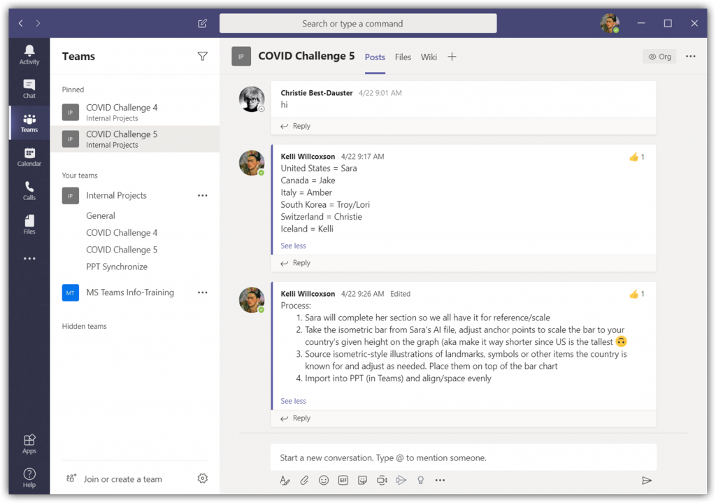
The TLC Creative design team kicked off the project with a group call using a Teams’ video meeting. The discussion was focused on ideas of what they wanted the result to visually be, how to divide the tasks, and assign roles and responsibilities. They used the Posts tab in the designated channel to post a recap of what was covered on the call for those that couldn’t make it:
The design team decided to maintain the bar chart concept, but with a more decorative and visual styling. Color scheme identified, perspective agreed upon, and graphic style to represent each country established. Each team member created their assigned country’s artwork and data viz graph. Each was merged into the core PowerPoint file hosted in the Microsoft Team.
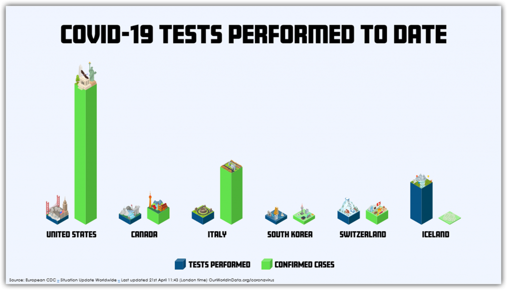
The next phase was another group collaboration meeting to discuss options for moving from good to a great visual. Here is the final team collaboration chart and slide layout:
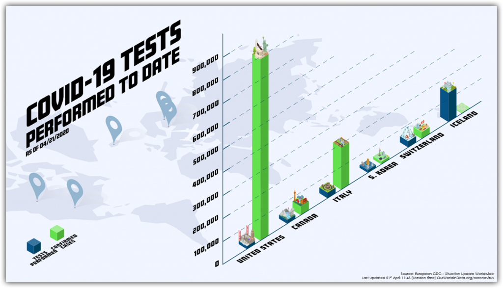
All text is editable in PowerPoint. All elements are imported .svg graphics that can be adjusted in PowerPoint. The entire process of working from a central Teams file with everyone’s edits automatically incorporated for the other designers to instantly see and work in tandem with each other was a success! Our design team did a great job on this challenge and, as a bonus, our design studio is using Microsoft Teams more than ever now for communication and collaboration!
Troy @ TLC