DISCLAIMER: This is NOT a TLC project, just something left on the door of my residence.

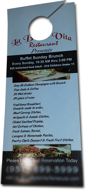
Oops, guess the designer did not think the restaurant name would be missed when the door hanger die the printer spec’d was used.
This is printed really well: good stock, ink coverage, aqueous coating, trim and die. But the design obviously did not account for the die that put a hole where the company name was. Looking closer, other design questions come up: what is the capitalization standard? What is the punctuation standard? Were 7 font styles too many?
I hear it very often, about how someone’s nephew is great with the computer and designed the company brochure – the guy in the end cubicle on the 4th floor has Photoshop on his computer and can create the event banner – the IT department is setting up the webpage (the registration backend page) and has been asked to also create the PowerPoint template.
These people are great and often creative. The downside is when the general person does not know, or understand, the technical needs of the design, the company branding, or just good design principles the results are not ideal. A company’s image suffers, users with improperly setup files suffer, or money is just wasted….
– Troy @ TLC
