A stroke and an outline are the same thing, but called different things based on the program being used. It is a line around the perimeter. The line can be any color, even a gradient of colors and any width. But PowerPoint has a flaw in its outline/stroke feature:
When you apply strokes to shapes in Illustrator or Photoshop, you have the option to align the stroke to the outside, inside, or center of the shape:
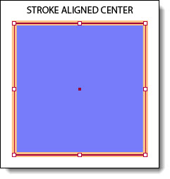
In PowerPoint, the stroke is automatically applied to the center of a PowerPoint, or vector, shape:
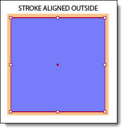
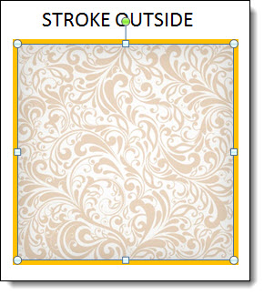
However, with inserted images, the stroke gets applied to the outside:
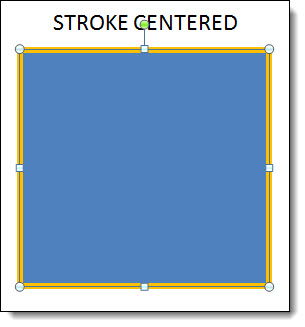
And for text, the stroke is applied to the center:

This makes it difficult if you are trying to align shapes with images, the strokes don’t align even if they are the same weight simply because PPT aligns to the edge of the shape/image and now the same size elements with the same width stroke are different sizes, because on one the stroke makes the shape wider than the other. With the text, the actual text starts to disappear (above example is the base text and then a 10pt stroke applied – which almost completely eliminates the black text). There is not a solution for PowerPoint as of PPT 2013, but we can hope for user control over the placement (inside-outside-center) by the designer to improve PowerPoint.
– Troy @ TLC