Many have heard the term “video safe” or “Title Safe” when creating graphics for video production. It is the idea that some of the outer edge of the graphic may be cut off, blocked, or not visible, so do not put any “real” content all the way to the outer edge. I always like to know about the environment where the presentation will be shown. Are there any physical obstructions blocking any part of the screen? Is there any other content on the screen? How low is the bottom of the screen (will the front row of people obstruct the rest of the audience from seeing content)?
The questions have shifted over the past year and an overwhelming large number of presentations have been given over virtual platforms. TLC Creative has done plenty of Zoom meetings. And for higher production value events we have embraced the Vimeo live streaming services (not the actual platform, we host events on our virtual meeting platform, VXP Meetings, and embed the Vimeo live stream players for each meeting room on it).
If you know a presentation will be viewed using Vimeo, this post is for you. The Vimeo player, both on-demand video and live stream video, have some interface overlays that need to be accounted for in the presentation design – or graphics that will be used in video production. Below is a download link to an overlay graphic we created that visually shows where the Vimeo interface elements are, and if your content is going to be obscured (if the viewer moves their mouse over the video player and activates the Vimeo interface).
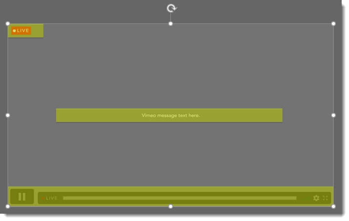
Download the 16×9, 1920×1080 .png overlay image HERE.
Troy @ TLC