I work with PowerPoint on a daily basis and I am very honored to be a Microsoft PowerPoint MVP. We have a talented team of presentation designers at TLC Creative Services and ThePowerPointBlog is our area to highlight PowerPoint tips, tricks, examples and tutorials. Enjoy! Troy Chollar
Why Do We Say “PPT”?
“The updated PPT is in process.
“Do you have bandwidth to help design a new PPT?
“Look at the PPT slide 23 layout!
Question, why do people say “PPT” when referencing a PowerPoint file?
The answer is almost 20 years old, which proves it is difficult to change a name once it has been assigned!
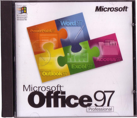
We are going back even further, to 1997, when Microsoft released Office 97. PowerPoint was in the Office 97 bundle and all Office files; Word, Excel, PowerPoint, used 3-letter file extensions. PowerPoint files had the extension .ppt. So when hear some reference a PowerPoint file as a “PPT”, they are literally referencing a file format from over 2 decades ago!
Why did we start with saying the answer is almost 20 years old?
Because in 2007, 19 years ago, Microsoft release Office 2007. Office 2007 gave us the modern version of PowerPoint, powered largely by PowerPoint being rebuilt in the Office Open XML (OOXML) standard. With this update all of the 3-letter file extensions added the letter “X” for the new 4-letter file extensions; .pptx, .docx, .xlsx, etc. The “X” representing the XML code base.

And why did we say the XML version of PowerPoint, .pptx, is the modern version?
Because each XML file is really a .zip folder with all of the XML code, images, text files, videos and more inside that PowerPoint uses to display the slides. Modern meaning smaller file sizes (it is a .zip folder!), modular components inside (so 1 corrupt file does not ruin the entire presentation!), interoperability (the XML file structure is how Apple Keynote, Google Slides and every other presentation program can convert their presentation to a PowerPoint file!), embedded video and audio (it is a .zip folder, so things like videos and audio files can be added!).

-Troy @ TLC