Make a Video Arrow
This short tutorial walks through the design process our presentation design team uses to create these fun “video arrows” in PowerPoint. The end result will be a series of arrow shapes on a slide… but their background is a dynamic video!
To start, add 3 PowerPoint arrows to a fresh slide (these can be the default PowerPoint arrows, or a more stylized .svg arrow from PowerPoint’s Stock Images, or a resource like TheNounProject. For this example, we used 3 ascending PowerPoint arrows:
![]()
With the static arrow layout set, we can move on to create the video version. Find a video that is larger than the area the 3 arrows occupy.
- For the best visual effect, a seamlessly looping video is best.
- PowerPoint has a good selection of videos by going to INSERT > VIDEOS > STOCK VIDEOS.
- Or use your website of choice (our team used Adobe Stock for our video selection).
Embed the video onto a separate, new slide.
On the arrows slide, select the arrows and MERGE so they are a single shape:
1-3: Select all 3 arrows
4: Go to the “Shape Format” tab
5: Select “Union” from the Merge Shapes dropdown menu
![]()
This will combine the arrows into a single vector shape – this is a crucial step for the next part.
![]()
Next, copy the new single shape of 3 arrows and paste it onto the video slide.
TIP: Hide the original 3-arrow slide to keep it for later use, because in the next step, we are going to “destroy” the arrows, so they are no longer arrow shapes.
![]()
On your video slide, select the video FIRST. Then shift + click to select the arrow’s shape.
NOTE: The order of this selection is very important.
Go to the MERGE SHAPES again (select > Shape Format tab > Merge Shapes> Union). This time, select the INTERSECT tool.
![]()
This crops the video into the arrow shape! The result is a video that plays inside a custom video shape – all created in PowerPoint!! The standard PowerPoint video playback functions are still used to set the video to play and loop, AND you can use PowerPoint’s crop function to size and position the video within the arrow shape. Talk about cool presentation design!
![]()
Now, you can copy and paste these custom video shapes into any presentation!
Jake @ TLC Creative Services
New Podcast Episode Available! “PowerPoint is Amanda Dalton’s Swiss Army Design Tool – and CreativePro Week 2026!”
New episode of The Presentation Podcast now available!
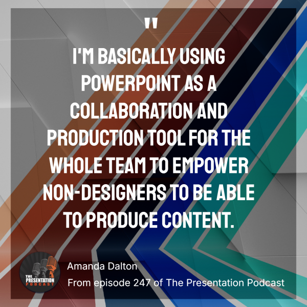
Episode 247: Unlock the power of PowerPoint in ways you may not have imagined. In this episode, Troy, Sandy, and Nolan are joined by Amanda Dalton, a seasoned graphic designer turned presentation and instructional design expert, to explore how PowerPoint can be a central tool for presentation design, video creation, and instructional storytelling.
In today’s ever-evolving world of digital communication, few tools are as versatile, or as underestimated, as PowerPoint. Amanda shares her professional journey and offers insights into how she leverages PowerPoint alongside other tools to create impactful stories, engaging training content, and dynamic visual experiences.
Plus, CreativePro Week 2026 is just weeks away! Amanda is one of the presenter at this year’s conference, and we are fortunate to have David Blatner, Director of CreativePro, preview what to expect at this year’s Nashville event. Listen on your favorite podcast app, or at The Presentation Podcast site here.
Presentation Jargon
Presentation designers have their own language. I did a fun thing of having Copilot review several of our presentation review meetings (Teams meetings captured by Copilot) and make a list of industry-specific terms. The results were interesting – and a lot (with a lot of results not really what I was looking for)!
Then, during a TLC Creative Services weekly team meeting, I posed the same question: “What are presentation-specific words that would not make sense to someone outside our presentation world?” It was a fun conversation!
Here, we present the 18 key words that overlapped between the Copilot review of presentation-specific meetings and our design team’s real-world look at the presentation industry’s words and phrases. Enjoy our “Presentation Jargon” – designed and animated in PowerPoint of course!
-Troy @ TLC Creative
Adobe Fonts in Microsoft, but No Microsoft Fonts in Adobe?
Ever tried to use an Adobe font in PowerPoint, and wondered why it’s not showing up? Or handed off a PowerPoint file to a designer, and the fonts look totally off when they convert it to InDesign? We see this situation often with people who use both Adobe and Microsoft products. Here’s the deal (and a hack to fix!)…
Quick answer:
- Yes, Adobe CC fonts can be used in PowerPoint and other Microsoft apps (with a simple hack).
- No, there is no equivalent hack to make Adobe apps recognize all Microsoft-only fonts. However, many Microsoft fonts are already installed on your system and work fine inside Adobe apps.
Part 1: Using Adobe CC Fonts in PowerPoint (“The Hack”)
1. Download and install the Adobe Creative Cloud desktop app (if you don’t have an Adobe Creative Cloud account, you can create and use the free account version).
2. In the Adobe Creative Cloud desktop app, find and click the Fonts section, either in the top right nav bar or in the “Stock & Marketplace” section under Fonts.

3. From within the Adobe Creative Cloud app (or by visiting fonts.adobe.com in a browser), search for the font you want to use in PowerPoint.
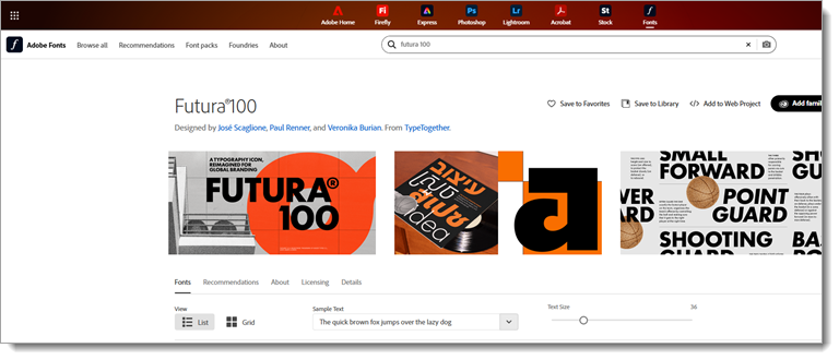
4. Select the font and click “Add to Fonts”, and the font will sync to your PC through the Adobe CC app. Upon adding it, you will get a pop-up to manage your fonts in the CC app.

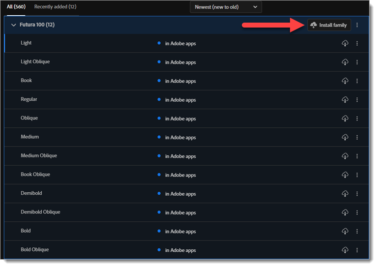
5. Use these steps to ensure the fonts are set for use across all apps:
- Open the fonts page in the Adobe Creative Cloud app, and you should see the font you just added at the top.
- Click the “Install Family” button to allow the new font to be used in other apps like PowerPoint.
- Once it installs, instead of seeing “in Adobe apps”, it will now say “in Adobe & other local apps”, and the font is good to go!
6. If PowerPoint was open, be sure to close and restart it since custom fonts (non-MS and non-Google web) only load when the PowerPoint app launches. After starting (or restarting) PowerPoint, use the font selector dropdown, and you should see your Adobe font listed!
Success!! Newly installed fonts should appear in the dropdown menu in PowerPoint. Adobe CC fonts remain on the computer for 20-30 days from the last time the Adobe CC desktop app was online. As long as Adobe CC “checks in” periodically, the fonts stay active and available to all apps – Adobe and Microsoft.
Note 1: The Adobe fonts you install are only available on that computer. To use the presentation on any other device, follow the same process to install the same fonts for PowerPoint to use.
Note 2: Adobe CC fonts cannot be embedded in a PowerPoint file. Plus, TLC Creative does not recommend PowerPoint’s embedded font option because it has too many failure points.
TLC’s Best Practices
For presentations built in PowerPoint, we default to Microsoft Cloud fonts whenever possible. They are cloud-based, require no installation, and most importantly, avoid font-substitution issues. When a client or brand requires specific Adobe CC fonts, we use the steps above to keep design files and presentations matching.
In conclusion, getting Adobe CC and Microsoft fonts to play nice is doable. Use the Adobe CC desktop app hack to bring Adobe fonts into PowerPoint. It is a bit of a setup process upfront, but the option is available.
Wondering if Adobe will recognize Microsoft fonts? We’ll talk about that in our next post.
Jake @ TLC
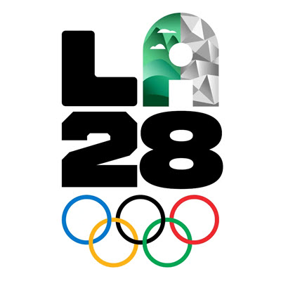
The LA28 Design System is Impressive!
I just bought tickets for us to see a sport climbing competition that is over 2 years away. In July 2028 to be more precise! That’s right: for the 2028 LA Olympics. And with the 2028 Olympics being nearby in LA, I was excited to be able to use the “locals” advance purchase option for us to see a few events in person.
Quick backstory…rock climbing is something Troy and I have a long history with, including during our pre-presentation design years, when we owned and ran one of the original premiere-level rock climbing gyms in America.

(Troy still rock climbs today, but more casually perhaps)
Now, while I was preparing to buy said Olympic competition tickets (and let me tell you, it is a process…well planned out and communicated…but a process nonetheless), the LA Olympics people suggested I watch a video about the ticket buying process. This is when I stumbled upon another video detailing the LA28 design system…and it’s really cool!
From a very versatile letter “A” (think MTV logo of old) to the event color scheme (think flower superbloom and LA specific flowers) to the patterns of the 2028 LA Olympics design system…I can’t decide which I like best (okay, the patterns win).

(Our local 2023 superbloom on a drive to LA)
Everyone who works in design will appreciate the 2028 LA Olympics design system in this less than 3-minute video!
I love that the video highlighted design systems from past Olympics and from what I see, LA28 is going to represent LA extremely well – I can’t wait to see the colors and patterns play out. Funny enough, I’m not a fan of the LA28 font system. However, I see the strategy and am curious if I’ll change my mind as I see the whole system play out over the next couple of years.
Enjoy!
-Lori @ TLC Creative
New Podcast Episode Available! “Are PowerPoint Templates In Our Future?”
New episode of The Presentation Podcast now available! In this episode, Troy, Sandy, and Nolan discuss the value and challenges of PowerPoint templates. They agree that well-built templates save time, make brand consistency easier, and improve efficiency. But everyone also agrees PowerPoint templates are frequently misused, broken, or ignored. While AI tools can generate content and slides, that is not the same as creating slides with the backend formatting and presets of template. And observations from testing multiple AI systems, all currently lack the ability to build or maintain proper template structures. Join The Presentation Podcast hosts for a great conversation centered around PowerPoint templates.
Listen on your favorite podcast app, or at The Presentation Podcast site here.
Format Presenter Notes Handouts
Before diving into Presenter View’s display of Presenter Notes, let’s first look at PowerPoint’s Notes Master.
This is where the slide and Presenter Notes are merged for print. But, really, it’s another “hidden” function within PowerPoint that few know about, and even fewer consider customizing.
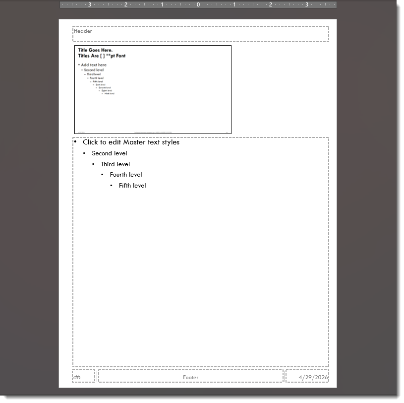
Each Master Slide in a PowerPoint file has a Notes layout, which is used for printing slide notes pages. The Microsoft default layout has a fairly large image, or thumbnail, of the slide, and a text box below it for the Presenter Notes using the same font as the master slide text and sized at 12 point. Along with the Header, Footer, date, and page number placeholders in the 4 corners of the page.
[image of default notes layout showing the placeholders]
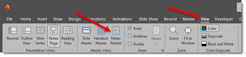
To access the Notes Master, go to the VIEW tab > MASTER VIEWS section > and click the NOTES MASTER icon.
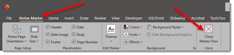
Note: To close the Notes Master and return to the slides, go to the HANDOUT MASTER tab > CLOSE section > click the CLOSE icon.
For TLC Creative, we have our own version of Notes Master layout that we like, and it is included on all PowerPoint templates we create.
- Smaller and positioned higher slide image
- Larger text box
- Preset bullets, font sizes, line & paragraph spacing
- Date moved to the lower left
- Footer centered at the bottom of the page
- Header and page number placeholders stay in their respective corners
A special note is that if a presentation has multiple master slides, each master slide has its own Notes Master. This is important for slide deck printouts where formatting of each Notes Master needs to be reviewed to ensure the Notes View printout is consistent.
So… how does this relate to using Presenter View when presenting? We will address that in the next post!
Troy @ TLC Creative