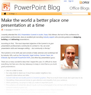
Office.com Recap of the 2011 Presentation Summit
Joy Miller at Microsoft Office Online added a blog post to Office Online PowerPoint blog about this year’s Presentation Summit. Read it here.
– Troy @ TLC
Joy Miller at Microsoft Office Online added a blog post to Office Online PowerPoint blog about this year’s Presentation Summit. Read it here.
– Troy @ TLC

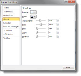
For this slide (see previous post for more info on it), I wanted the numbers to be a visual focal point. I also wanted to keep them as editable PPT text. By mixing the stylized text with more standard text, a nice slide layout was developed. The big number text was created by:
1. Make it big (this text is 125pt).
2. Give it a gradient fill – using colors that coordinate with the template color scheme.
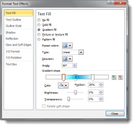
3. Add a subtle outline (stroke) to the text to help it contrast for legibility.
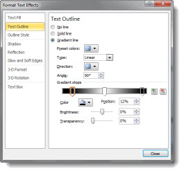
4. Add a drop shadow.
The sample slide can be downloaded here.
– Troy @ TLC
One of the greatest things I hear is something like this “Just make the slides have the key concepts I am talking about.” To me, that means the presenter:
– Knows their talk
– Is a confident presenter
– Will not be reading the slide to the audience
– And has given me freedom to design visual slides (yeah!)
This is a sample slide from a recent presentation TLC Creative Services developed (Note: Corporate template and much of the content adjusted for the sample slide). This minimal content slide reinforced the presenters point, did not distract the audience from the presenter and provided much more memorable speaker support than a list of bulleted text with all the details (that the presenter provided during the talk).
– Troy @ TLC
Received an email that is personally exciting for me this weekend. Microsoft has awarded me as one of their PowerPoint MVPs once again!
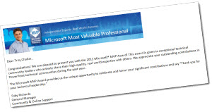
There are around 30 MVPs for PowerPoint and more information on the overall award and program are at Microsoft here.
– Troy @ TLC