It’s A Bright Pink World Full of Animation! – A Look Back to June 2018
What a great look back for our design team! Yes, PowerPoint 7 years ago was capable of great animation and video export – as shown in this project from 2018. For our team, this project is also full of memories, as several of the marketing campaigns are no longer current. But we were there and supporting Barbie!
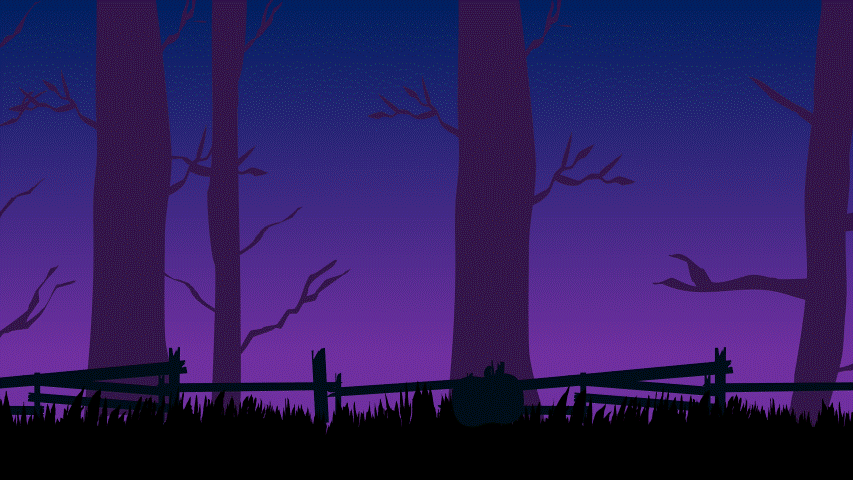
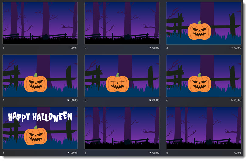
Sometimes a presentation project is just all about the animation. In this case, we were tasked with developing a 2+ minute motion graphics video to be used as a meeting opener. A short segment is here for preview. We developed all in PowerPoint, and then exported to video with a music track. It is not the tool that creates bad, boring and bland presentations; PowerPoint is just a canvas, and can accomplish wonderful results in the hands of professional design team.
-Troy @ TLC
This is from our Look Back series, rediscovering previous blog posts with relevant PowerPoint tips, tricks and examples. The original post from June 1st, 2018 can be viewed here.