Using Color in a PPT Template
The goal of this template was to use bright and energizing colors and a horizon. Here is the client approved template.
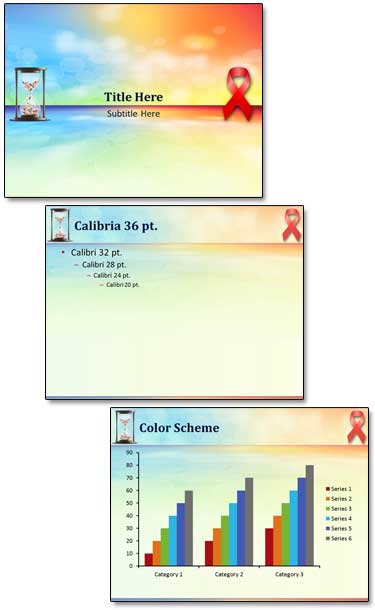
– Troy @ TLC
The goal of this template was to use bright and energizing colors and a horizon. Here is the client approved template.
– Troy @ TLC
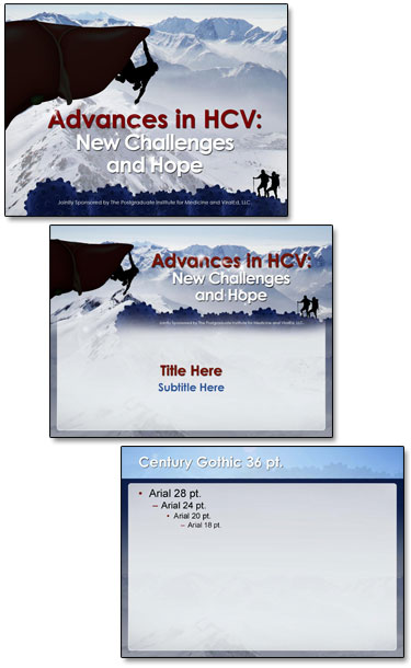
As this client proves, medical slides do not need to be the standard boring blue background white and yellow text. The topic is Hepatitis liver function and the challenges in treatment. And we were free to explore visual cues in developing the PowerPoint template. The final approved template used a rock climber facing a challenge, a cliff that is actually the human liver, a hiking ridge made of viruses, a blood red title and a vast open mountainscape for the background.
Here is the theme graphic, title slide and general content master layouts.
Here is the theme graphic, title slide and general content master layouts.
-Troy @ TLC
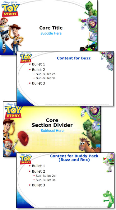
For Toy Story, I had lots of great character art to work with! The request for a white background and lots of character options made good use of the multiple master layouts in PowerPoint! I invested a full day in storyboarding the character combinations and slide combinations. The final template has 22 unique Master Layouts. Many of the layouts use the same placeholders and formatting, but different character art. The goal was to make it very easy to design a slide and reassign the Master Layout at any time to different characters without changing any of the slide content formatting.
– Troy @ TLC
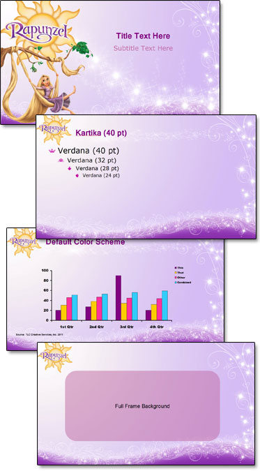
At the other end of the entertainment spectrum from the previous WWE post is Disney’s Rapunzel. Using great animation art as the focal point for each master slide layout and adding plenty of princess glitter, here is the Rapunzel marketing template developed.
– Troy @ TLC
PowerPoint is used everywhere – even the Wresting Ring! Well, the presentations may not be actually in the ring, but the marketing guys talk about the ring a lot in their presentations. Here is the template developed for the 2011 WWE marketing presentations.
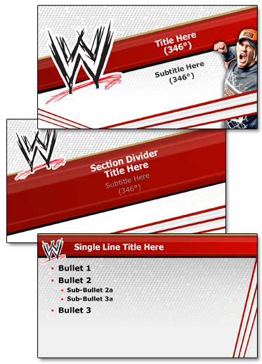
– Troy @ TLC
Seeing your work displayed to the world is always pretty great. In this case, it has also brought in hundreds of comments on a recent Facebook post by Microsoft.
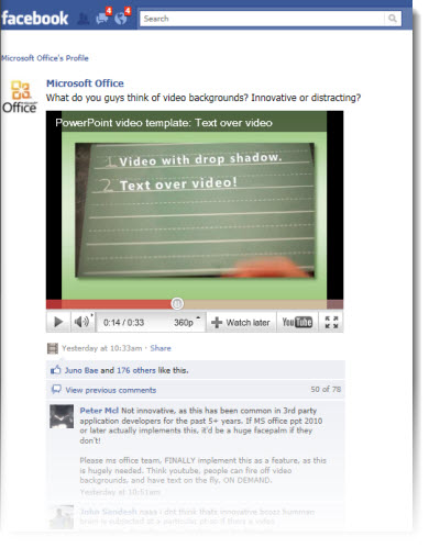
From a recent project for Microsoft, here is one of the video “templates” I created to demonstrate the video capabilities of PPT 2010.
The Facebook post is here.
In reading the comments, I was surprised at the number of people requesting content-over-video be added as a feature. Maybe some additional advertising and market awareness campaigns are needed. Content-over-video is available in PPT 2010, works great, and the video being commented on was developed in PPT 2010.
– Troy @ TLC
On a recent project, we were provided with a number of corporate logos and asked to create an animated presentation that would be able to seamlessly loop.
The logos were all supplied as Illustrator .eps files. So the first task was converting to .emf or .png format.

Then each logo was separated into many small image files to allow flexibility in animating. All animation is developed in PowerPoint 2010. Here is the result:
Troy @ TLC
Timelines are a staple for presentations. But memorable, content applicable, and legible timelines are not. Here is a timeline developed for a recent client that tied in with the visual style of the presentation and emphasized the key message with animation.
[youtube src=”https://www.youtube.com/embed/CsTi7dV7now?rel=0″]
The timeline was spread across two slides to make the design (and modification) easier. In the full presentation there were several on-click animations to coordinate with the speaking points and the slide transition acted as one of the clicks to advance to the next point.
– Troy @ TLC
These slides come from a recent project. The original had a Visio (?) flow diagram. Aside from being an uneditable .jpg image, it was full of colors that were inconsistent with the rest of the deck and could use a bit of professional polish.
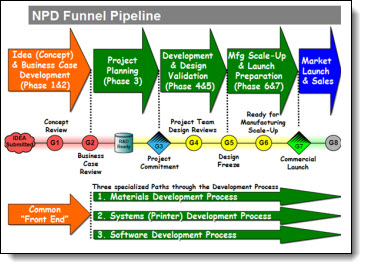
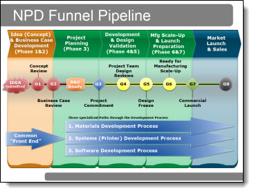
The recreated diagram used a subtler color scheme, separate elements to show the sections, and everything recreated in PPT to allow animations and section-by-section edits as needed.
– Troy @ TLC
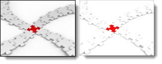
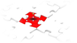
This is a slide from a recent project. The supplied original was the template title slide with the word “Questions” in the middle. This was the final slide of the presentation and I wove in a puzzle theme throughout.

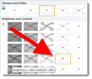
Using a stock photo (from Thinkstock.com) the entire effect was developed in PowerPoint. First was adjusting the photos color by going to PICTURE TOOLS >> FORMAT >> ADJUST >> CORRECTIONS >> and using a preset Brightness/Contrast setting:
Then adding the reflection to the inserted logo and text. For the logo reflection PICTURE TOOLS >> FORMAT >> PICTURE STYLES >> PICTURE EFFECTS >> REFLECTION >> and using a preset. For the Text reflection DRAWING TOOLS >> FORMAT >> TEXT EFFECTS >> REFLECTION >> and using a preset:

And finally, the final touch of the cast shadow under the logo with a gradient filled oval shape:
– Troy @ TLC