We’ve all been there. You’re building a PowerPoint deck, and you find a GREAT image to complement the talking point… but it’s not quite perfect. Maybe there’s a random stranger walking through the background of your team photo. Or perhaps the image could use a touch-up to make it pop more. In the past, stopping for edits like this meant pausing your workflow entirely to head over to your photo editing app of choice.
If you have Adobe Creative Cloud, this means launching Photoshop and opening the same image separately and then proceeding with the editing yourself. Time-consuming tasks such as removing a background or adjusting the brightness, contrast, etc., are certainly a friction point that forces you out of your presentation mindset.
But with this new update, Microsoft has just changed that workflow! Powerful AI photo editor tools are now baked directly into PowerPoint’s ribbon. You get decent editing capabilities without ever having to leave the PowerPoint application.
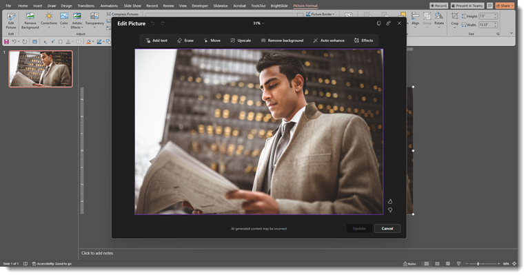
Here is a high-level look at the new “Edit Picture” interface and what these tools can do. And before you read any further, no, the new Edit Picture tool does not have the ability to expand the background of a photo. ☹️
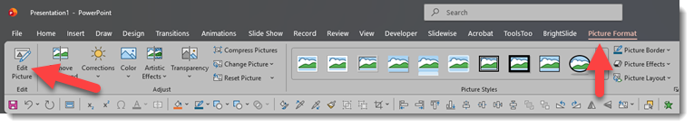
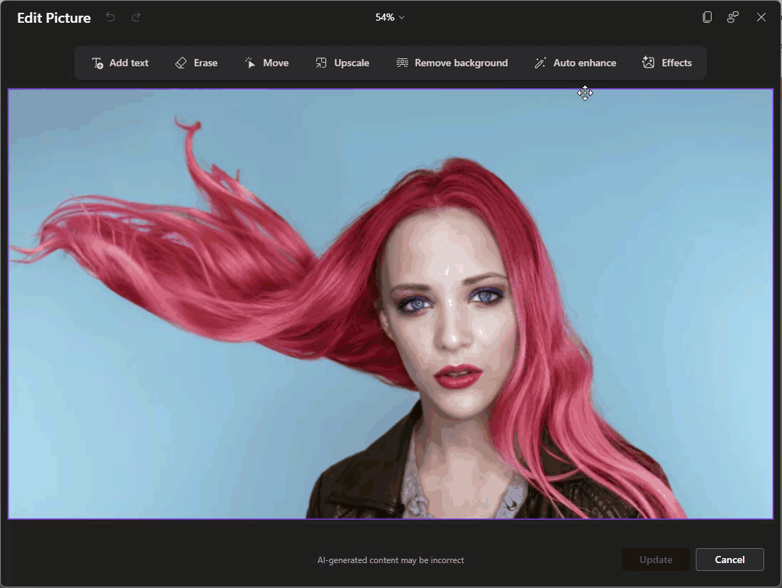
Accessing the new editor is in a slightly different spot on the Picture Format tab. Once you insert a photo (for this example, we just used Microsoft’s stock library), click the Picture Format tab and then select “Edit Picture” way over there on the left:
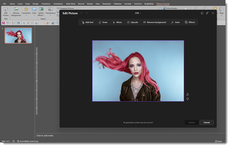
This will open up the new interface as PowerPoint shifts into a focused photo editor mode, with a dedicated AI toolbar at the top.
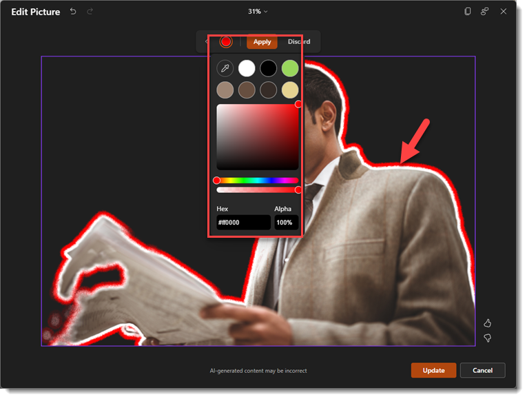
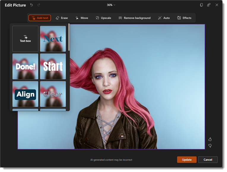
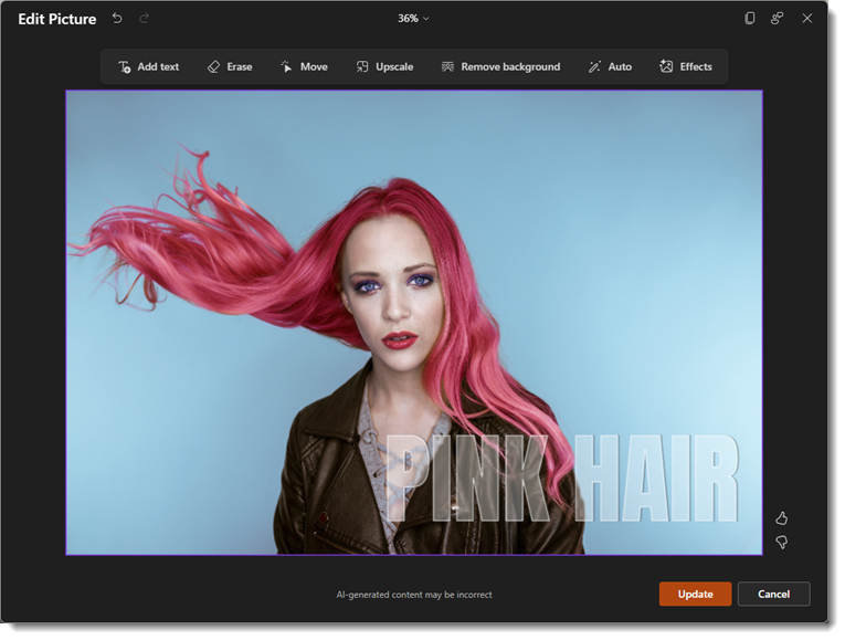
We’ll walk through a few of the editing options starting with Add Text: This will add custom text with a variety of different effects.
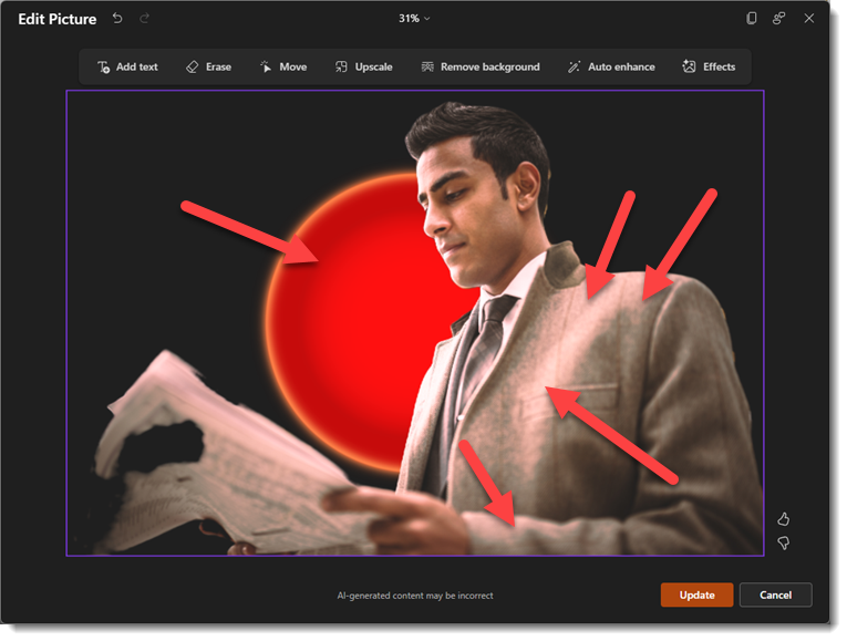
Erase: You can use a quick selection or manually brush an area of the photo you’d like to erase. This isn’t the best example of a photo to use for this tool, but here’s a look:

Move: This feature allows you to select a part of the image using the same auto selection or brush tool and then move that to another part of the image area (great for adding space for copy!)

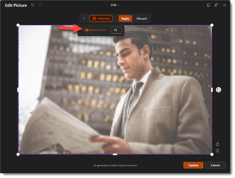
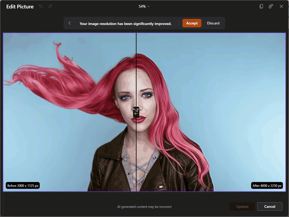
Upscale: Using this feature requires a fairly low-resolution image (most stock images, including the library within PowerPoint, are already very high resolution). For the sake of this walkthrough, I’ve downsized the resolution of our sample image here so that the upscale feature can be used. The photo editor will use AI to upscale the image to a higher resolution with no pixelation. You’ll notice it shows you a “before and after” slider so that you can see the changes:
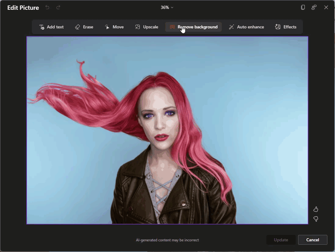
Remove Background: This will auto-select the background and remove it, like the old Remove Background feature that’s been in PowerPoint for quite some time, but AI-powered (and a lot less clunky).
Auto Enhance: Using this will do an automatic photo touch-up. However, for better or worse, there are no customization settings, just one click, and it’ll enhance the image. This feature also uses the before and after slider so that you can see what was changed.
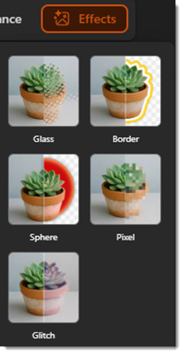
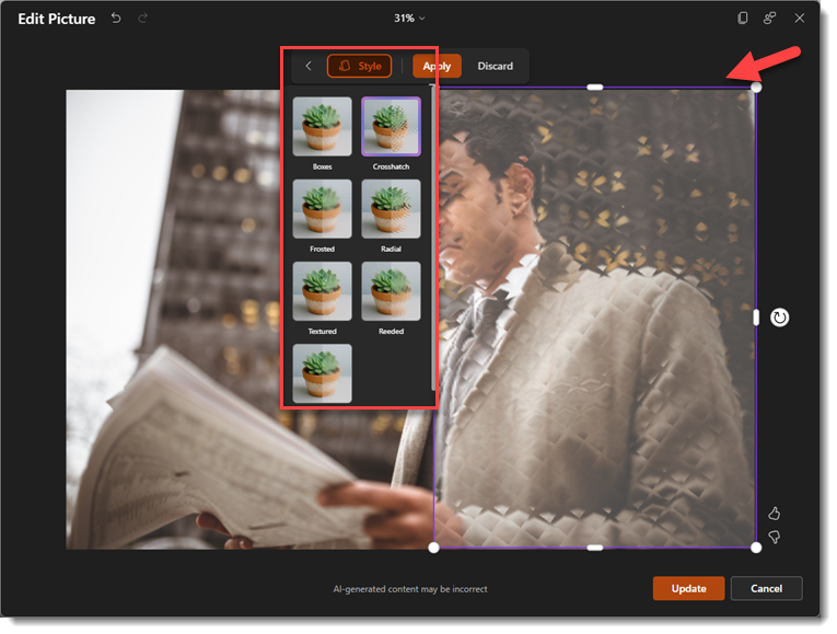
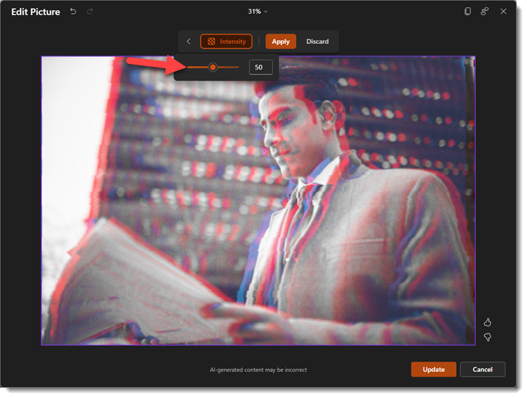
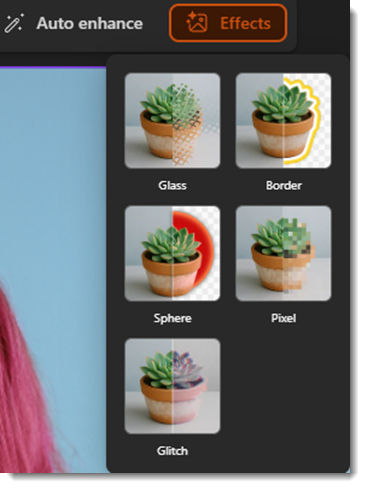
Effects: These are special effects that we’ll be going into more detail in a future blog post.
Now you might be thinking this is all powered by Microsoft’s flagship AI, Copilot. Technically, it’s not. While Copilot acts more as a “Project Manager” within the Office ecosystem, the Edit Picture feature is actually a two-part system:
- Computer Vision: To “see” the image and separate the subject from the background – this is part of the larger Microsoft Azure toolbox.
- Generative AI (DALL-E 3): To draw new pixels when you erase or move objects.
Ultimately, this update isn’t just about cool AI photo editing tricks. You can think of it more as maintaining your workflow momentum. Every time you must minimize PowerPoint to open another app, it can make you lose focus. By bringing these image editor tools directly into the ribbon makes it easier to stay in the flow. Of course, these tools won’t replace the touch of a professional graphic designer, but for quick image fixes and touch-ups, they can really help keep you in the zone.
-The TLC Creative Services design team