Good PPT Article All Should Read
Last week a great article on PowerPoint presentations came out on bMighty by Nilofer Merchant (most likely posted many other places as well). 
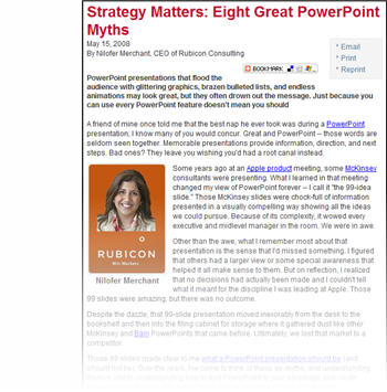
The article is “Strategy Matters: Eight Great PowerPoint Myths” which you can read here. It has a good message – don’t use animation for animation, don’t use too much content on a slide, and the presentation is to support the speaker who is to convey the message to the audience (not read the slides or let the presentation tell the story).
My only caution is that the author is not overly objective about the proper use of animation (myth #5) and draws the line on its use by throwing it out… maybe she has seen to many bad presentations.
– Troy @ TLC