Play Video Across Slides No More
In October 2017, we shared a post about a great PowerPoint video playback feature, video across slides, shown in the above video. At that time it was experiencing some issues with playback of stylized videos. See the original post for more information and examples (Read the original post here).
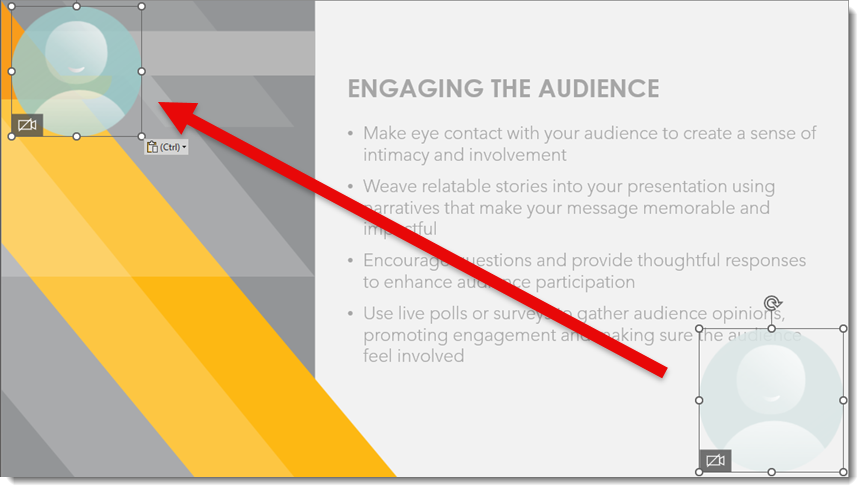
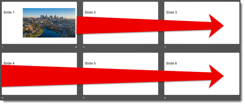
The goal of this feature is to enable a video on one slide to continue playing seamlessly across multiple slides.
Fast forward to today. Microsoft has quietly turned off the play-across-slides feature. I searched and there was no documentation from Microsoft, this feature was just not functioning – argh! With some piecing together of information I could find, there is a reason this feature is no longer working (but still this is frustrating to discover when presenting!). The reason? The Windows OS is no longer supporting the legacy Windows Media Player engine. And the PowerPoint play-video-across-slides feature uses (used) the legacy Window Media Player engine.
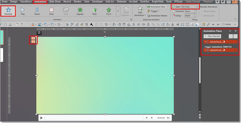
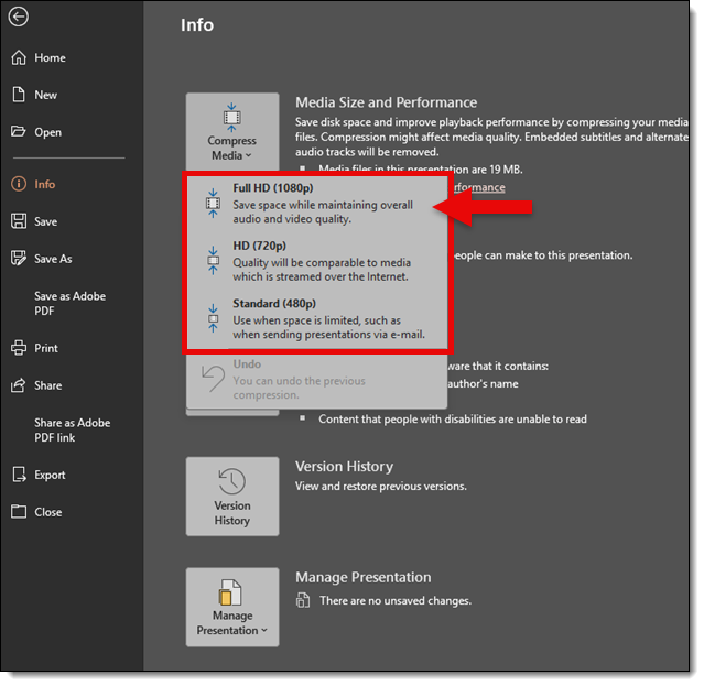
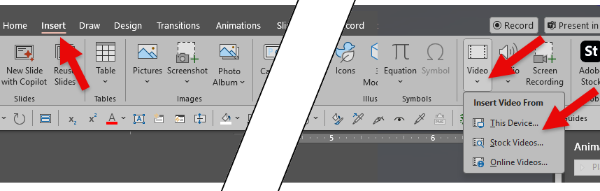
Here is the quirky part. PowerPoint, as of today, has not caught up with the Windows OS change. The animation options for video playback, and play video across slides, are still available in the dialog:
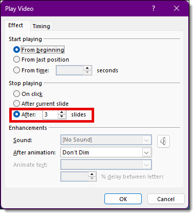
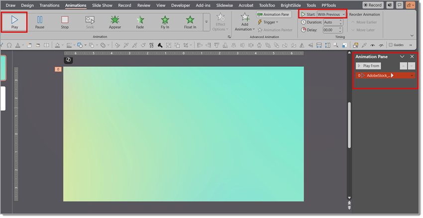
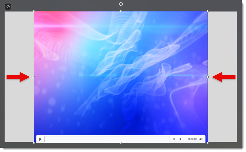
We can still set a video to stop playing after 2 slides or 99, but the video won’t play across any slides, it just plays on the first slide. It gets worse, in testing, existing presentations that were built with videos setup to play across slides do not just lose the across-slides playback, the videos themselves do not play at all…instead, only the video poster frame, a static image, is seen on the first slide of the video playback series of slides.
So, while the feature was always limited (never available on Mac or the online version of PowerPoint), I believe it is now completely gone from the Windows side too. It was a useful feature for many years (I know I used it in PowerPoint 2000 presentations!). So this is not so much a look back post, it is really a farewell to a useful PowerPoint feature.
NOTE: just before this post went live, Microsoft added this info page on The “Stop Playing After N Slides” feature is not working as expected in PowerPoint for Windows. This lists ActiveX controls have been disabled in PowerPoint as the reason for the play-across-slides not working. I am uncertain if that is the same or different than what I was told about the legacy media engine – but the end result is the same, things don’t work.
-Troy @ TLC Creative