
Animate Visual Dividers
Using the previous post’s sample, here is how I set up the animation on the slide.
Here is the sample slide:

Here is the Animation Pane for the slide:
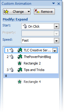
1. Text Box = Entrance animation – Expand – On-click (for each level) – Fast
2. Divider Lines = Entrance animation – Fade – With Previous – Fast
3. Drag 1st lines animation under 2nd line (2nd animation). So it fades in as the 2nd line of text expands.
Done!
The animated sample slide can be downloaded here (47K ).
– Troy @ TLC
Gradient Visual Dividers
Lots of slides have a few main points, like this example:
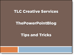
I like to add a simple divider line as a visual break between each line. And I create it in PowerPoint using a simple gradient fill. So my sample slide looks like this:
To create the divider line, start with added a basic rectangle – no outline and the fill color you want.
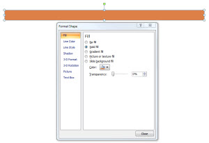
Then change to a Gradient Fill.
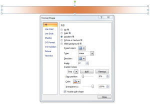
Creating the feathered edge is a bit tricky:
1. Type = Linear
2. Angle = 0
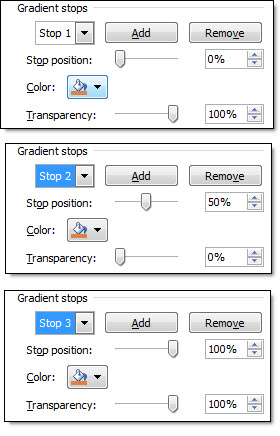
3. Stop 1: position = 0, color = your pick, transparency = 0
4. Stop 2: position = 50, color = your pick, transparency = 100
5. Stop 3: position = 100, color = your pick, transparency = 100
** Delete any additional stops (only want 3)
Last, adjust the rectangle height to be smallest possible.
Done!
– Troy @ TLC
3D Star Sample
For a recent project I needed some eye catching callouts/starbursts. I created a series of 3D stars and overlayed text boxes with the key phrases (New, Now, Available, etc.). It was a quick solution that looked really nice.
I started with a simple Star autoshape.

Adjustments to several tabs of the Format Shape box was all that was needed to create the visual.
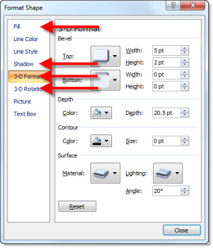
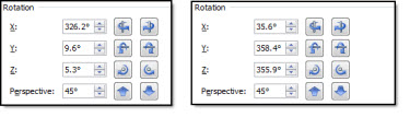
One of the tricky adjustments is changing the perspective to have a left facing star and a right facing star. Only 2 tabs are needed. The Shadow tab, adjusting the Angle and the 3D Rotation tab. Compare the numbers on the Rotation tab.
You can download a slide with these 3D stars on it here (33k ).
– Troy @ TLC
Dilbert March Madness PowerPoint ‘Boss Button’
PowerPoint is a ubiquitous office application and I think you know you’ve arrived when cartoon character Dilbert references it. This one is worth checking out!
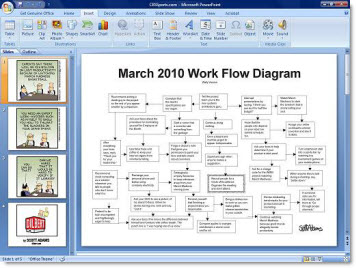
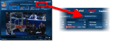
This goes beyond a cartoon and is actually a full screen image of a ‘dilbert’ PowerPoint presentation designed to hide your March Madness (basketball) viewing. It is activated with the “Boss Button” on the NCAA.com video player.
– Troy @ TLC
Zoom and Pan Animation Sample (Hockey)
Living in Southern California, Hockey is not really a focus for me. But with the excitement of the Winter Olympics hockey match up I was inspired to create this animation example. A popular animation effect used in recently (especially in commercials) is a zoom and pan where the background stays in place and key elements slowly lift and move to create depth and motion from a static image. The effect is not difficult in video or PowerPoint, it just requires a lot of prep work.
Here is my original image:

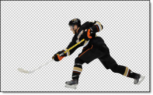
In Photoshop I dropped out the background and saved it as a .png:
I also created a background only version in Photoshop, where I ‘erased’ our hockey player from the image:

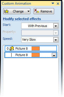
Then in PowerPoint I inserted 2 images; the hockey player and the blank background. Then applied the zoom and pan animation (grow/shrink 120% and motion path) to the hockey player image.
The result is a subtle motion to the slide that adds a nice polish and depth to what would be just a standard slide. Download the sample slide here (1.14MB ).
– Troy @ TLC
MS PPT Team Blog – Post by Me
This week the Microsoft PowerPoint Team Blog had a guest (eg. non-Microsoft employee) poster – me 🙂
Full post here.
– Troy @ TLC
NewsMap for Presentation ‘Statistic’ Graphics
I recently made use of NewsMap for some great visual images to visually show the trends being talked about by the presenter. NewsMap is actually an old web based application that has had some big improvements recently.
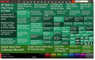
NewsMap visually shows any topic from the Google News aggregator in a treemap. The treemap shows the topic in bands and sized boxes that show patterns in news the reporting at that moment.
Of note – the newsmap images change quickly as the news changes. So my sample Newsmap of “Microsoft” will have a different layout when you create it for the same topic.
– Troy @ TLC