
MVP Summit ’09
Spent the day at the Microsoft Conference Center. Everyone can be excited about “Office 14”, the next version of PowerPoint that will (someday) be released.
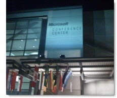
– Troy @ TLC
Microsoft MVP Summit (1)
Heading up to Seattle today for the Microsoft MVP Summit. One of the big honors of being a Microsoft MVP is being a guest on the Redmond campus and getting some indepth time with the PowerPoint product development team.

Looking forward to spending time with the other PowerPoint MVPs, the PowerPoint development team, and hearing from the Microsoft executive team.
– Troy @ TLC
Lexus LS
The final portfolio post this month is a slide from a 16×9 high-def show (1920x1080px projection onto 28′ wide screen). The template design was subtle gradients with stylized swooshing lines (used in the collateral materials for the meeting).
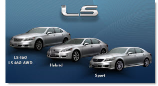
What makes this slide stand out is the photoshop work. The ‘LS’ chroming and drop shadow was applied to standard text (using the provided Lexus font). Each car was cutout to remove the background (and keeping wheels looking round and proper is not an easy task). The text was done in PPT 2007 with a custom bevel effect. And the nice animation entrance cannot be seen in the static image – but it was nice too.
– Troy @ TLC
Before and After
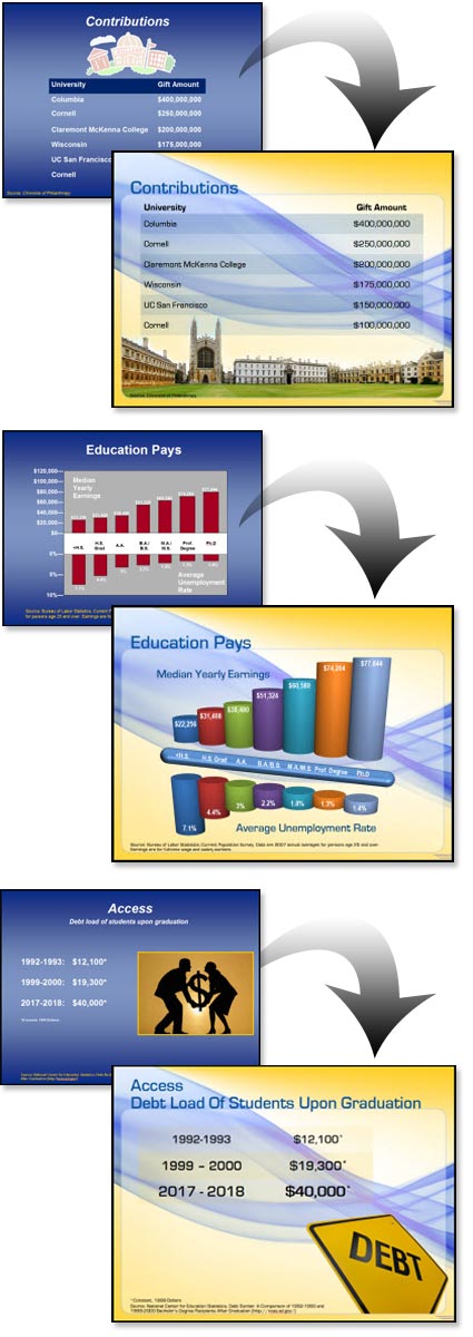
I received enough email since the last post to make me change my plans and show some of the Before-and-Afters from the project highlighted in the previous post “Higher Education”. As a side note: I have been collecting images for a month long series of before-and-after slides which should be good to go in May (don’t hold me to that) – and this is one of the posts you will see again 🙂
With this project I received a “raw” presentation and was tasked with developing a new template and updating all of the slides. The great thing about the presentation is the content for each slide was very minimal, allowing it to be big – dominant – and on a dynamic template.
– Troy @ TLC
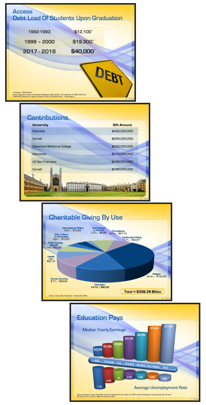
Higher Education Presentation
This project was for a university program. They needed a template that integrated their school colors, but was lively-energetic-modern-cool. That was the direction provided and from there I was able to go in any direction. I developed 5 concepts and this was the one selected.
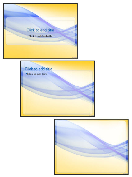
The template also used a custom font, which was installed on all presentation computers vs. embedding in the presentation. It featured 3 master slides:
1. Title slide
2. Content slide
3. Full Frame slide
The full frame layout is unique in that generally this style master slide removes the title bar to allow room for images/charts that need the full frame. In this template the title are is actually defined by the absence of the content area. So the Full Frame slide has the content area extended, creating a full canvas for content.
Of course there is a lot of competing visuals with a template like this. The background is full of contrasting, dominant shapes. It has a definite flow that draws the eye across the slide (from left-right). Lots of small text could easily become lost. And this would not be first choice for “standard” corporate template.
For this project I was provided the full (raw) presentation before any design work began and was able see the type of content. Because the content was large, minimal and to-the-point (eg. no inserted 200 cell excel charts or 20 bulleted lines) I was able to go with a more dominant and visual template design.
Here are few slides from the presentation:
– Troy @ TLC
Secret Saturdays Template
If you have boy, age 6-12, you a probably familiar with Secret Saturdays. This is a new cartoon series on Cartoon Network and with my 3 girls I was forced to enjoy some research watching several episodes to get in touch with my inner adventurous boy before developing this marketing template.
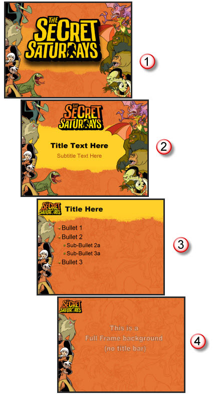
Working with entertainment properties, especially animated properties, is great. They have all the visual assets needed. And they are all high-res and layered (so no background).
For this project I assembled all of the characters into good and bad. Then selected the most vertical poses and went to work in Photoshop to create my layouts. The key characters (the good guys) are on the left, remain a constant throughout all master slides and positioned just far enough off the slides to not interfer with the content area. The background is a great line drawing the characters overlayed on the primary background color (pulled from the style sheet). And there are 4 master slides:
1. Theme (used at beginning and end of presentations)
2. Title slide
3. Content slide
4. Full Frame slide
Definitely not your standard corporate template – and I bet these presentations are more fun to sit through!
– Troy @ TLC
Print – 1 Sheet
I did a series of print design projects and this is one piece from them. Working from a hand drawn diagram I recreated the flowchart and content in the coordinated colors and design scheme.
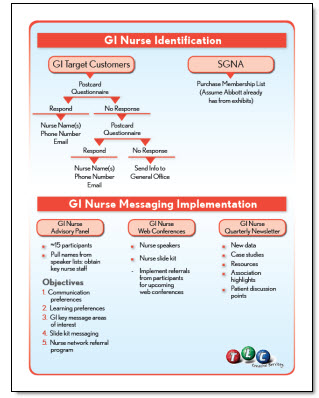
This is a standard US Letter size piece that was supplied to the client as a print-ready PDF that could be used on the local color printer or sent to a print shop for large volume printing, all from the same file as there is no ‘bleed’ (color extending to the edge), which was a purposeful element of the overall design.
– Troy @ TLC