Monthly Archives: March 2007

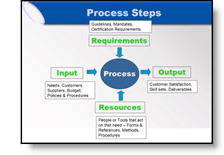
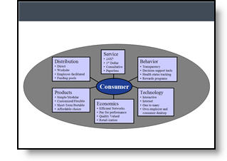
Great Graphic – For an Engineer

Here is the original graphic provided. It has all the needed information, is nicely balanced, has good contrast – and has all the factors an engineer would appreciate.

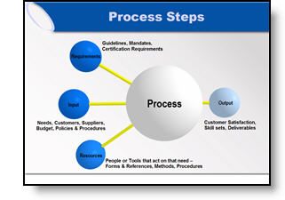
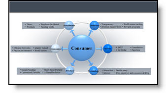
Taking the same content, basic layout, and even color scheme, here the revised version of the diagram developed for the (16×9, widescreen) presentation.

– Troy @ TLC

By |2016-11-17T15:45:31-08:00March 5th, 2007|Portfolio, Tutorial|

Accurate Graphic, But Wrong Emphasis

Here the original graphic from a presentation. It is a universal company-wide depiction of their process. No problem, I initially recreated the graphic using the 3D spheres for a more professional look.

But listening to the presenter during rehearsals he was discussing how three elements drive the final element (output). We adjusted the graphic for this presentation to be in line with the message being discussed.

– Troy @ TLC

By |2016-11-17T15:44:31-08:00March 3rd, 2007|Portfolio|

Show It A Story

Lots of presentations show quotations. Here is the original slide with a lot of quotes – each animates on with a click.

To put the quotes in a visual environment a series of ‘torn paper’ graphics where designed, font sizing and line spacing were also adjusted.

– Troy @ TLC

By |2016-11-17T15:44:00-08:00March 1st, 2007|Portfolio, Tutorial|
Go to Top