Monthly Archives: August 2012

PPT 2013 – New Format Picure Dialog

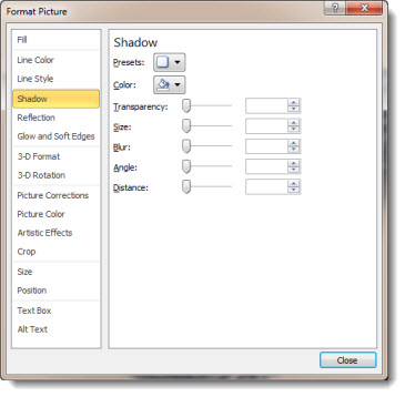
Here is the familiar Format Picture dialog from PPT 2010:

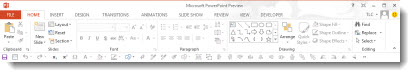
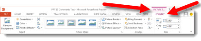
In PPT 2013, the tools options and features remain the same, but the dialog gets a remake. The Format Picture ribbon shows the Metro icons:

Opening the Format Picture dialog opens a new pane on the right:

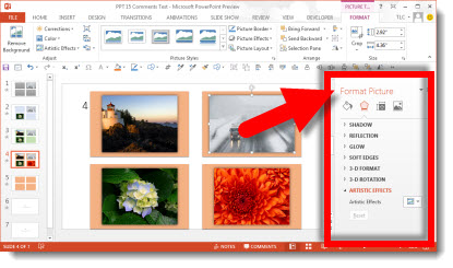
This new single pane is where all of the formatting options are accessed:

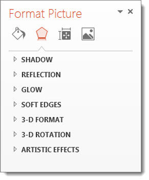
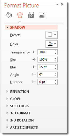
Select a tool and the dialog box extends to show the formatting options.

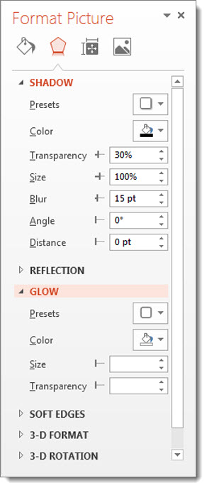
Select another tool and the box continues to extend and reveal those formatting options.

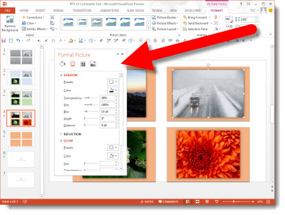
In addition, the Format Dialog pane can be detached from the UI and become a free floating dialog box. When floating, the same expanding list and organization of tools is seen. The floating dialog is not bound to the application window and can be positioned on a second monitor.

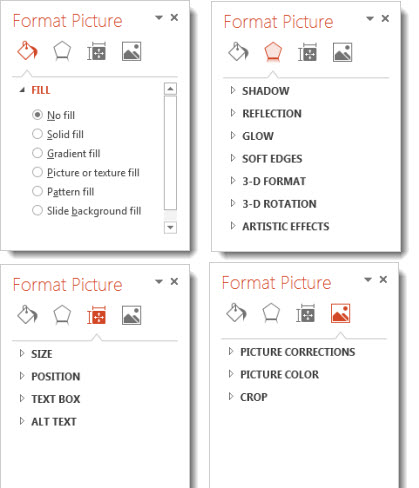
Using the icons across the top of the Format Dialog brings up the options for:
– Fill and line
– Effects
– Size and properties
– Picture

– Troy @ TLC

By |2016-08-16T09:16:02-07:00August 8th, 2012|PowerPoint|

Office 13 App Icons

Every version of Office has its own variation of the application icons. Here is a quick history:

Office 2003 used square “chiclet” icons:

Office 2007 used alpha transparency for unique, non-square, icons and added gradients throughout:

Office 2010 used the solid square of 2003, filled with the icons and gradients of 2007, and added uniform identifying letters for each app (despite the full application suite had 3 “P” icons):

Office 2013 has both a solid square version and a alpha transparency version. The icons are developed direct from the Microsoft Metro style guide, which is simplified icons, but retaining the identifying letters (and yes, still 3 P’s):

When PowerPoint 2013 is launched, one of the immediate reactions is the orange bars and accents in the UI. One of the constants for Office is each application has an identifying color. Looking through the generations of icons, PowerPoint is orange, Word is blue, Excel is green, OneNote is purple, etc. So by the luck of history, the most visual application, PowerPoint, has one of the most offending/conflicting/glaring colors associated with it… I can say, based on the early builds of PowerPoint I looked at, the UI could have been much more distracting.

– Troy @ TLC

By |2016-08-16T09:16:21-07:00August 6th, 2012|Resource/Misc|

PPT 2013 – Updated Ribbon “Metro” UI

When you first launch PowerPoint 2013, it looks similar and different at the same time.

If you look at the ribbon, everything is in the now familiar locations and order.

When viewed more closely, you can see all of the aesthetics are new – in the “Metro” style. The Metro style was developed by Microsoft for the Windows Phone 7 interface. It is a success and has now become the basis for the Windows 8 UI and the Office 2013 UI, plus the MS website and many other interfaces.

Ironically, one of the original design reasons for Metro was “a key design principle of Metro is better focus on the content of applications, relying more on typography and less on graphics.” But, PowerPoint’s interface is definitely icon oriented and where typography is used, it has mixed reviews (ie. all caps for the ribbon tabs).

Also new is the logged in user option (for my Beta install the user is “TLC”). There is a lot of new features around the user account, which are overviewed in upcoming posts.

The happy face icon on the far right is a standard feature of Microsoft beta software. Clicking it brings up a dialog box to submit feedback, bug reports, etc. you discover while using the application. The smiley will not be a part of the retail version.

While the new aesthetics are not going to be everyone’s favorite, they are what is coming to a computer near you.

– Troy @ TLC

By |2016-08-16T09:17:33-07:00August 3rd, 2012|Tutorial|

PowerPoint 2013 All This Month!

After many months of testing the new version of Office, a few weeks ago Microsoft released the Public Beta, which clears the NDA commitment and lets me do this series on the upcoming PowerPoint release. So the entire month of August will be posts about the new and exciting things in our presentation future!

Side note: I have been invited to present at this years Presentation Summit specifically about PowerPoint 2013. I am excited about the conference in general – it really is one of the best gatherings of presentation professionals in the country – and this talk will allow me to go into greater detail using PPT13 for live demos of real world presentation design and delivery scenarios. So, if you can be in Phoenix, AZ this October and want to talk about what the future holds for us in PowerPoint design and delivery, I look forward to seeing you at The Presentation Summit.

– Troy @ TLC

By |2016-08-16T09:17:55-07:00August 1st, 2012|Personal, Resource/Misc|
Go to Top