The PowerPoint® Blog

I work with PowerPoint on a daily basis and I am very honored to be a Microsoft PowerPoint MVP. We have a talented team of presentation designers at TLC Creative Services and ThePowerPointBlog is our area to highlight PowerPoint tips, tricks, examples and tutorials. Enjoy! Troy Chollar

U.S. Economy Stat Slide

This is a slide developed for a recent executive presentation. The goal for the presentation was speaker support visuals, lots of photos, key message only and viewable as a static image.

– Troy @ TLC

By |2016-08-16T08:55:15-07:00December 7th, 2012|Portfolio|

Web Fonts in Presentations

Web Fonts have been a big topic recently and several companies are offering them. TLC staff designer, Amber, spent some time researching them for us and put together a good overview and example of their use with the Google Web Fonts.

– Troy @ TLC

———————————————–

Web Fonts are a font format with a specific license that permits web designers to use real typography online without losing the benefits of live text (dynamic, searchable, and accessible content). Until recently, type on the web was very limited. Most sites could only display the small selection of system fonts installed on user’s computers. Designers who wanted to integrate individuality to their pages would need to create jpeg images (which don’t get read for Google search results) or use Flash or JavaScript to render their fonts, even though not all end-users had started using that software.

Now, there is a CSS declaration called @font-face that web designers can use to specify a font. The font file will either be saved on your server like images are, or it can be hosted by a third party.
The issue that is still being debated is achieving an approximate consensus on how the producers of fonts could continue to control and therefore profit from their work.

Click here for a list of commercial font foundries which allow @font-face embedding.

Cick here for a list of fonts available for embedding.

Google offers a library of web fonts with no restrictions here.
Plus, all of the Google Web Fonts are offered under the Open Font License which means you can use them even in commercial projects without having to worry about licensing issues.

You can utilize Google’s Web Fonts in your PowerPoint presentations too. Although I am not using it as a true “web” font, but really adding it to my computer as a custom font, here are the steps for use:

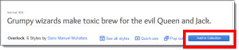
1. In the Google Web Font library, select the font you would like to use in your presentation, and select “Add to Collection.”

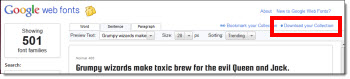
2. Once you’re done adding fonts to your collection, click the “Download your Collection” link at the top right of the page.

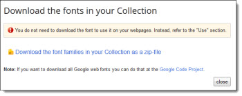
3. A window will pop up letting you know that you don’t need to download the font to use on the web – however, we do need to download to use in PowerPoint, so click the link to download the font collection as a zip file.

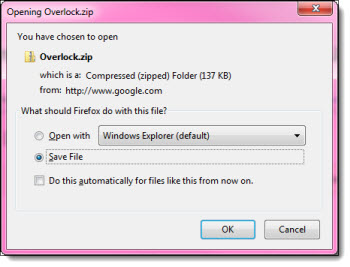
4. Once you’ve downloaded and extracted the font file from the zipped folder, you can install the Web Font on your system and use in your PowerPoint presentation. (Note: If you are planning on sharing your presentation, you will need to also provide the font or risk having the font default to a generic font when PowerPoint can’t find the file installed on others’ computers).


By |2016-08-16T08:55:32-07:00December 5th, 2012|Tutorial|

Sample Video of 4×3 and 16×9 Aspect Ratios

“What is the aspect ratio?” It has become one of the first questions for presentation and video projects. It is still a very confusing concept for many people. We use a simple video of each aspect ratio for clients to see the difference. It is the same video footage, which makes it easier to see the 4×3 aspect ratio is taller and the 16×9 aspect ratio is wider.

4×3 aspect ratio
[youtube src=”https://youtube.com/embed/gQaXbSPQoDQ?rel=0″]

16×9 aspect ratio
[youtube src=”https://youtube.com/embed/NTRV8ISqE1A?rel=0″]

– Troy @ TLC

By |2016-08-16T08:55:56-07:00December 3rd, 2012|Resource/Misc, Tutorial|

Tech Area for LA Auto Show

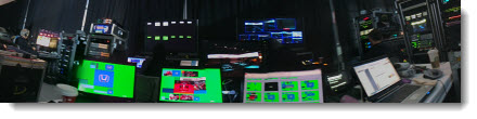
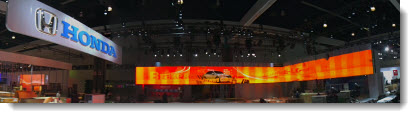
Just wrapping up at the LA Auto Show where I handled the presentation design and running of the press event for Honda. Event screen was a 200′ long L-shape screen LED wall, my computers and equipment is along the bottom (with the green background).

– Troy @ TLC

By |2016-08-16T08:56:23-07:00November 29th, 2012|Personal, Portfolio|

Template Concepts To Final

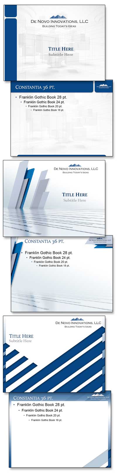
TLC Creative Services develops a lot of PowerPoint templates each year. Most templates begin with developing a series of concepts which are refined to meet each client/project needs. Here is an example of a recent project and 3 initial concepts developed (client chose the top option with some revision requests).

– Troy @ TLC

By |2016-08-16T08:57:06-07:00November 19th, 2012|Portfolio|

Veterans Day Salute By TLC

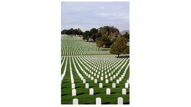
As a salute to everyone in the U.S. military for everything you do, and sacrifice – here is a tribute created in PowerPoint:

1. Great video loop from videoblocks.com

2. Image from istockphoto

3. Same image after some development work in Photoshop and saved as a .png with transparency

4. Image from istockphoto

5. Same image after resizing and development work in Photoshop, saved as a .png with transparency

Assemble all in PowerPoint 2010, animate and export as a video
[youtube src=”https://youtube.com/embed/heUG1f5yBKg?rel=0″]

Troy @ TLC

By |2016-08-16T08:57:59-07:00November 14th, 2012|Personal, Portfolio|

Global Expansion as a Visual

For this speaker support presentation, the global adoption of the discussed medical procedure was the point being presented. This strong visual was developed (and animated) to show the global reach of the procedure.

– Troy @ TLC

By |2016-08-16T08:58:18-07:00November 12th, 2012|Portfolio|

Visual Layout for “Business Development” Slide

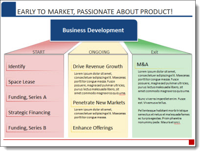
We strive to minimize bullet lists, simplify text and make presentation content as visual as possible. Of course, the first step is discovering how the presentation will be used (speaker support, knowledge reporting, handouts, etc.). For a recent presentation, there was a lot of data that needed to be included, but the request was to also minimize the use of bullet lists (always a great sign when the presenter understands the need to help the audience capture the slide content!).

For this slide, an overview of the Business Development phases of the company, we minimized the text and categorized it. Then a visual layout was created to clearly show the 3 phases, label the phases and finally add the detail text into each phase. The end result is here, and it was a lot easier for the audience to remember than a slide full of bullets!

– Troy @ TLC

By |2016-08-16T08:58:36-07:00November 10th, 2012|Portfolio|
Go to Top