Portfolio

Veterans Day Salute By TLC

As a salute to everyone in the U.S. military for everything you do, and sacrifice – here is a tribute created in PowerPoint:

1. Great video loop from videoblocks.com

2. Image from istockphoto

3. Same image after some development work in Photoshop and saved as a .png with transparency

4. Image from istockphoto

5. Same image after resizing and development work in Photoshop, saved as a .png with transparency

Assemble all in PowerPoint 2010, animate and export as a video
[youtube src=”https://youtube.com/embed/heUG1f5yBKg?rel=0″]

Troy @ TLC

By |2016-08-16T08:57:59-07:00November 14th, 2012|Personal, Portfolio|

Global Expansion as a Visual

For this speaker support presentation, the global adoption of the discussed medical procedure was the point being presented. This strong visual was developed (and animated) to show the global reach of the procedure.

– Troy @ TLC

By |2016-08-16T08:58:18-07:00November 12th, 2012|Portfolio|

Visual Layout for “Business Development” Slide

We strive to minimize bullet lists, simplify text and make presentation content as visual as possible. Of course, the first step is discovering how the presentation will be used (speaker support, knowledge reporting, handouts, etc.). For a recent presentation, there was a lot of data that needed to be included, but the request was to also minimize the use of bullet lists (always a great sign when the presenter understands the need to help the audience capture the slide content!).

For this slide, an overview of the Business Development phases of the company, we minimized the text and categorized it. Then a visual layout was created to clearly show the 3 phases, label the phases and finally add the detail text into each phase. The end result is here, and it was a lot easier for the audience to remember than a slide full of bullets!

– Troy @ TLC

By |2016-08-16T08:58:36-07:00November 10th, 2012|Portfolio|

Template Inspired By Logo

TLC Creative Services has the opportunity to work on PowerPoint templates for companies in many industries, events, brands and shows. The diversity makes the design interesting for us and this template was for a small niche company with a distinct logo. In addition to assuring all template options were customized (font size-color-style, line spacing, custom bullets, custom color scheme, etc.), we focus on designs that create a coordinated look. I really like the visual beauty of this template that Jennifer worked on.

– Troy @ TLC

By |2016-08-16T08:59:00-07:00November 8th, 2012|Portfolio|

PowerPoint + Photoshop = Visually Dynamic Slides

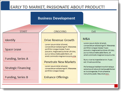
For a recent project, the presenter described the first mover advantage of Kodak when they developed the first digital camera (and then the fate of not acting on that advantage). Rather than a bullet list of facts, dates and details, we provided a 3 slide sequence to visually support the presenter.

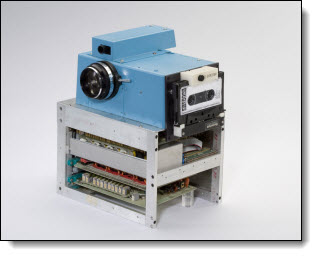
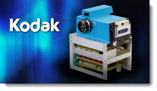
After developing the slide concept, the first task was researching and finding a high enough resolution image of the first Kodak digital camera (and the “camera” is pretty cool):

Using the image as is, we could have developed a slide like this: Insert .jpg, add outline and drop shadow, insert company logo (as a scalable .emf vector graphic of course).

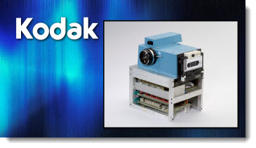
Instead, we spent 40 minutes in Photoshop dropping out the background and saving out the optimized .png image with transparency. The inserted image has a PowerPoint drop shadow a some gradient accent lines emerging from the camera lens.

The result is a great image that works with any template background and visually pops.

– Troy @ TLC

By |2016-08-16T08:59:34-07:00November 5th, 2012|Portfolio|

CEO Presentation for Toyota

TLC Creative Services was happy to work with Toyota to develop a presentation delivered at the CAR (Center for Automotive Research) Meeting last month.

The presenter was Mr. Jim Lentz, President & CEO, Toyota Motor Sales, U.S.A., Inc. TLC Creative Services developed a custom template, story boarded a presentation based on the presentation script, then optimized images and designed and animated the visual layouts slides.

Just another presentation project (but this time, public information so we can share some of the design work).

– Troy @ TLC

By |2016-08-16T09:06:22-07:00September 26th, 2012|Portfolio|

Big and (Mega) HD

This meeting was really great from a presentation standpoint: 84′ wide screen (3 project blend = 5700px wide x 1080px tall) with a 30″ x 7″ PPT. Then 16×9 PIPs for the presenter presentations (each a 1080p HD projection field). This is the general session look. For the awards, I was able to design the presentation to use the entire (Mega) wide screen (no PIPs).

(Yes, that is me)

– Troy @ TLC

By |2016-08-16T09:32:19-07:00February 27th, 2012|Personal, Portfolio|

Quotes Should Not Be Bullets (A Before-and-After Example)

The supplied slide had plenty of great callouts end users, but in a bullet list it looks just like any other (boring) slide.

Taking a cue from IM (Instant Messaging) applications, each quote was put into a speech bubbles for a lively and visual slide layout. The key messaging of each is also bolded text to direct the audience.

– Troy @ TLC

By |2016-08-16T09:34:09-07:00February 8th, 2012|Portfolio|

Technology That is Not Clear (A Before-and-After Example)

This a slide from a presentation makeover project. The original slide was typical in that had some photos, screen captures and bulleted list text. The overall design was clean and (overly) compartmentalized the content.

The makeover used the same images, bullet list text and focused on grouping content. In the final slide layout, it is much easier to quickly identify the 3 topics and the bullet lists are easier to read with improved line spacing and alignment.

– Troy @ TLC

By |2016-08-16T09:34:28-07:00February 6th, 2012|Portfolio|
Go to Top