2025 Happy New Year (with a PowerPoint animated GIF)!!

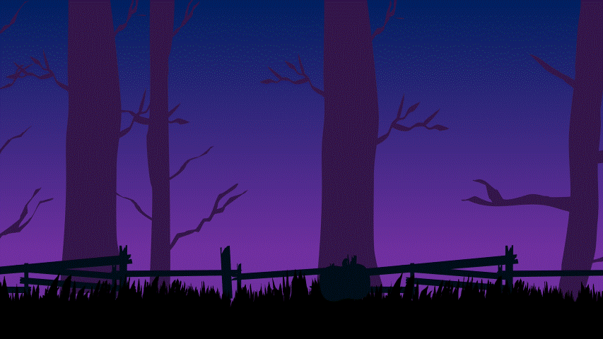
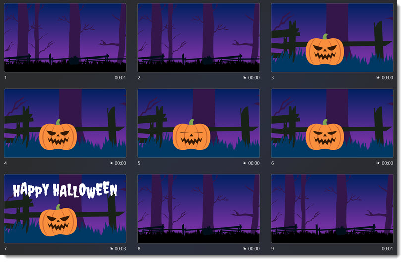
From our design team at TLC Creative Services, HAPPY NEW YEAR! Jake on the design team had some inspired PowerPoint design with this animated GIF that is designed as a seamless loop – and created in Microsoft PowerPoint, then exported from PowerPoint to GIF format. Thanks Jake!