PPT Requires A Lot of PSD
Here is just the title slide to a very visually stunning presentation Lori recently developed for a client (maybe later I will upload some of the highly stylized content slides).

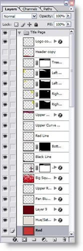
The key with this entire project, is that the amount of time spent in Photoshop was more than double the amount of time spent working in PowerPoint. Here are the layers created in Photoshop to end up with the above template background (and this one is pretty straight forward/easy in the number of layers and effects).
– Troy @ TLC