TLC Top 10
[iframe src=”https://www.screencast.com/users/TLCCreative/folders/PPT Blog Videos/media/abc74bfa-5c1d-4b66-9dcf-9664255e61e7/embed” width=”100%” height=”360px”]
[iframe src=”https://www.screencast.com/users/TLCCreative/folders/PPT Blog Videos/media/abc74bfa-5c1d-4b66-9dcf-9664255e61e7/embed” width=”100%” height=”360px”]
Give 9 presentations at TLC the task of creating personalized holiday themed animations and you end up with 4 minutes of animated holiday cheer!
[iframe src=”https://www.screencast.com/users/TLCCreative/folders/Christmas Animations/media/7d6bd422-176f-4f35-b124-5e94cac05e69/embed” width=”100%” height=”360″]
– Troy @ TLC
Special recognition to TLC designer Jennifer for this wonderful 3D illustration all developed in PowerPoint 2013!

The video shows the development of Olaf in flip-book style animation. The first part of the video is a fast animation, followed by a slower version that shows each design step. Enjoy!
In addition to the obvious PowerPoint 3D and shadow options, most of the development relied on PowerPoint’s Merge Shapes tools.

– Troy @ TLC
Staff designer Christie, developed this wonderful Thanksgiving Turkey entirely in PowerPoint 2013 and captured the design stages in this video.
– Troy @ TLC
For a recent employee update presentation that TLC designed for one of our clients, we created a seasonal Fall Time themed set of slides for their employee recognition. Using PowerPoint 2013 and the ability to layer content on top of video, embed video, and custom motion path animations to develop these wonderful slides.
– Troy @ TLC
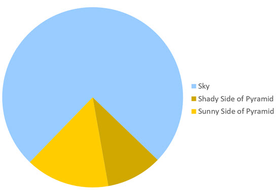
Here is a graphic supplied by the client for a recent presentation design project . Quick – what is wrong?

In developing ideas for a new way to show this information we noted the pie chart numbers add up to greater than 100% (108.4%). We let our client know of this and received a great soundbyte “Wow, you guys actually look at the content you are working with!”
Yes, TLC is very picky about the aesthetics (color scheme, alignment, consistency) AND the message.
– Troy @ TLC
—
This is the 2nd posting of this sample as the post last week did not include the video of the PowerPoint slides… oops.
—
These are slides from a recent presentation and the video below is the animated version of the 4 slides:

With some creative layout and PowerPoint animation, the presenter used this animated sequence to convey the message of their expanded Social Media presence and how it has a global reach (all animated on clicks):
– Troy @ TLC
The Selection Pane, introduced in PowerPoint 2007 is a great (and long over due) addition. But I think the dev team was not looking at the feature from a real-world use – and has not been updated yet (sigh…).
Here is my sample slide, that has many items on it. A good example of where the Selection Pane would be used.

To open the Selection Pane: HOME >> EDITING >> SELECT >> SELECTION PANE


Note the on/off icon is on the right.

When the Selection Pane is made a smaller width, the tools at the top (Show All, Hide All, Move up/down) wrap nicely to fit the narrower layout.

When the Selection Pane is made narrower, the names do not wrap, but the on/off icon is cut off and disappears rendering that feature unusable. At the bottom is a scroller, which does allow access the on/off icon – but it requires so many additional mouse clicks and movements it is not a practical option.

To answer the inevitable question from the MS Dev team – “why would you need to make the Selection Pane so narrow?”. In the real world, we work with different resolutions (please test the Selection Pane at 1024×768 to see how much screen real estate it needs to be functional), have several panes open side-by-side, have dozens of objects on a slide – on and off the slide area – and want to work at the largest viewable size, and many other real situations where the selection pane is in the way when so wide.
So what should the MS Dev team do? Simple: move the on/off icon to the left side and let the names get cut off.

Leave a comment about your experience with the Selection Pane tool (in PPT 2007, 2010, 2013).
– Troy @ TLC
Here is a quick Before-and-After slide. The original slide deck was primarily all bullet list text. TLC reviewed all content and proposed layouts that minimized the bullet list format and provided more visual layouts of the same content. For this slide, in going over the content with the client, we learned the bulleted text was really the talking points for a discovery process, which we happily converted into a process diagram layout. Same message, same content, but visual layout!

– Troy @ TLC
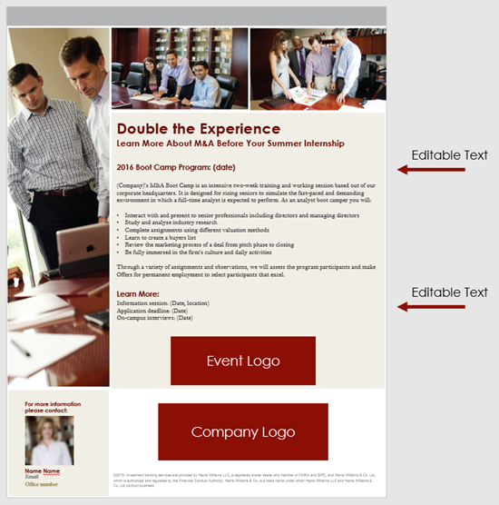
If you have used PowerPoint to create a print document that was never intended to be projected as a slide show, fear not, you are not alone. TLC Creative Services has been creating lots of projects over the past few years that we internally refer to as “PowerPoint Documents.” Nancy Duarte has release a new “book” all about using PowerPoint for non-slide show documents called “SlideDocs.”

The downloaded book is a giant example of how PowerPoint is used for document design, because it is a PowerPoint file.

The core message of SlideDocs, which I agree with, is there are a range of documents. On the left are formal print design documents. On the right are slide show presentations. In the middle are print documents that are designed in PowerPoint.

I recommend everyone, especially clients, read SlideDocs if nothing else for the overview of graphic design and layout principles in the middle section. Get more info and download the free SlideDocs book and templates here.
– Troy @ TLC