I often, as I am sure you do, have to download lots of files for a project (PowerPoint, Photoshop, images, PDFs, etc.). Unless all are on an FTP site I can access with an FTP application your browser limits you to 2 simultaneous downloads. Great if I was on a bandwidth limited dial-up modem, but I have a 15mb/s connection and want to download more.
The good news is this limitation can be overcome, but you have to do a bit of digging and adding values. I have all of my computers set to allow up to 10 simultaneous downloads. Here’s how:
1. Go to START >> RUN >> REGEDIT
2. Click on HKEY_CURRENT_USER
3. Click USER
4. Click SOFTWARE
5. Click MICROSOFT
6. Click WINDOWS
7. Click CURRENTVERSION
8. Click INTERNET SETTINGS
Now that you have burrowed deep into the OS, you need to add to new values (the ones that say let me download up to 10 files simultaneously).
9. Right-click anywhere in the right pane
10. Select NEW
11. Select DWORD VALUE
These next steps you will repeat twice, once for each needed value.
12. Double-click the newly created NEW VALUE #1 icon
13. In the Value Name area type “MaxConnectionsPerServer”
14. In the Value Date area type “10”
15. In the Base area click DECIMAL
16. Click okay
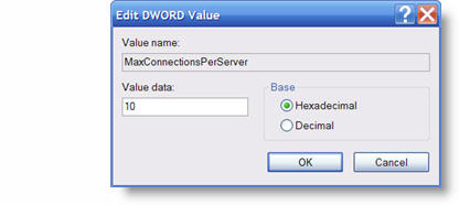
Do it again.
17. Repeat #12-16, but in the Value Name area type “MaxConnectionsPer1_OServer”
You are now free to download up to 10 files simultaneously (provided you have enough bandwidth with your internet connection)!
– Troy @ TLC