Export Presenter Notes to Word Doc – The Easy Way!
Presenter Notes in PowerPoint are useful for scripts and internal documentation… but extracting them can be a hassle when you’re using available built-in PowerPoint features!
First, let’s acknowledge PowerPoint’s built-in export option “Save to Word.” Second, we won’t use this export option.
At TLC Creative, our design team uses two trusted PowerPoint add-ins for this task. These tools make exporting quick, consistent, and easy. We’ll demonstrate by using a 22-slide deck with notes on almost every slide. Here’s how to export Presenter Notes from a slide deck into a Word document in under 6 clicks.
Exporting Presenter Notes with Brightslide
First up is leveraging Brightslide’s “Export to Word File” feature. This, of course, assumes you have the free Brightslide PowerPoint add-in installed (available for Windows or Mac PowerPoint).
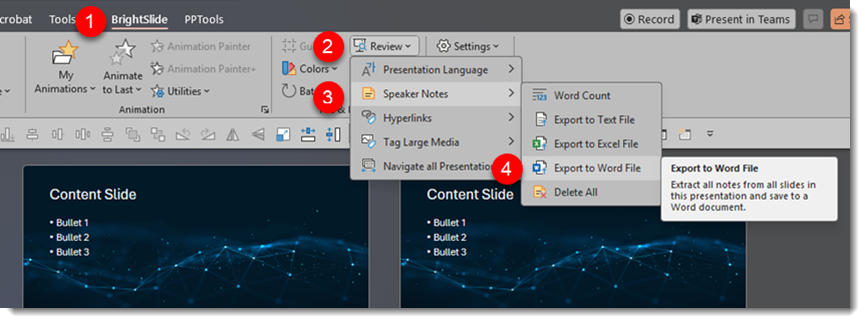
1. Click Brightslide in the menu bar
2. Toward the right side, click “Review” to open the dropdown menu
3. Scroll down to “Speaker Notes”
4. Choose “Export to Word File”
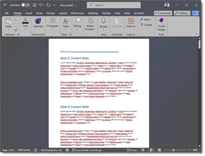
A pop-up notification will appear, letting you know that the newly exported document has opened directly in Microsoft Word.
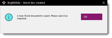
And done! A single continuous scroll Microsoft Word document has been created, complete with large slide numbers and slide titles along with the presenter notes! (Note: if a slide does not contain presenter notes, the slide will simply be skipped in the Word document).
TIP: Brightslide also has options to extract presenter notes to a text file (.txt), which is generally greatly appreciated by teleprompters! And there is an option to extract the presenter notes to an Excel file (.xlsx) too.
Exporting Presenter Notes with ToolsToo
Another option is to leverage the ToolsToo suite of PowerPoint tools (Windows PowerPoint only). It offers a similar workflow, but the output is a bit different, which may be better for certain projects. Here is the process:
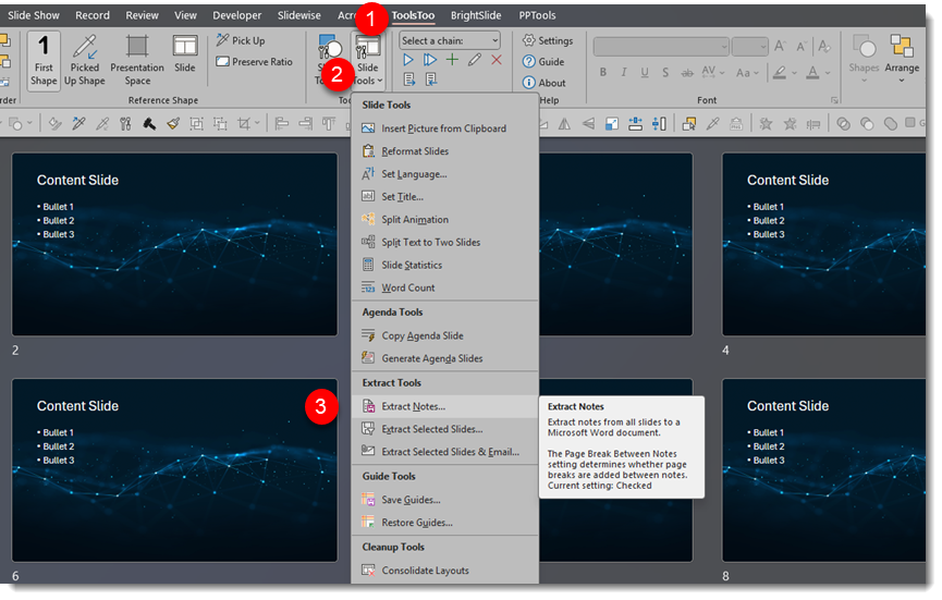
1. Click the ToolsToo tab in the menu bar
2. Then click the “”Slide Tools” button
3. From the dropdown box, select “Extract Notes”
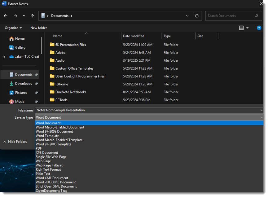
At the “Save As” dialog box, save the extracted notes. (Note: “Word doc” is selected by default, but other options are available.)
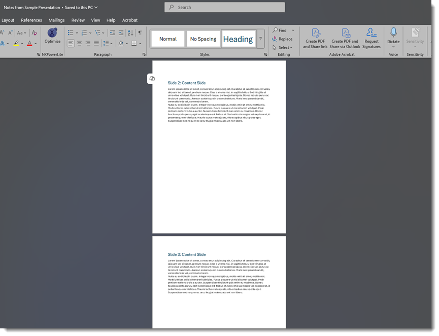
Saving will automatically open the newly created Word document. What is different with using ToolsToo is that each slide is a separate page. So, our sample 22-slide deck becomes a 22-page Word doc.
These two different PowerPoint add-ins can make the task of extracting presenter notes from a presentation amazingly quick and easy!
-The TLC Creative Design Team
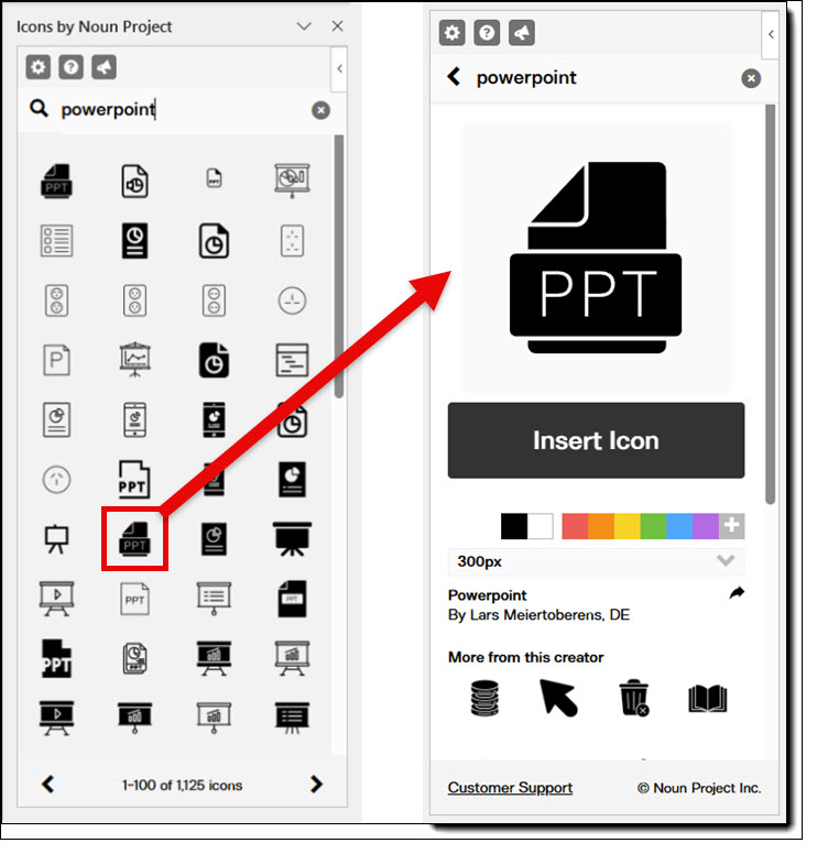
A Look Back to The Noun Project Used Directly Within PowerPoint
1,000,000+ vector icons are ready to drop straight into your slides while you are working in PowerPoint. And, honestly, what is not to love about that?! Anyone who has gone down the rabbit hole of searching for “the right icon” knows just how much time it can consume. So, being able to grab exactly what you need without leaving PowerPoint is a game-changer.

Way back in 2018, we shared a post about The Noun Project: a ridiculously low-priced subscription that gives you access to a vast library of icons. And since our blog post, The Noun Project has added so many more icons, photos, illustrations, and other creative assets as add-ons.
The Noun Project PowerPoint add-in was the focus of the original post – how it was a treasure chest of icons you could access and add as vector art, all within PowerPoint. That post still holds today. You can check it out here: Noun Project Add-in.
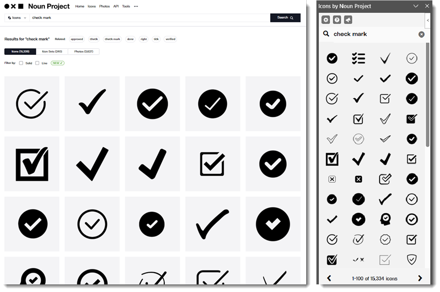
Since then, Microsoft has rolled out its own built-in icon library, accessible from PowerPoint, Word, and Excel – and it is a really solid collection of vector icons. Even with that, our team has never uninstalled the Noun Project add-in. We use it all the time. The sheer variety of its now 8M+ icons makes it worth it! Need a super specific icon? You’ll probably find it. Want a full set of icons that match each other in style? You’ll find that too. And because everything is vector, in .SVG file format, you can resize, recolor, and tweak them however you need – directly in PowerPoint!
At the end of the day, the Noun Project add-in just makes life easier. It keeps the design process moving and cuts out all the back-and-forth of hunting for the perfect slide design assets. PowerPoint’s icons are great, but having access to millions more right in the same place? That is something we are not giving up anytime soon.
Learn more about The Noun Project at https://thenounproject.com.
-The TLC Creative Design Team
Announce TPP e230 – New Podcast Episode Available! “Behind the Scenes of the Presentation Summit: What Awaits Attendees This Year, with Rick Altman”
New episode of The Presentation Podcast now available!
In this episode of The Presentation Podcast, our hosts are joined by Rick Altman, director of The Presentation Summit. They discuss the upcoming Summit (October 19th-22nd 2025), its array of guest speakers and engaging sessions. Rick shares behind-the-scenes insights and announces a special $75 registration discount, exclusively for The Presentation Podcast listeners. Listeners can find more details and show notes on The Presentation Podcast website!

Listen on your favorite podcast app, or at The Presentation Podcast site here.
Play Video Across Slides No More
In October 2017, we shared a post about a great PowerPoint video playback feature, video across slides, shown in the above video. At that time it was experiencing some issues with playback of stylized videos. See the original post for more information and examples (Read the original post here).
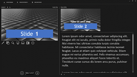
The goal of this feature is to enable a video on one slide to continue playing seamlessly across multiple slides.
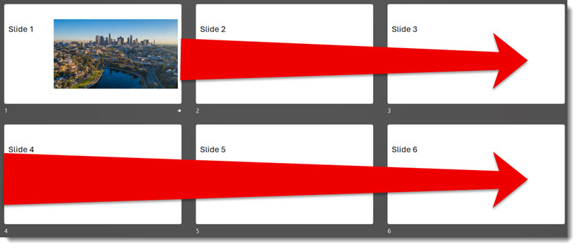
Fast forward to today. Microsoft has quietly turned off the play-across-slides feature. I searched and there was no documentation from Microsoft, this feature was just not functioning – argh! With some piecing together of information I could find, there is a reason this feature is no longer working (but still this is frustrating to discover when presenting!). The reason? The Windows OS is no longer supporting the legacy Windows Media Player engine. And the PowerPoint play-video-across-slides feature uses (used) the legacy Window Media Player engine.
Here is the quirky part. PowerPoint, as of today, has not caught up with the Windows OS change. The animation options for video playback, and play video across slides, are still available in the dialog:
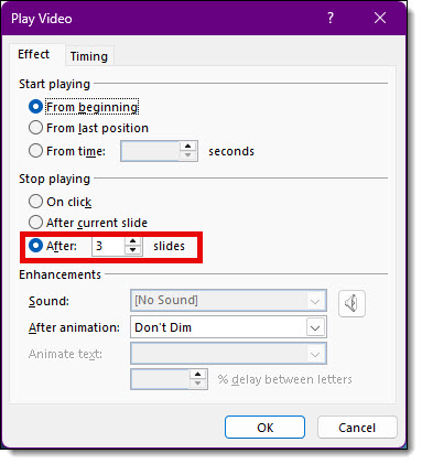
We can still set a video to stop playing after 2 slides or 99, but the video won’t play across any slides, it just plays on the first slide. It gets worse, in testing, existing presentations that were built with videos setup to play across slides do not just lose the across-slides playback, the videos themselves do not play at all…instead, only the video poster frame, a static image, is seen on the first slide of the video playback series of slides.
So, while the feature was always limited (never available on Mac or the online version of PowerPoint), I believe it is now completely gone from the Windows side too. It was a useful feature for many years (I know I used it in PowerPoint 2000 presentations!). So this is not so much a look back post, it is really a farewell to a useful PowerPoint feature.
NOTE: just before this post went live, Microsoft added this info page on The “Stop Playing After N Slides” feature is not working as expected in PowerPoint for Windows. This lists ActiveX controls have been disabled in PowerPoint as the reason for the play-across-slides not working. I am uncertain if that is the same or different than what I was told about the legacy media engine – but the end result is the same, things don’t work.
-Troy @ TLC Creative
A Look Back to PowerPoint’s Built-in Language Translation (Subtitles are Cool!)
![]()
AI is making amazing advances in language translation, both in written/captions and spoken/heard. But this is all very recent. Looking back to 2018, we had a post about a very cool PowerPoint add-in Microsoft released, called Presentation Translator. If you want to read the full post and see the screen capture examples, read here.
Microsoft retired the Presentation Translator add-in back in March of 2021. What was not kept was the very ambitious feature to translate all on-slide content to other languages (see the 2018 blog post for examples of that in use).
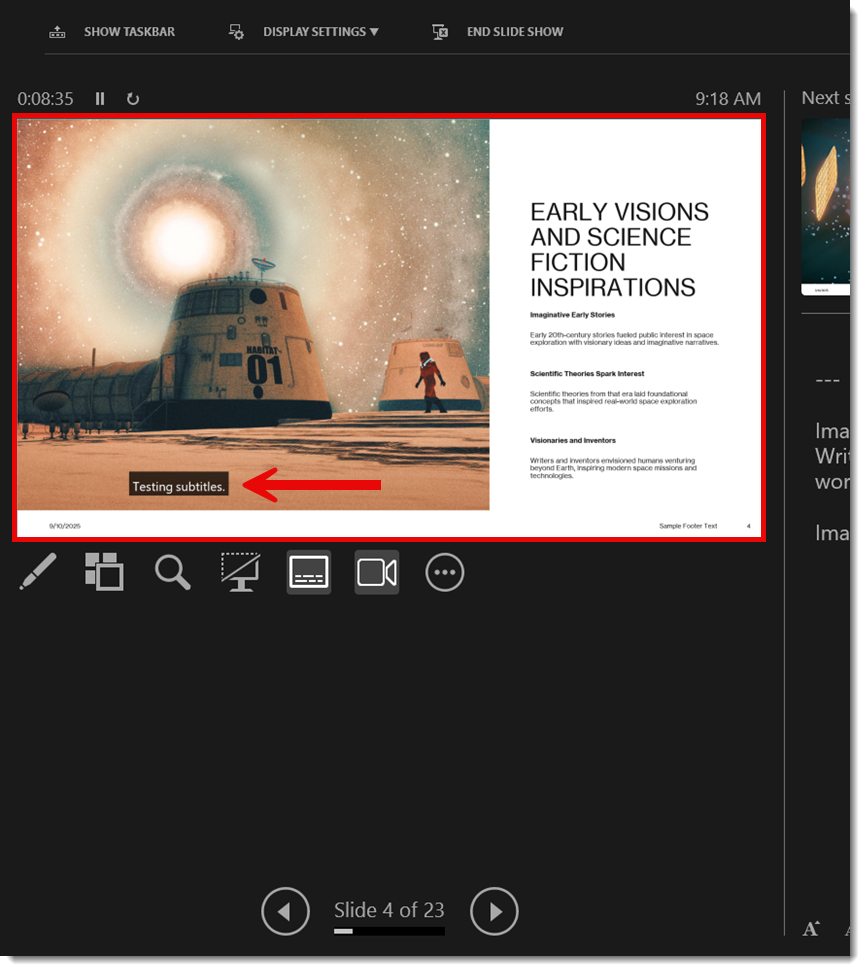
But some of the features from Presentation Translator did make it into PowerPoint, including the subtitle captioning translation feature. PowerPoint now has a simplified and consolidated set of controls for text subtitles. Look for this on the SLIDESHOW tab in the CAPTIONS & SUBTITLES section.
![]()
SUBTITLE SETTINGS
The ALWAYS USE SUBTITLES checkbox, in my opinion, should be renamed to TURN ON SUBTITLES. In reality, you can ignore this checkbox and see further below how I recommend dynamically turning on this feature. There are 3 settings in the SUBTITLE SETTINGS that I recommend setting before starting the slide show:
1. Select the spoken language. This is the language the presenter on stage is speaking.
2. Select the subtitle caption language. This is the language that will be displayed as text. It can be the same as the presenter’s language, or a different translated language.
3. Select the microphone that PowerPoint will hear the presenter through (more recommendations on this below).
With these settings, start the slideshow – speak – and see the subtitles (or live captions) automatically display!
DYNAMICALLY TURN ON/OFF SUBTITLES
During a slideshow, the subtitle settings are hidden – but accessible if you know where to look!
- Right-click anywhere on the slide
- In the right-click menu is START SUBTITLES and SUBTITLES SETTINGS. The issue is this big menu on screen is a distraction to the audience, so instead…
- In presenter view, right-click on the active slide
- The same right-click menu is available to you, but invisible to the audience!
![]()
- Select START SUBTITLES and the subtitles are added to the screen for everyone to see (see below for more details on the settings options)
TIP: Subtitles can be dynamically turned on/off seamlessly during a presentation. For example, if one presenter is native Spanish speaking, turn on subtitles via the Presenter View method described above to “hear” Spanish and display English subtitles for just that segment of the meeting.
POWERPOINT SUBTITLES VS. MICROSOFT TEAMS PRESENTING TRANSLATION
When you share your screen or use PowerPoint Live in a Teams meeting, a similar translation subtitle option is available. However, in Teams, subtitles are called “Captions” (Microsoft, where is the cross-app consistency?!).
The other big difference in a Teams meeting is that captions are turned on individually by each attendee. The presenter has no setup or control over the captions being used. In a Teams meeting, each attendee has the option to go to the MORE tab, in the language and speech section, click “show live captions”, and select the language they want to see or read.
![]()
![]()
During a regular presentation (e.g., not a Teams meeting), when the subtitles are active, the presenter’s screen is the slide plus the subtitles, and everyone in the audience will see the same thing.
SETTINGS
You can customize and control the placement of subtitles in native PowerPoint (you cannot do this with PowerPoint Live in a Teams meeting). Choose from:
- Bottom of the slide (this is the default)
![]()
- Top of the slide
![]()
- Bottom, overlaid on top of the slide content
![]()
- Top, overlaid on top of the slide content
![]()
In addition, the MORE SETTINGS gives you control over the colors, font used, and more (note that we change over to using “captions” in these menus – consistency, Microsoft?).
![]()
TIP: Any changes you make to the caption styles will persist after closing and reopening PowerPoint. However, because these settings are controlled through Windows OS, this feature won’t work the same on a Mac.
At this point in time during our use, the number of languages is approximately 63 so far, which is fantastic!
![]()
MICROPHONE
As a presenter, the microphone is a consideration. If you are presenting from the stage, then you (the presenter) are most likely not directly at the presentation computer and therefore PowerPoint cannot hear you speak. The presenter must have a lavalier or handheld microphone from the AV team, and how the computer gets access to that microphone for the live subtitles to work is a consideration to be worked out before the presentation begins!
![]()
CONCLUSION
Back in 2018, Microsoft was ahead of the AI revolution, and through its specialty PowerPoint add-in, we were offered some very advanced translation capabilities at the time. While the ability to translate the slide content is gone (and ironically something I have not seen any AI presentation system do better than Microsoft’s 2018 feature!), the live subtitles feature was preserved and is still part of the PowerPoint app for everyone to easily use.
Of note, for our live events, the PowerPoint subtitle feature has been used many times – and always amazes not only to the AV Production team but is thrilling to the client and audience (note to Microsoft – please do not remove this feature from PowerPoint!).
-Troy and TLC Creative design team
NXPowerlite Has a Problem – No 8K and Beyond Options
If you work with PowerPoint files packed with images, you’re probably familiar with the struggle of huge file sizes, sluggish performance, and headaches when trying to share or upload! This is where NXPowerLite comes in. It’s a gift to PowerPoint users, giving us powerful image compression with the ability to control how that compression happens.
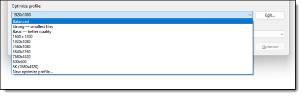
The TLC Creative design team uses NXPowerLite daily on the many project files we receive and create. By default, NXPowerLite offers three compression profiles.
- Balanced – a nice middle ground between quality and file size
- Strong – gives you the smallest files (great for when file size is priority number one)
- Basic – leans toward keeping better image quality, at the cost of slightly larger files
These options can cover a lot of typical needs, but at TLC Creative, we have gone a step further and created a custom set of seven compression profiles for our design team and fleet of show computers. These make it easy for us to apply the exact same settings across different files, ensuring consistency whether we’re working on standard presentations or complex, high-resolution projects. This is just another part of how we keep things consistent and reliable.
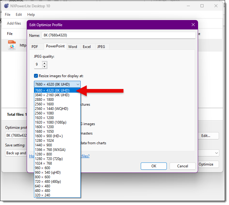
Like all tools, NXPowerLite does have its limitations. When you create a custom profile, the maximum resolution it allows is 8K (7680 × 4320 pixels). Now, 8K is a massive, gorgeous resolution, and for most projects, that’s plenty. But for us, working on ultra-wide screens and giant event presentations, we often create and work on even bigger files. That’s where we hit a wall with NXPowerLite. It’s a bit of a bummer, because we love the tool, but for these super-sized projects, it just can’t handle the size we need.
Still, NXPowerLite has a permanent place in our hearts and our toolbox. While it’s not the right fit for every single project (like the ultra-high-res presentations), it’s incredibly helpful for keeping file sizes under control and workflows moving smoothly.
-The TLC Creative Design Team
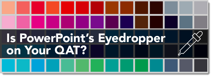
Is PowerPoint’s Eyedropper on Your QAT?
Ever struggle with color matching within your PowerPoint slides? Maybe you want your text to match a logo, or you need a shape to blend in seamlessly with a background image. Whatever you need it for, PowerPoint has a simple but powerful tool that lets you pick up and reuse any color on your slide.
What is the Eyedropper Tool?
The Eyedropper is a color matching tool that grabs the exact hue from any visible element on your screen. It might be from a shape, an image, a logo, or a background. It is easy to use and guarantees your designs stay colorfully consistent.
Accessing the Eyedropper tool can be a bit tedious, because it takes a few steps. You have to open the Format tab, click on the Fill Color, Font Color, or Outline Color dropdown (depending on what you’re changing). Then choose Eyedropper from the menu. Not too difficult, but it does take a few clicks.
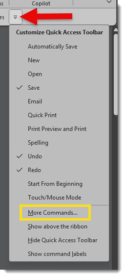
But First, Add the Eyedropper Tool to Your QAT:
If you use the Eyedropper tool regularly, we suggest adding this feature to the Quick Access Toolbar (QAT) at the top of your PowerPoint window.
1. Click the small dropdown arrow at the far right of the Quick Access Toolbar.
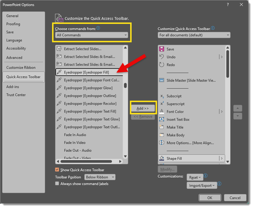
2. Choose More Commands.
3. In the new window, set the “Choose commands from” options to All Commands.
4. Scroll down and select Eyedropper (Eyedropper Fill in this case), then click Add >>
5. Click OK.
Now the Eyedropper tool is just one click away. No need to go through tons of color menus every time you need it!
Note: You can move the position of where the Eyedropper tool appears on your QAT by moving it up or down in the “Customize the Quick Access Toolbar” menu using the up and down arrows on the right.
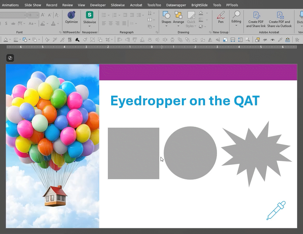
Once you have the Eyedropper tool added to your QAT, you’ll wonder why you didn’t add it earlier!

The Eyedropper allows you to capture a fill color from any element on the slide – whether it be from an image, another shape, or even text:
Extending Photo Backgrounds
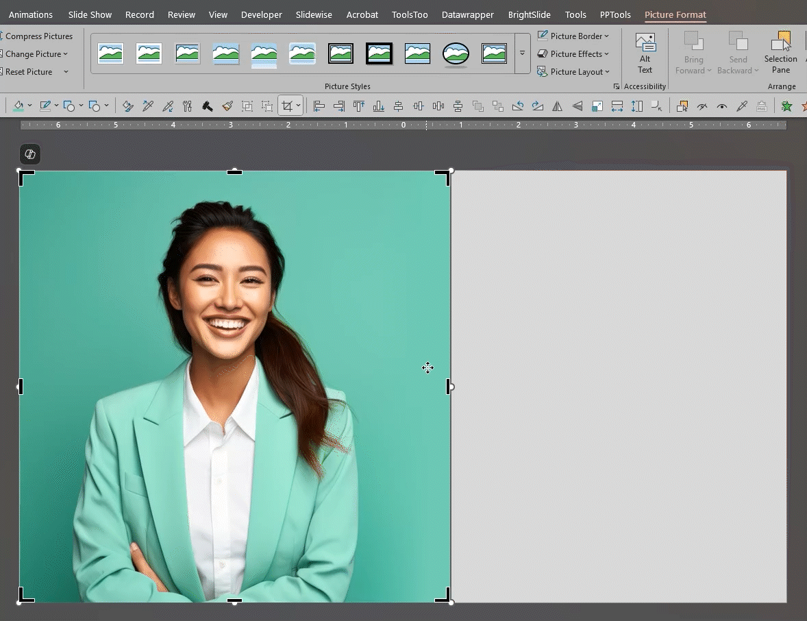
Here, we have inserted a square photo, but we’d would like to extend it to fill the whole frame.

1. Select the image and click Crop from the Picture Format tab.
2. Drag and extend the crop area to fill the entire slide (trust us on this!).
3. Select and utilize the Eyedropper from the QAT and pick a color from the edge of the image’s background.
4. Done! You’ve created a seamless, solid background color.
What About a Color I Like from Outside PowerPoint?
No worries! PowerPoint gives you the option to move the Eyedropper off the slide screen and onto something else open on your desktop. Borrow a color from a website, an image, or a document. In the example below, and in honor of the 50th anniversary of Jaws, we are picking up a hue from the movie’s color palette, which is a separate image I have open on my desktop.
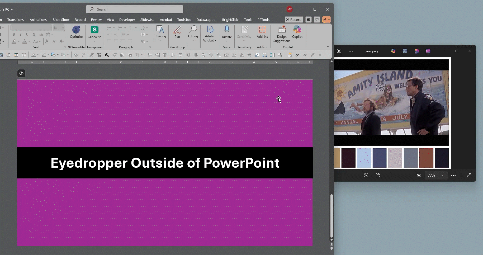
Again, select the Eyedropper tool from the QAT. This time, however, click and hold down the mouse button. Now, drag the cursor off the PowerPoint workspace and onto the desired color object.
Final Thoughts
Color matching just got a whole lot easier! The Eyedropper tool may be small, but it is an essential and powerful tool when it comes to slide design. Once it’s on your Quick Access Toolbar, it’s even faster to use and helps you stay on-brand and visually consistent with minimal effort.
-Mike and the TLC Creative Design Team