PowerPuff Fun! A PowerPoint Template
Yes, even cartoons need a reboot to make them work with the next generation of kids. The TLC Creative design team had a ton of fun developing a series of marketing presentation template concepts (the client selected shown here). Just another day in the design studio!
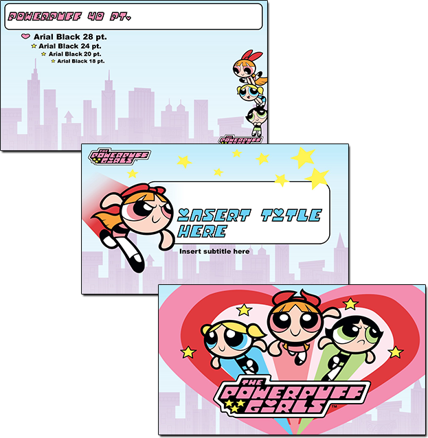
For the TLC Design Team, slide design must maximize usable content area, PowerPoint preset options, and lots of creativity. Creativity such as how to use the provided art elements and creating layouts, color schemes and animation to present dynamic and engaging presentations vs. presentations that have a nice background but are otherwise boring.
Note: This project was developed for a specific client, using licensed art, so we are sorry, but it is not available for download.
-Troy @ TLC
Vector Editing Inside PowerPoint for Text Boxes
In the previous portfolio sample of a recent PowerPoint template for HCV Treatment Research, the Section Divider layout had some customized formatting.
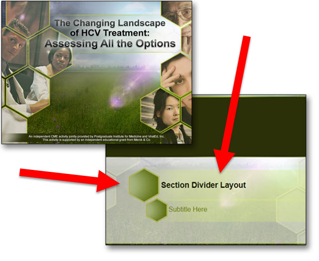
One of the TLC Creative Design Team objectives is to do as much formatting within PowerPoint to preserve future editing options (vs. doing all design in external programs like Adobe Photoshop and Illustrator and importing a series of uneditable images). The Section Divider in this template is a great example of our process of future proofing templates.
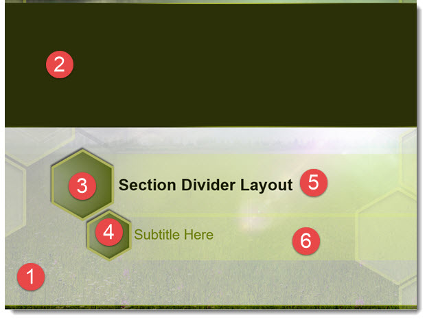
- Photoshop developed background image
- PowerPoint color block
- PowerPoint shapes, with custom semi-transparent gradient fill, thick outline, and drop shadow effect
- Duplicate of #3, resized
- PowerPoint text box with semi-transparent fill, text formatting preset
- PowerPoint text box with semi-transparent fill, text formatting preset
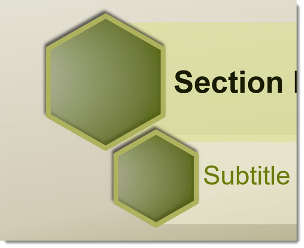
The Hexagon accent title boxes actually have a lot of customized PowerPoint formatting in putting them together.
- Add 2 PowerPoint text boxes, with semi-transparent fills and text formatting options preset (including a custom left margin to move text away from left edge).
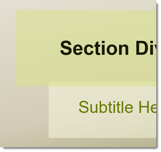
- Add PowerPoint hexagon shapes with semi-transparent gradient fill, thick outline, shadowing and other styling applied. The position and size was determined by the text boxes. Each was sized to have the outline within the text box shape.
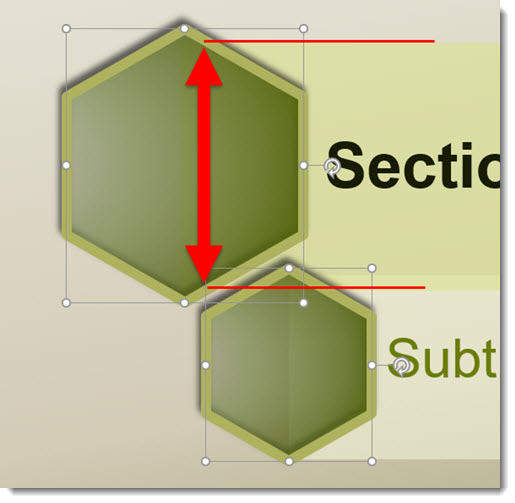
- The dilemma is, even with the text boxes sent to back, the semi-transparent gradient fills of the hexagons show the text box edge.

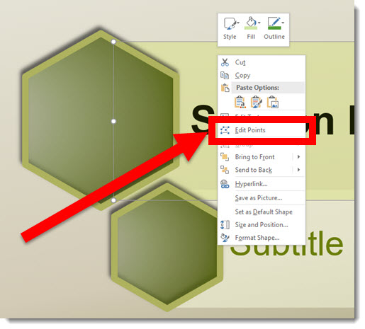
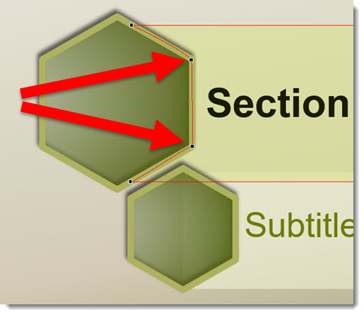
- Using PowerPoint’s Vector Shape Editing capabilities, we can customize the text boxes further in order to meet the visual needs of the template. Step 1 is selecting a text box and EDIT the vector POINTS.
- The text boxes are simple rectangles with 4 points, these two are the ones we are customizing.
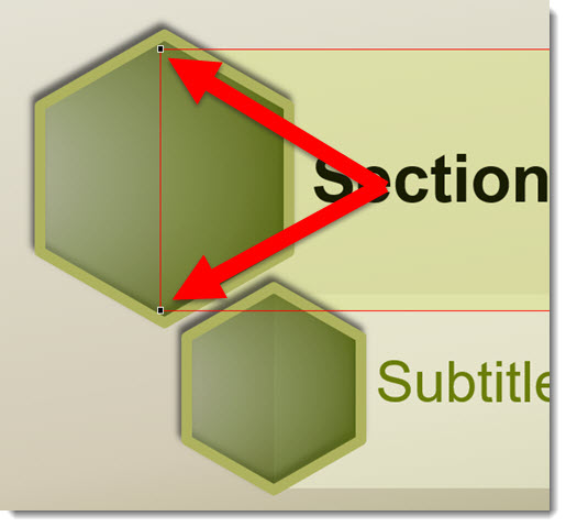
- Right-click the red shape outline and ADD 2 additional vector points to the vertical left of the rectangle (location is arbitrary).
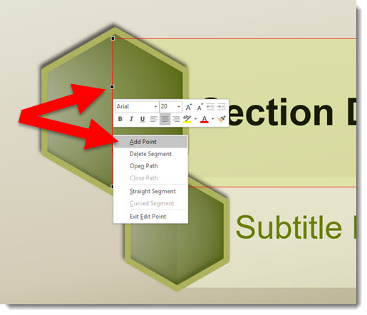
- The thick (4.5 pt) shape outline was a nice styling accent, but it also makes this vector customization much easier by providing lots of area to “hide” the text box shape under. We moved the 2 new vector anchor point to sit in the middle of the hexagon outline and making the text box shape, when sent to back under the hexagon, hidden from view.
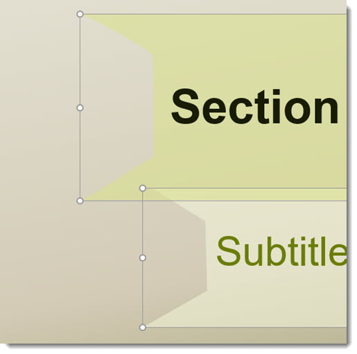
- Temporarily removing the hexagon shapes, here are the customized text box shapes with their new left edge.
- The end results, Title and Subtitle custom text boxes for the Section Divider layout, are all developed within PowerPoint and maintains template color scheme colors and editability.
-Troy @ TLC
PowerPoint Template for HCV Research
Presentations that focus on in depth medical studies and analysis and are presented to a peer of like minded doctors can also be visually dynamic and professional! The TLC Creative Services Design Team develop a large number of custom templates (and does an even larger number of presentation makeovers) for medical/pharma/device industries every week. This is the PowerPoint template for HCV (Hepatitis C) research that was used recently.
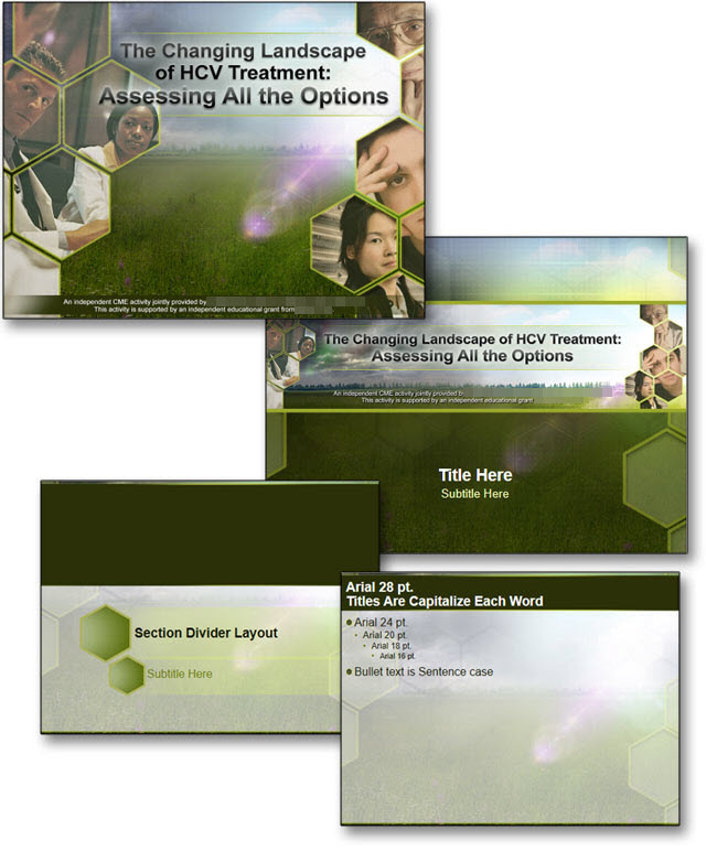
We identified a color scheme, an accent graphic (hexagons), the overall message (difficult, with positive and negatives), patient population demographics and other factors that influence the visual message the template should convey. After a round of concepts, the selected visual was developed into a full featured PowerPoint template with every preset customized to assist the multiple presenters in creating presentations easily and to coordinate with all other presentations.
-Troy @ TLC
The Presentation Podcast Episode #14 Released Today!
A new episode from The Presentation Podcast with Troy, Nolan, and Sandy is available today! Check out their latest discussion on “What’s on the Bookshelf?” and add to your favorite Podcasts on iTunes, Google Play, Stitcher, SoundCloud and more at The Presentation Podcast.
![]()
Panoramic Photos for Presentations
FotoSolution is a digital photo specialty group based in Hanoi, Vietnam. They sent TLC info and a link to one of their site pages with 20 FREE beautiful panoramic photos. These images would be great to use in a number of presentations.

The panoramic images on FotoSolution are not just wide angle lens images, but lots of overlapping photos stitched together into a single, perfectly in perspective image.
I downloaded a few of the panorama images and, unfortunately, the overall size was not super large – I was hoping to use Morph to create some great movement animation effects using one. But as an image on a slide, the size was good.
Check out the panorama images here.
-Troy @ TLC
Ellen Finkelstein Presents the 2016 Outstanding Presentations Workshop

Learn from some great presentation experts with this year’s Outstanding Presentations Workshop series. This is the 7th year for the workshops and this year, the series of webinars start this Thursday (9/15). This year, the entire series costs $17 (that’s total, for all 4 workshops!). Registered attendees have access to the recordings to view later (which is great for me because I cannot attend 2 of the workshops during their live presentations as I am on showsite).
Click here to get more details and registration information.
-Troy @ TLC
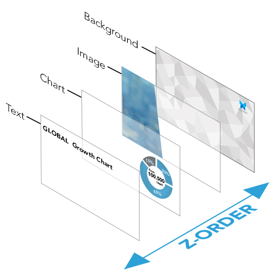
PowerPoint Layer Order Explained
How do you describe what is on top or bottom for slide content?
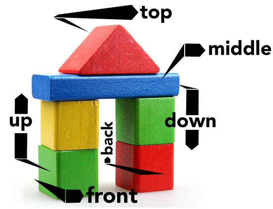
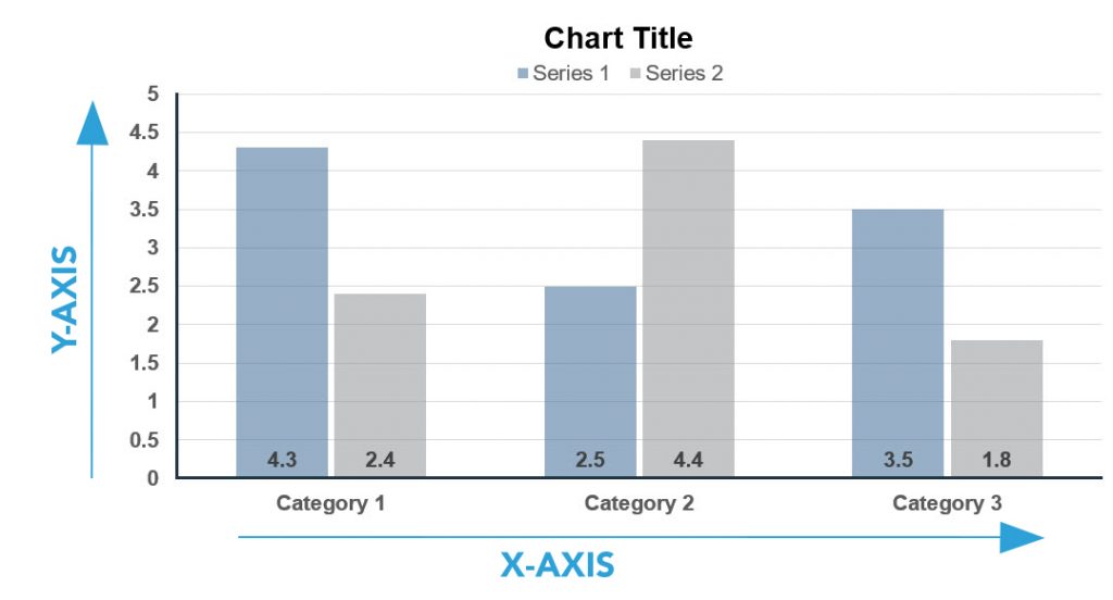
Let’s look at a simple explanation of 2D design. With presentation design, this is very easy to visualize by looking at a chart. A standard bar chart has two axes: left-right (X) and up-down (Y).
To expand on things, here is a simple explanation of 3D design. In 3D design, there are 3 axes; left-right (X), up-down (Y) and front-back (Z).
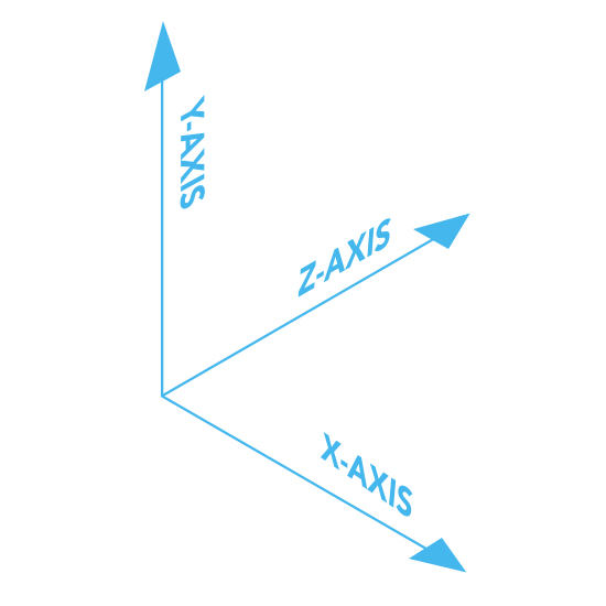
Similarly, PowerPoint slides can have 3 axes for content. Slide content is 2D, which is left-right and up-down. But, it can also be layered on top of each other, which is the Z-axis. So, content that is layered on top of each other is referred to as the “Z Order.” Here is an exploded view of a slide. The Z-order has the text on top, so no other slide content is going to block it – but the text may overlap other content.
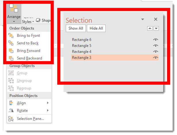
Z-order is adjusted with PowerPoint’s ARRANGE > ORDER OBJECTS tools. These are the “bring to front” and “send to back” buttons. The SELECTION PANE shows all slide objects in their Z-order with items at the top of the list on top and items lower on the list having the other items on top of them.
Note: PowerPoint cannot have objects on the same layer, so as soon as there is 1 object on a slide, something is always layered on top.
-Troy @ TLC