
Quotes Should Not Be Bullets (A Before-and-After Example)
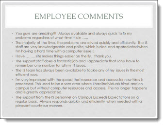
The supplied slide had plenty of great callouts end users, but in a bullet list it looks just like any other (boring) slide.
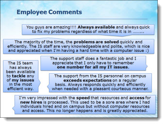
Taking a cue from IM (Instant Messaging) applications, each quote was put into a speech bubbles for a lively and visual slide layout. The key messaging of each is also bolded text to direct the audience.
– Troy @ TLC
Technology That is Not Clear (A Before-and-After Example)
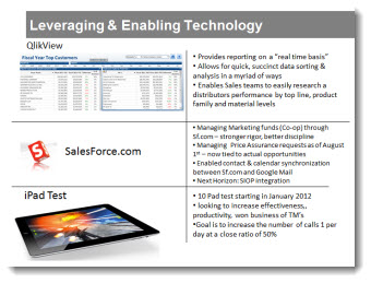
This a slide from a presentation makeover project. The original slide was typical in that had some photos, screen captures and bulleted list text. The overall design was clean and (overly) compartmentalized the content.
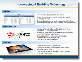
The makeover used the same images, bullet list text and focused on grouping content. In the final slide layout, it is much easier to quickly identify the 3 topics and the bullet lists are easier to read with improved line spacing and alignment.
– Troy @ TLC
The Timeline Road (A Before and After Slide)
As part of the presentation makeover, I wanted to take this process, that was central to an entire section of the presentation, and create a layout that visually supported the presenter’s talk and was more engaging to the audience.
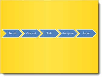
The core message was the process of engaging with a brand over many stages. The visual layout creates a road with the stages along it. Each stage is highlighted with supporting graphics.

– Troy @ TLC
Presenting the New “TLC Creative Services, Inc.” Logo
As part of the new design offices and needing new business cards, signage and everything else, Lori took on the task of updating our company logo – which was last revised in 2006.

All the same information, just some updated styling on the “TLC ” spheres (now vector art) and a more streamlined and modern linear feel to the text.
Look for it on the blog, website and where ever else the TLC logo appears.
– Troy @ TLC
PPT 2010 – PPT Web App – and SkyDrive = Perfect Partners for Interactive Online Tutorials
Fellow PPT MVPs Glenna Shaw and Luc Sanders have an online tutorial posted on the Microsoft MVP Blog that has great information. See it here.
While the PPT Web App is still limited compared to the full application, it is the best online option available at this point from any of the offerings (and it keeps your PPT file as a PPT file). If you have not tried the PPT Web App, this tutorial walks through the process of setting up the (free) account needed and offers tips on using it.
– Troy @ TLC
A Campaign Process Everyone Can See (a Before-and-After Example)
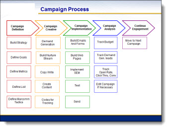
Provided slide had lots of good points: It was not a bulleted list, items are color coded, and alignment is not to off:
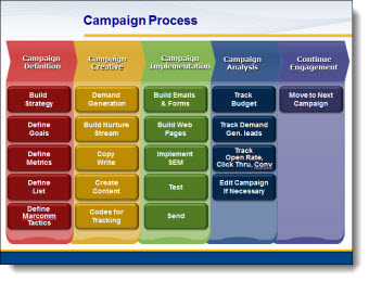
The “after” slide developed used the same layout concept, but used colors for extra contrast, layering of content along with bolder and more legible text:
– Troy @ TLC
Things We Do Consistently Well (a Before-and-After example)
Most every presentation software for the past 15 years has made information as bullet points the default way of visually presenting it. While efficient, and duplicate-able, it is definitely not the most attractive or memorable way to present information. Here is an example of “Bullets vs. Visual Layouts” from a recent project.
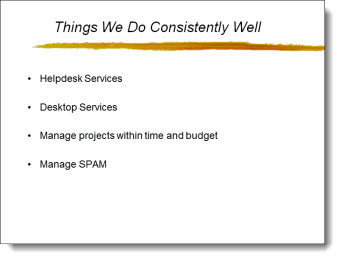
Here is the original slide – simple, consistent, boring bullet list:
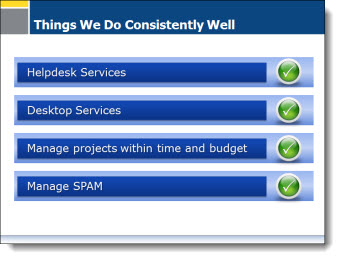
Here is the slide after the presentation makeover project. It has the same information, but has some visual impact with color, shapes, layering, and speaker support animation (obviously not seen in this flat image of the slide):
– Troy @ TLC