
Outstanding Presentations Workshop Webinar Series

Beginning tomorrow, and ongoing weekly for the next 8 weeks, Ellen Finkelstein has coordinated 8 top presentation speakers to each keynote a free webinar.
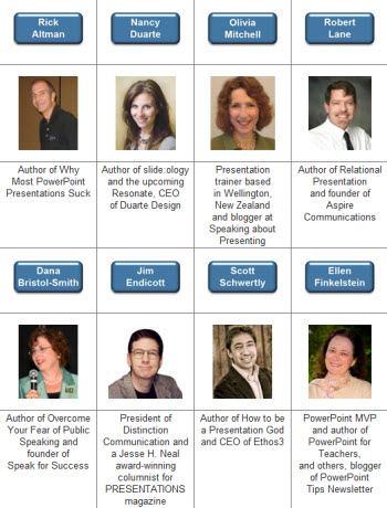
The “Outstanding Presentations Workshops” should be great and I have already registered. Get all the details here.
– Troy @ TLC
Free PowerPoint Files.com Review
The Free PowerPoint Files website is a collection of PowerPoint templates. It looks to be a companion site to the “PowerPoint Styles” website I reviewed back in June offering the same template designs. Free PowerPoint Files offers several hundred PowerPoint templates that are image based with stock images for the background and text placeholders formatted to coordinate with the background image.

The templates are all the legacy .ppt format. But they are free. What you download is a nice background image, but not a very functional template. The images used for the template backgrounds are very modern and work well for templates. When I opened the template I downloaded it looked good from the thumbnail view with multiple layouts and PowerPoint placeholders positioned well on the background image.
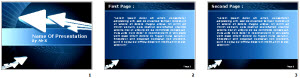
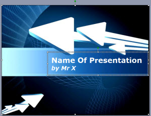
But the Title slide (viewed in edit view, not master slide view) showed a single text box vs. separate text boxes for the title and subtitle text, which have different formatting. And the background was a placed .jpg (eg. not from a preset master slide).
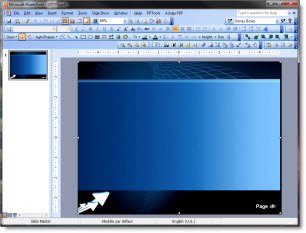
The Master Slides revealed no formatting, just a placed .jpg for the background. No text placeholders, named master, title slide master, etc.
If you are familiar with the basics of setting up templates with default placeholders, color scheme and transitions the PowerPoint Styles templates offer nice backgrounds to start with.
– Troy @ TLC
Apply “Sharpen” to Images
PPT 2010 has lots of great Photoshop-like effects built into the application. This post is highlighting the SHARPEN AND SOFTEN filter in a real-world situation.
Here is my original image.

Here is the effects applied to stylize the image (rounded corners, bevel, reflection, etc.). All looks great, but look at the face – it is not as crisp and defined.

With the image selected go to FORMAT >> ADJUST section >> CORRECTIONS
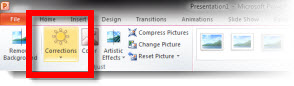
Looking at the top row is the SHARPEN AND SOFTEN quick options. The highlighted box shows what is currently applied to the image. I am going to click and apply the far right option which is a much greater sharpen filter.
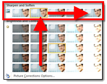
Here is the same image, same stylizing effects, but with the greater sharpen filter setting. The bevel is there, the reflection is there and the face is super crisp.

– Troy @ TLC
Drugs for Presenters!
Absolutely serious – this is an add that was in the Sunday paper.
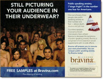
“One out of every three people rate public speaking anxiety as their number one fear… Bravina will prepare you to execute your next presentation.”
I might need to see the research before recommending this one…
– Troy @ TLC
Clear Formatting Fast (With Keyboard Command!)
Q – What is the fastest way to clear the formatting to text, shape or picture?
A – Select and use keyboard
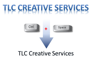
Here is my example. I have formatted the company name with a gradient fill and reflection. Now I want to go back to just the original text (bottom). To get there I just select the text and click the CTRL + SPACEBAR. Done.
– Troy @ TLC
“Where Did I Save That Presentation?”
“Where did I save that presentation?” is something I say or hear daily. In PPT 2010 there is a great addition to the ‘Recent Documents’ feature.
Go to FILE >> RECENT >> RECENT PLACES
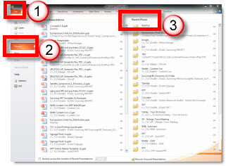
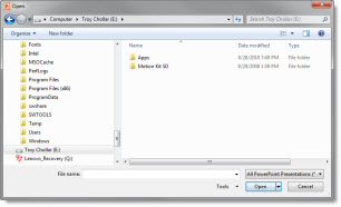
The right column shows the folder location of the past 20 saved presentations. Click any of the locations and a OPEN dialog lets you pick any presentation in that folder.
– Troy @ TLC
Comping The Theme In PPT
We handle the ‘total package’ for lots of campaigns, which includes the website, brochures, flyers, postcards, signage, PowerPoint template and presentations, name badges, web banners/ads and any element that needs to be designed to assure a consistent visual theme. But each of these projects begins with developing the theme graphic.
For this specific project I was given the general thought of the program (the official title was still be determined). This was a medical speaking series on the topic of “evaluating the traditional/accepted/old therapies and looking toward the future and integrating new therapies into the standard protocols”.
My first step was doing keyword searches in a number of online photo sites to come up with visual ideas.
From there I merged my notes down to a series of concepts – simple 1-2 sentence descriptions.
Then I downloaded comp images, did some very basic positioning and editing to create a series of slides like this:

The goal is to provide the client with words and visuals to see which resonates with their vision for the program so the real design phase can begin with a direction.
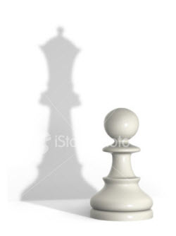
Here are the 7 concepts provided for this specific project:
1. “From Little to Big” – switch from the accepted space to a new enviroment.

2. “From Empty to Full” – Move from half full to plentiful.

3. “From Status Quo to New” – move from the crowded/accepted to fresh space.

4. “See and Understand” – What is seen/accepted can transform into more.
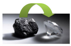
5. “Out of the Old” – From coal comes the true treasure, diamonds.
6. “Becoming Superman” – Regular guy Clark Kent needs to transform to be seen as a superhero.

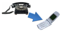
7. “Advancing Technology” – Move from outdated to modern for faster, better, more efficient.
From this simple storyboard of theme concepts evolved a full multicomponent design project that carried consistent visual message, color scheme and styling to all elements.
– Troy @ TLC