A Look Back at Slide Background Design with Text – and a New Background Text Idea!
We are looking back to February 2020 and the post entitled, “Use PowerPoint Text As Part of Background Design”. Click here to view the full 2020 post.
Looking back, I feel this was a pretty simplistic example of a slide design. I know it was inspired by a real client project (and like most of our design work, that project was under an NDA and not able to be directly shared). But I have a new project that incorporates text into the background that I feel is much more dynamic!
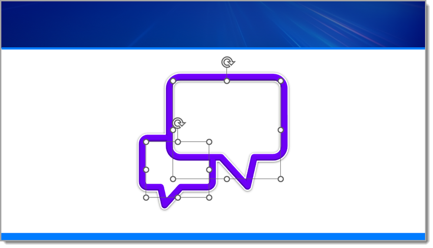
In this new slide design tutorial, we’ll use a speech bubble SVG from The Noun Project and transform it with shadows, bevels, AND a subtle logo texture as part of its background, all for a polished and presentation-ready design element. If you don’t have access to The Noun Project (highly recommended), you can replicate this slide using your own art.
Step 1: Insert and Prepare the SVG
Start by downloading a speech bubble .SVG file from The Noun Project and inserting it onto your slide (I use the PowerPoint add-in, but you can also go to The Noun Project’s website).
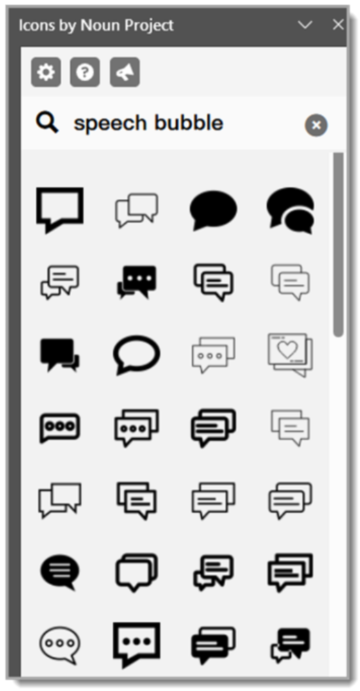
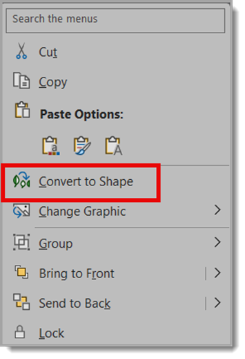
Once placed, right-click and choose Convert to Shape (if needed) so all the PowerPoint style options are available.
Step 2: Add a Drop Shadow
To give the icon a little depth, apply a drop shadow with these settings:
Size: 100%
Blur: 8.5 pt
Angle: 90°
Distance: 1 pt
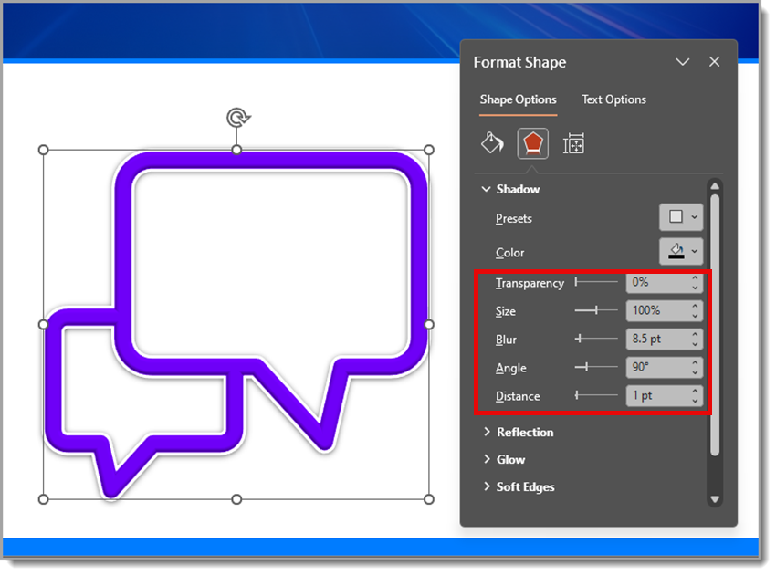
This creates a subtle, soft shadow that lifts the icon just enough off the background.
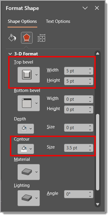
Step 3: Apply a Bevel and Contour
For extra dimension, use a Round Convex bevel:
Width: 5 pt
Height: 5 pt
Then, add a contour set to 3.5 pt. This gives the edges of the speech bubble a nice highlight and makes it feel more 3D.
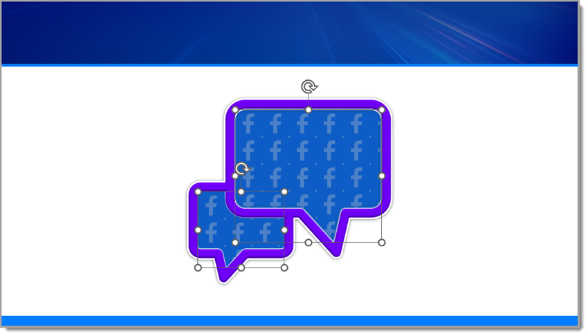
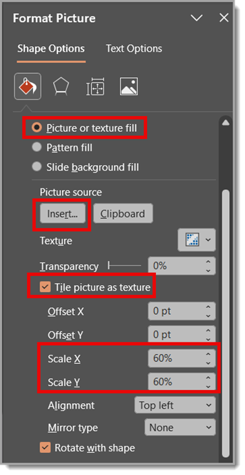
Step 4: Fill the Speech Bubble with an Image
Next, fill the inner blank area of the speech bubble with an image of the Facebook logo:
Go to Shape Fill > Picture or Texture Fill
Choose the Facebook logo image (this Facebook logo is also sourced from The Noun Project)
Check “Tile picture as texture”
Set Scale X and Scale Y to 5%
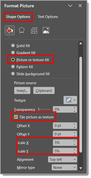
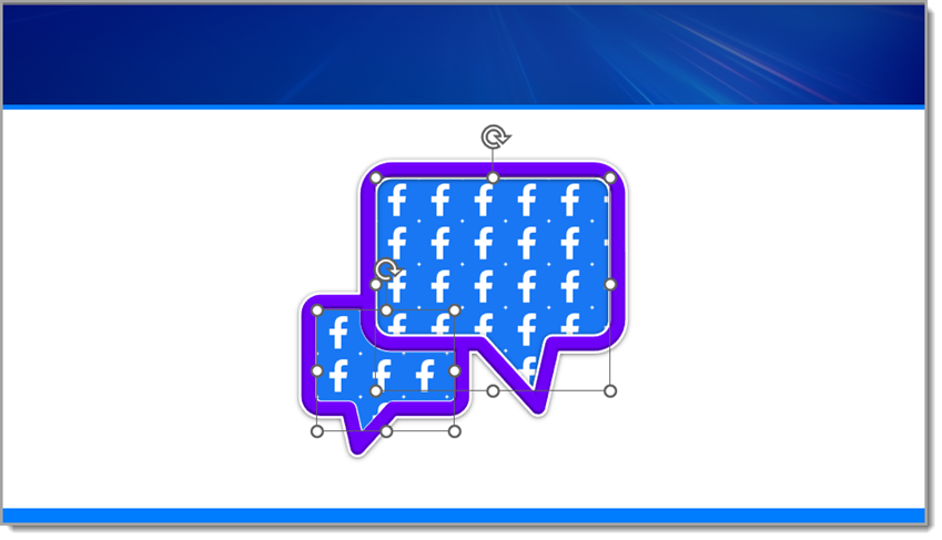
This creates a tiled pattern of the Facebook logo inside the bubble — a cool effect that works well for digital or social media-themed slides.
Step 5: Add a Soft Color Overlay
To blend the texture and unify the look, copy and paste the same inner shape directly on top. Then fill it with a solid color and set the transparency to 25%.
This soft overlay mutes the tiled pattern just enough while keeping the detail visible underneath, giving your speech bubble a professional, layered look.
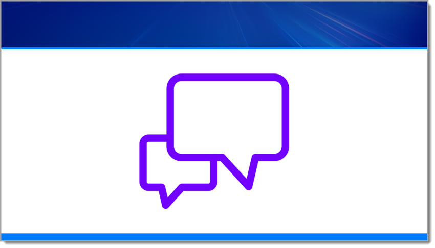
Step 6: Add Text on Top
Now add a text box over the speech bubble and type something like: Add Facebook stat/callout here.
This is where you can highlight a key metric, social media insight, or fun engagement fact to make your design more informative and engaging.

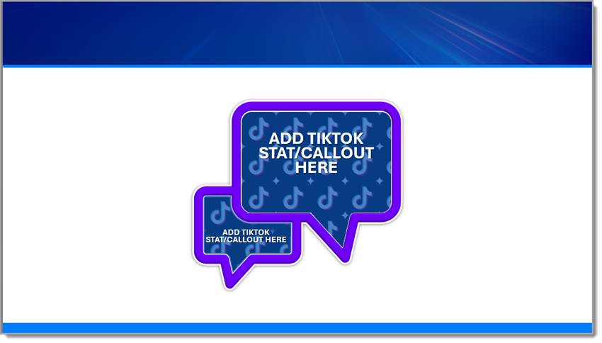
Now, Let’s Repeat the Same Steps Using a TikTok logo.
Repeat the same steps as before, but with one small edit (I sourced the TikTok logo from The Noun Project).
Back to Step 4: Fill the Inner Blank Area of the Speech Bubble with an Image of the TikTok Logo
Go to Shape Fill > Picture or Texture Fill
Choose the TikTok logo image
Check “Tile picture as texture”
Set Scale X and Scale Y to 5%
Note: You may need to adjust the Scale X and Y percentages depending on the size of the logo being used for the repeated texture.
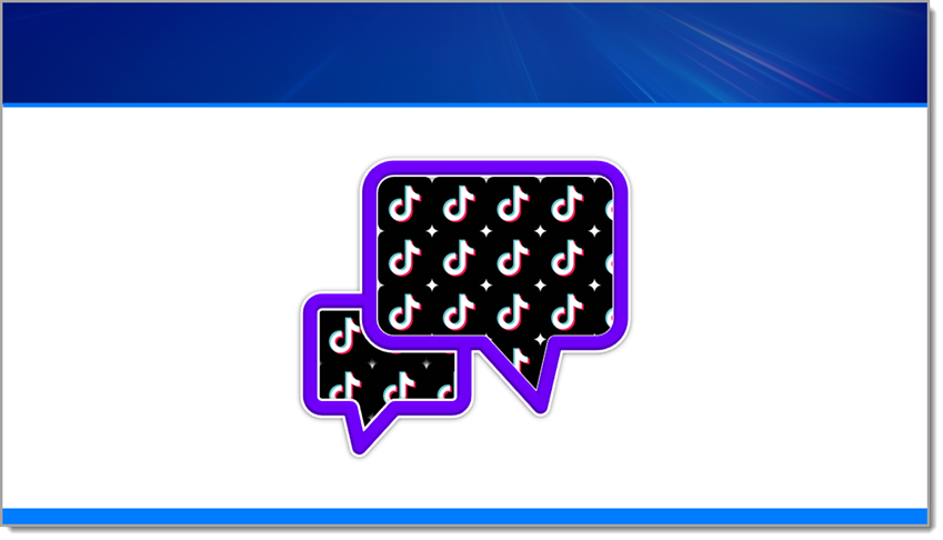
Final Result
The final result is a presentation-ready graphic because all of the design was completed directly in PowerPoint! Not only is the branded and dimensional speech bubble a standout slide element, it’s native to PowerPoint, so it can scale and be edited easily. It’s a great example of mixing vector shapes, styling effects, and rich surface detail – all directly in PowerPoint, no Photoshop required.
Want the final product for yourself? Download the editable TikTok PowerPoint slide HERE!
Hope you enjoyed these examples and design tutorial!
-Christie and the TLC Creative presentation design team
New Podcast Episode Available! “PowerPoint stories of horror – humor – and everything in between”
New episode of The Presentation Podcast now available!
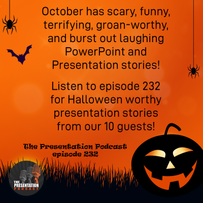
It is October, and Halloween, and scary things happen. For The Presentation Podcast, it is a perfect time to gather a group of presentation design experts and hear presentation stories that are funny, terrifying, or something that quote, “should not be done in PowerPoint”. Join Troy and Lori of TLC Creative Services as they talk with a group of our presentation colleagues. You get to hear amazing presentation stories that make us groan, shudder, or burst out laughing! Click play on your favorite podcast app, or at The Presentation Podcast site to hear presentation the Halloween haunts now!
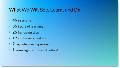
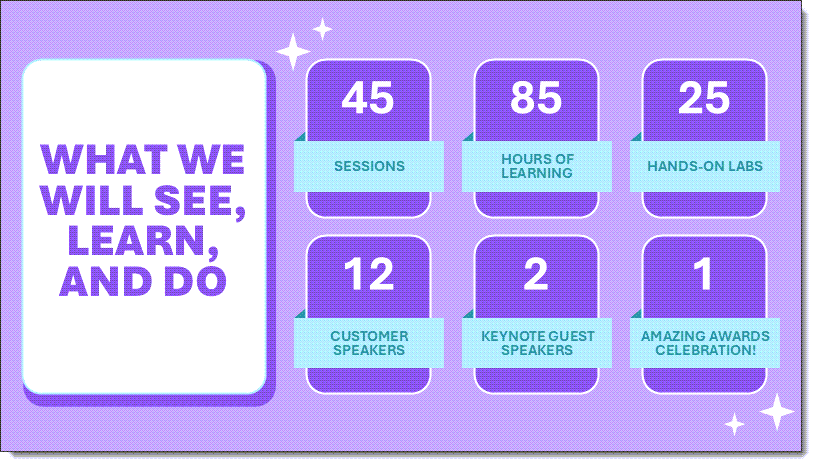
Learn, See, Do Slide Makeover (4)
We are showcasing the slide makeovers of the TLC Creative presentation design team. Everyone was given this slide, with the only design parameters of 30 minutes design time maximum – any color scheme, fonts, graphics and layout.
Client slide:
Christie’s slide makeover:
New Microsoft App Icon
Throughout 2025, each Friday’s article has featured a “Look Back” at previous posts – some are from last year, and others are from 20 years ago! Microsoft this month (October 2025) revealed a full visual refresh of the Office suite icons, so, to tie this into our Look Back series, let’s first look at our post about Microsoft’s icons from August 2018, “Windows 10 Start Menu Icons”.
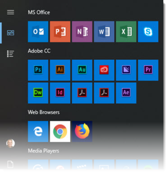
The important note is that this post was not really about the app icons, but rather that the Windows 10 start menu had color-coded the icon “chiclets” with the background of each app color. I liked it and thought it was a nice design unification for the Microsoft Office icons (I did not like that other apps had random styling). Read that post here.
Now in 2025, the Microsoft team describes their visual refresh update as an “evolution, not a revolution”.
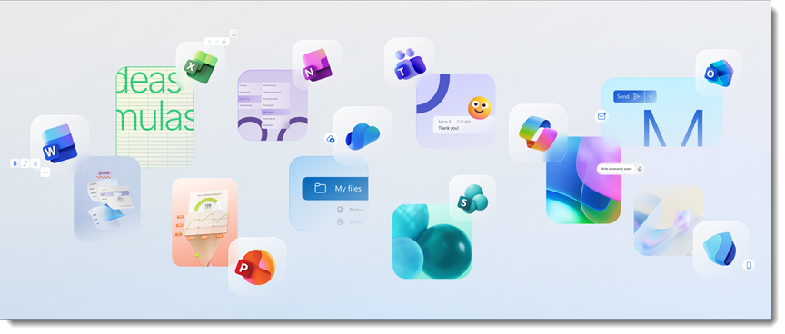
According to the official release article, this new look reflects Microsoft’s broader shift toward “fluid experiences” that connect across devices and platforms. The icon designs use depth, motion, and lighting, and Microsoft notes the updated icons feel more organic, less mechanical, and have shapes that flow rather than sit rigidly in place.
At least the app colors remain constant from the previous versions, although there is now a rich use of blended gradients.
Over time, the Microsoft Office app icons have had several eras of design. We pulled this diagram showing the icon history from the Microsoft website:
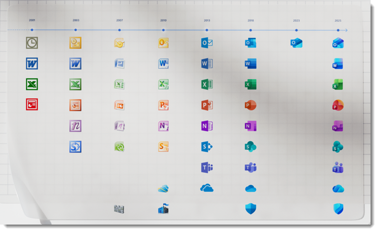
The flat 8-bit compatible icons of 2000 evolved into gradients and then onto more complex shapes, landing on Microsoft’s flatter, “Metro” aesthetic in the 2010s. Then, a subtle repeat of moving back to more complex shapes, to gradients, and now onto a more complex use of gradients and subtle shape consolidation (at least that is my initial thought about the latest evolution in the icons).
In reading about the app icons, Microsoft calls out that every Office icon was rethought to make it easier to recognize immediately, yet when you look at this really nice historical grid of icons, I am not certain the latest set makes it easier to recognize one app from another vs. the previous versions…
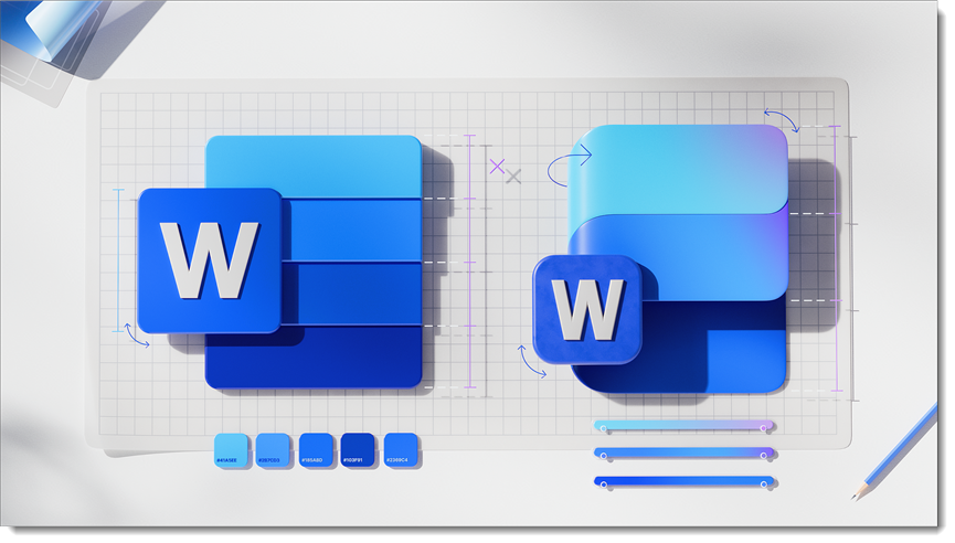
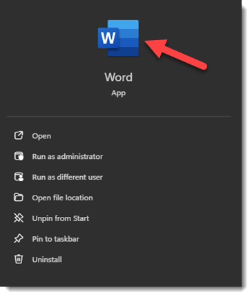
One minor observation: in the Microsoft article, the Word app “before” icon is not quite the icon we see in our Windows 11 OS or SharePoint interface today. It looks great, but it has visible dividers in the gradient bars and a more pronounced drop shadow effect than seen in the actual (current) icon.
All that said, in my opinion, the new icon system is neither a win nor a loss. It is an evolution that I feel is more like a style guide alignment rather than a push towards functionality. Now the question is “when”… When will we see the new version of the Microsoft app icons in our taskbar?
-Troy, Jake, and the TLC Creative design team
Learn, See, Do Slide Makeover (3)
We are showcasing the slide makeovers of the TLC Creative presentation design team. Everyone was given this slide, with the only design parameters of 30 minutes design time maximum – any color scheme, fonts, graphics and layout.
Client slide:
Mike’s slide makeover:
Learn, See, Do Slide Makeover (2)
We are showcasing the slide makeovers of the TLC Creative presentation design team. Everyone was given this slide, with the only design parameters of 30 minutes design time maximum – any color scheme, fonts, graphics and layout.
Client slide:
Jake’s slide makeover:
A Look Back to 4:3
While perusing past blog posts, this one caught my attention just from the image in the post (original post on The PowerPoint blog here):
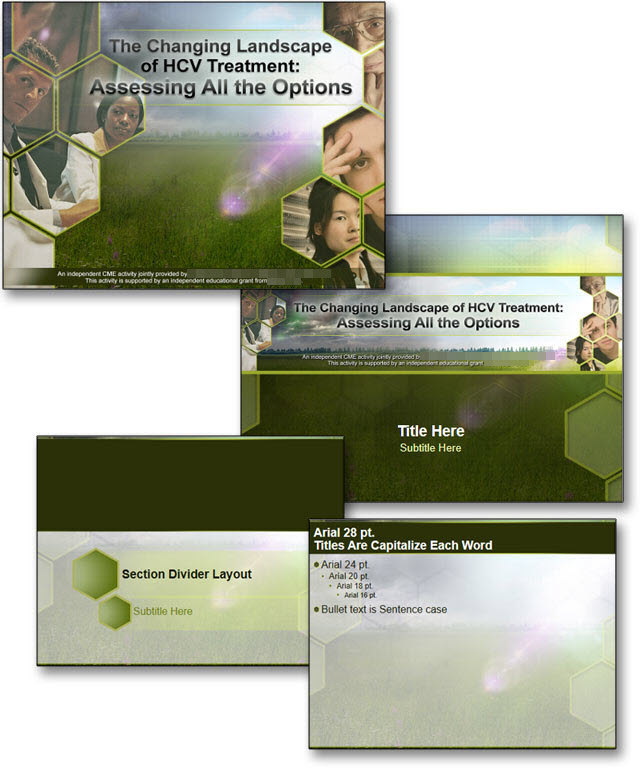
First, it is a 4:3 aspect ratio, instantly dating it as an “old” project in today’s 16:9 world. But then I noted the date of the post: September 22, 2016. This is close to a decade ago (10 years!), but PowerPoint as an app at that time had changed to a 16:9 default slide with the release of PowerPoint 2013.
This PowerPoint template project we were highlighting in 2016 was an outlier, holding onto the legacy 4:3 aspect ratio. Perusing our project log, I found dozens of PowerPoint template projects in 2016, but only 7 were 4:3; all the others were 16:9 or wider (ultrawide presentations have been a part of the live event staging world for 20+ years!).
In 2017, there were again dozens of PowerPoint template projects in our project log. But this time I only noted only 4 as 4:3 aspect ratio templates (and 3 of those were for the same client as this template!).
This was a nice trip into the past of presentation design. The world is now 16:9… but the needs of a full-featured PowerPoint template remain the same.
A good PowerPoint template serves as a style guide available to everyone in the company, department, or event, setting the consistency standards for color scheme, fonts, and overall styling.
If interested, click here to view the full post from September 2016, showcasing another PowerPoint template project TLC Creative Services was asked to develop.
-Troy @ TLC