Cheat Sheet to Presentation Jargon
…
At TLC Creative Services Inc, we spend every day inside PowerPoint, and most of the time, our muscle memory serves us well. We know the keyboard shortcuts, the menus, the add-ins and, of course, how to manipulate and format objects. But there is one specific UI inconsistency that creates chaos with our workflow, and it’s when we switch between the Desktop and Web versions of PowerPoint. This is not a missing feature; it’s literally how you select objects.
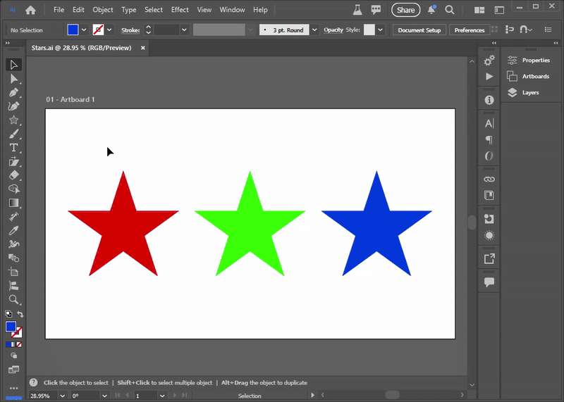
Let’s start outside PowerPoint, in Adobe Illustrator. First, Illustrator is a much (much) more robust vector image app vs. PowerPoint (but PowerPoint does have a lot of vector image editing and creation features!). The most basic feature is selecting elements or objects. Illustrator has a few variables based on the tool being used, but we are keeping this very simple – and Illustrator’s process is very simple. When drawing a selection marque in Illustrator, if ANY pixel of an object is within the selection, that object is included in the selection.
Okay, that is how most graphic designers learn how object selection works. But the rules change in PowerPoint – and they change based on which PowerPoint app version is being used! Desktop or Web.
If you’ve been using Desktop PowerPoint for years, you are used to the strict selection rule (which is completely different from Illustrator). To select an object or a group of objects by dragging your mouse, you must fully enclose all objects. If you draw a selection box around a group of items, but miss even just one corner by a pixel, that object is ignored and isn’t included in the selection.
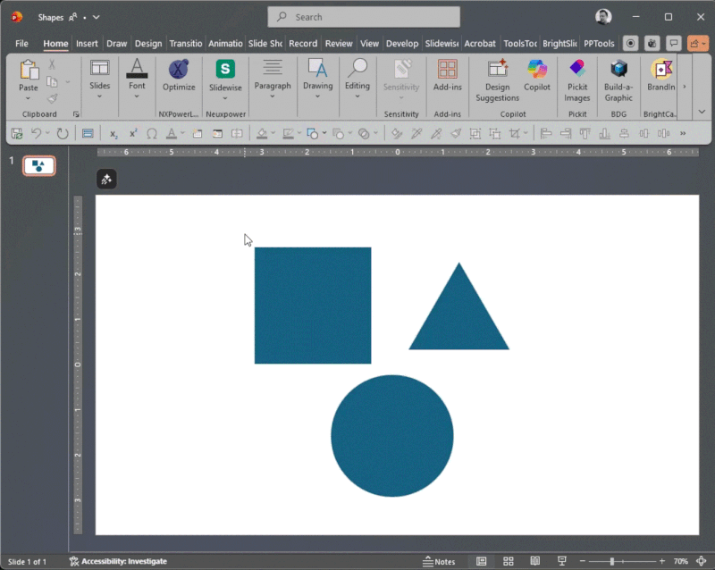
PowerPoint forces you to be deliberate. You must draw a massive box to ensure the entire object is “roped” in. Miss just one pixel, and that object is not part of the selection. This can be used to the advantage of the designer, or it can become a tedious part of the object selection process!
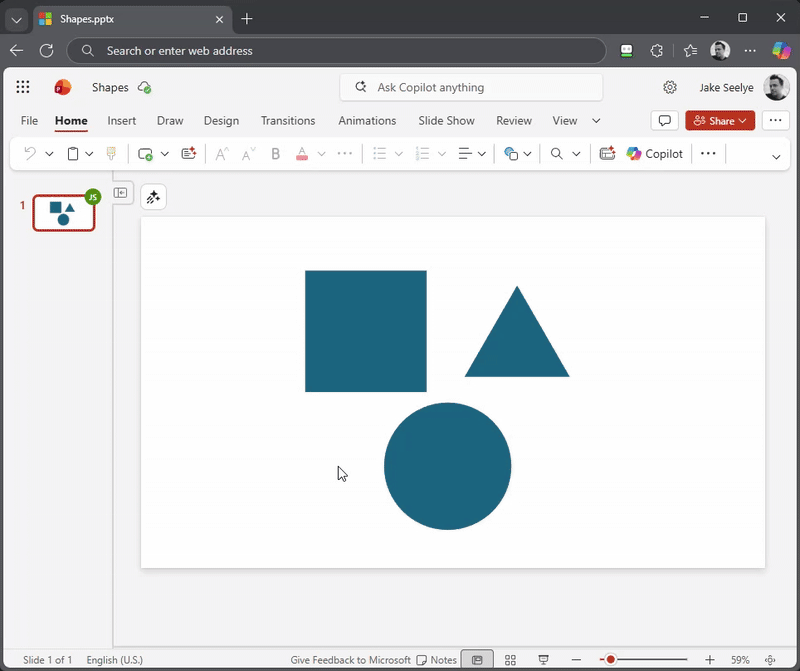
But take the same slide and the same objects to PowerPoint for Web, and the rules change completely! PowerPoint for Web behaves much more like Adobe Illustrator. Draw a selection marque, and if the selection box touches even just one pixel of an object, it’s included in the selection. So yes, you can enjoy Adobe Illustrator-like selections in PowerPoint…for Web.
It seems like a small detail, but when you’re moving fast, the inconsistency in selection methods between Adobe Illustrator and PowerPoint, and between Desktop PowerPoint and PowerPoint for Web, can easily throw off muscle memory workflows!
Our ask of the PowerPoint Dev team – please add a preference setting in the future to both Desktop and Web versions of PowerPoint to toggle this behavior! Until then, you simply must remember which “mode” your brain needs to be in when you’re designing in the worlds of Adobe and Microsoft.
Talk about a difference in user interface design! Which selection do you prefer, the precision of Desktop or the speed of Web?
-Jake and the TLC Creative Services Design Team
After using PowerPoint daily for years, one starts to have a handle on everything the app is capable of. It becomes rare to stumble across a new shortcut that genuinely surprises you, let alone an extremely useful one. Recently, I discovered a keyboard combo that solves an annoying part of slide formatting: fixing capitalization.
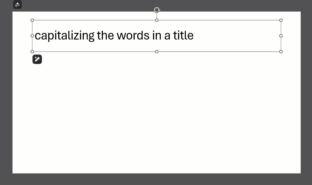
I’m sure this has happened to some of you out there: you paste a list of bullet points from an email, and the text is all lowercase. Or you frustratingly leave Caps Lock on while typing a long title. Usually, the fix would involve deleting and retyping or hunting down the feature on PowerPoint’s ribbon.
It turns out that there is a keyboard shortcut that does it instantly: Shift + F3.
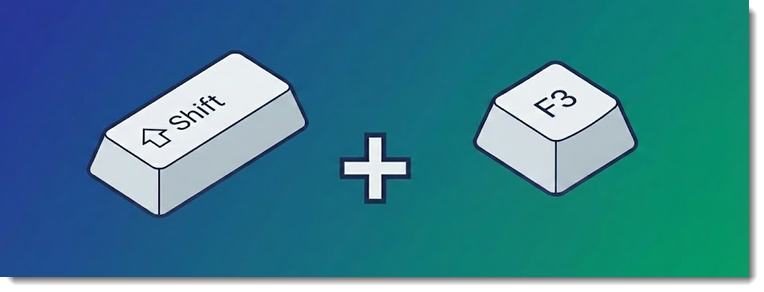
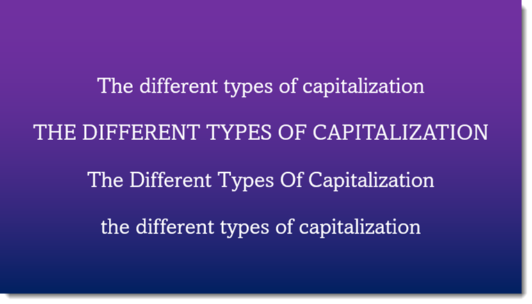
Shift + F3 is a universal “Text Case Cycler” for all Microsoft Office apps. It works in PowerPoint, Word, Outlook, etc. This keyboard shortcut cycles through 3 these capitalization options:
NOTE: This is one of Windows’ shortcut keys, meaning it’s the same shortcut in the web version of PowerPoint. For MAC users, the shortcut is Shift + fn + F3.
When trying to correct capitalization, basically, there are different ways to fix it:
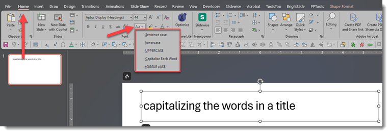
3. And finally, the ultimate keyboard shortcut: highlighting the text or clicking the text box and using the Shift + F3 keys. Do this one time for sentence case, two times for all caps, and three times for small caps (unfortunately, Capitalize Each Word is not included):
The best keyboard shortcuts aren’t the complex ones that launch macros; they are the simple ones that fix daily annoyances. Shift + F3 turns a five-second frustration into a split-second fix. It’s a tiny trick, but once you start using this hotkey, you’ll wonder how you ever managed without it.
-Jake @ TLC Creative Services, Inc.
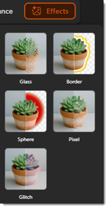
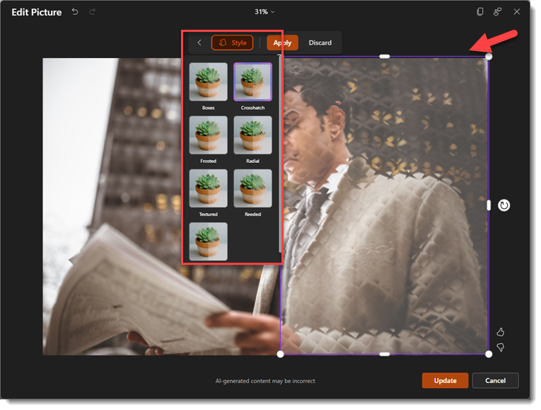
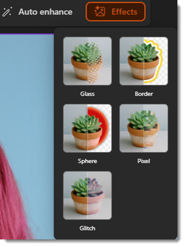
In our last post, we looked at how PowerPoint’s new AI powered Photo Editor can help fix a photo with a variety of tools. This time, we’ll cover the last photo editor tool in the tool bar, which is called “Effects.” These are styling effects, and currently, there are 5 different picture effects:
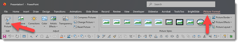
To get to this menu, you simply click the Picture Format tab and then click Edit Picture to pull up the interface. Now, we can start editing pictures!
You will see the effects tab all the way to the right. Clicking this will bring up the menu with those 5 picture effects.
Glass creates a sort of frosted glass effect on your picture, and you can adjust how much of the picture uses the effect, and also change the style of the glass texture.
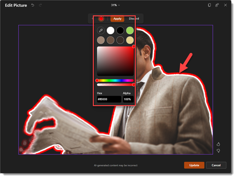
Border removes the background of the image, and then applies 2 borders to the image, an inner white border, and then another border that can be any color of your choosing.
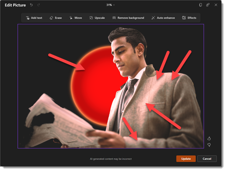
Sphere is sort of a unique effect, like Border, it removes the background, but this one adds a glowing sphere in the background, and subtle highlights to the subject that match whichever color you choose.
Pixel simply applies a pixelization effect to your photo, and you can adjust the area being affected, as well as the intensity of the pixels. The left side of the slider will create smaller pixels, while sliding it to the right will create larger pixels.
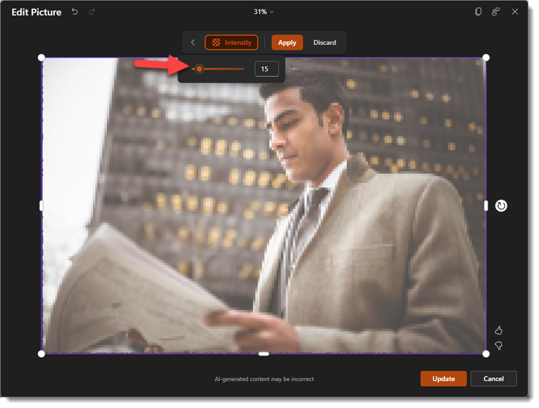
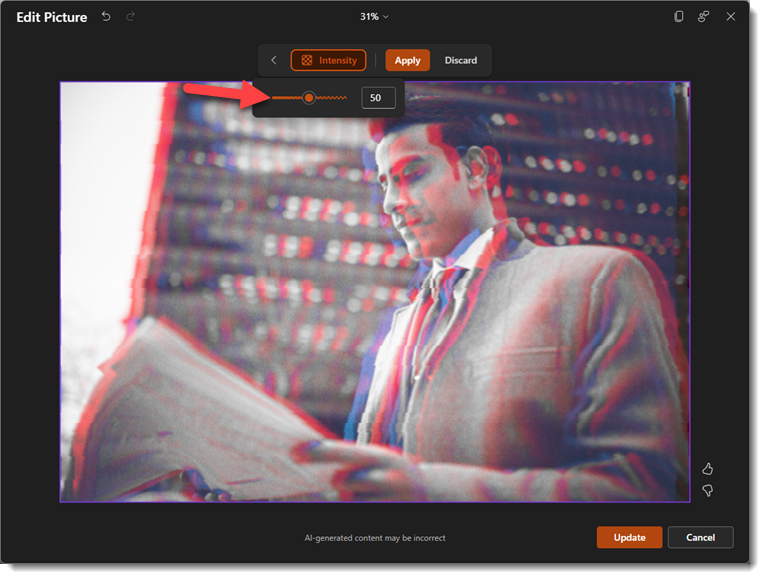
Glitch is a pretty cool effect that applies a glitchy look to the photo, and once again, this one has an intensity slider to adjust how pronounced the effect is.
The picture effects panel in the new Image Editor is a bit limited, but it can help make images more interesting, and you can even combine tools to push the image even further. Here’s an example using the background remover tool, glitch effect, and text effects all in one:

The new AI Image Editor toolbox in PowerPoint has introduced some genuinely useful creative tools right out of the box. While it won’t replace professional photo editing software (e.g. Photoshop, Figma, Affinity, etc.) for heavy lifting, it’s perfect for giving your slides a modern edge without the hassle of switching apps. It will be interesting to see where Microsoft takes this in the future, but for now, it’s a solid upgrade to our daily workflow!
-The TLC Creative Services design team
We’ve all been there. You’re building a PowerPoint deck, and you find a GREAT image to complement the talking point… but it’s not quite perfect. Maybe there’s a random stranger walking through the background of your team photo. Or perhaps the image could use a touch-up to make it pop more. In the past, stopping for edits like this meant pausing your workflow entirely to head over to your photo editing app of choice.
If you have Adobe Creative Cloud, this means launching Photoshop and opening the same image separately and then proceeding with the editing yourself. Time-consuming tasks such as removing a background or adjusting the brightness, contrast, etc., are certainly a friction point that forces you out of your presentation mindset.
But with this new update, Microsoft has just changed that workflow! Powerful AI photo editor tools are now baked directly into PowerPoint’s ribbon. You get decent editing capabilities without ever having to leave the PowerPoint application.
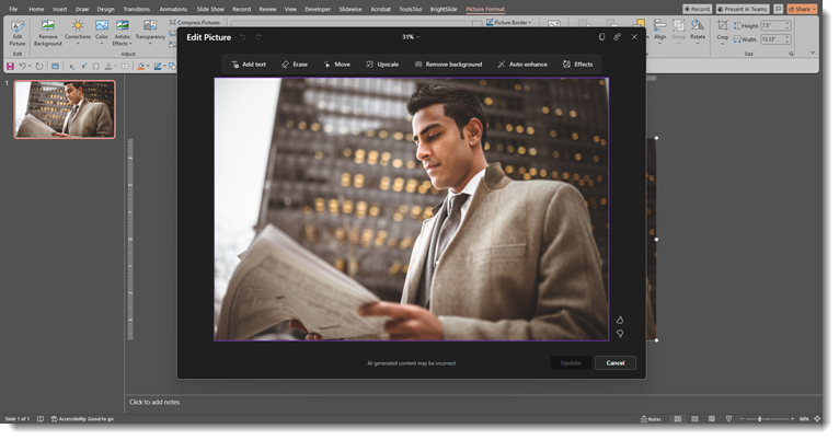
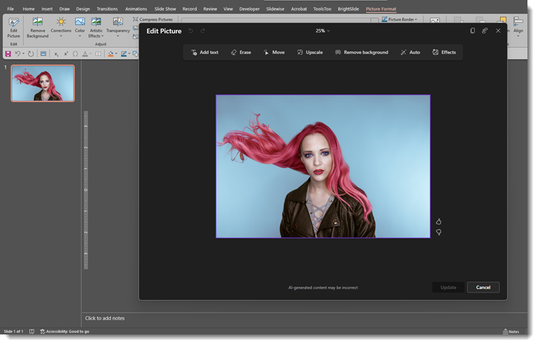
Here is a high-level look at the new “Edit Picture” interface and what these tools can do. And before you read any further, no, the new Edit Picture tool does not have the ability to expand the background of a photo. ☹️
Accessing the new editor is in a slightly different spot on the Picture Format tab. Once you insert a photo (for this example, we just used Microsoft’s stock library), click the Picture Format tab and then select “Edit Picture” way over there on the left:
This will open up the new interface as PowerPoint shifts into a focused photo editor mode, with a dedicated AI toolbar at the top.
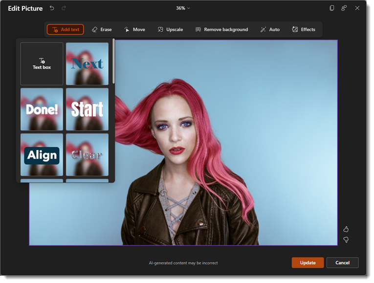
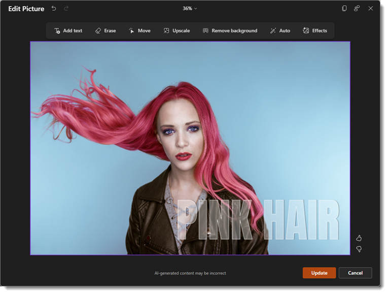
We’ll walk through a few of the editing options starting with Add Text: This will add custom text with a variety of different effects.
Erase: You can use a quick selection or manually brush an area of the photo you’d like to erase. This isn’t the best example of a photo to use for this tool, but here’s a look:

Move: This feature allows you to select a part of the image using the same auto selection or brush tool and then move that to another part of the image area (great for adding space for copy!)

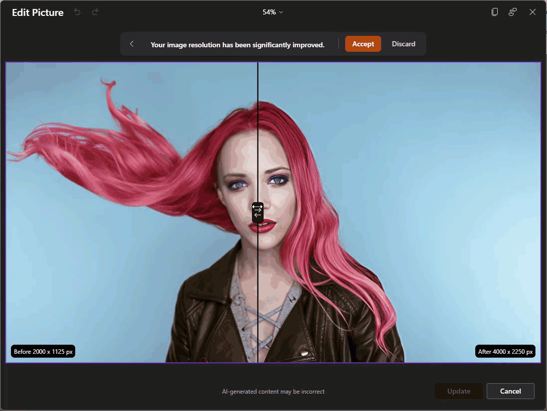
Upscale: Using this feature requires a fairly low-resolution image (most stock images, including the library within PowerPoint, are already very high resolution). For the sake of this walkthrough, I’ve downsized the resolution of our sample image here so that the upscale feature can be used. The photo editor will use AI to upscale the image to a higher resolution with no pixelation. You’ll notice it shows you a “before and after” slider so that you can see the changes:
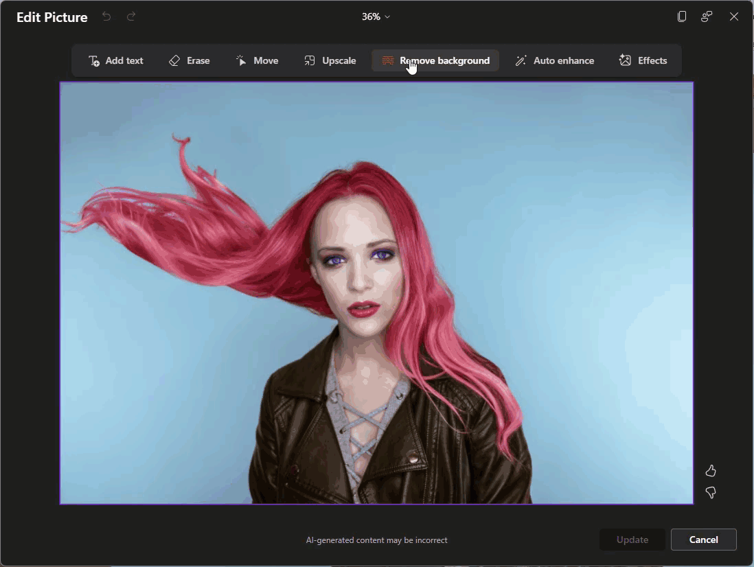
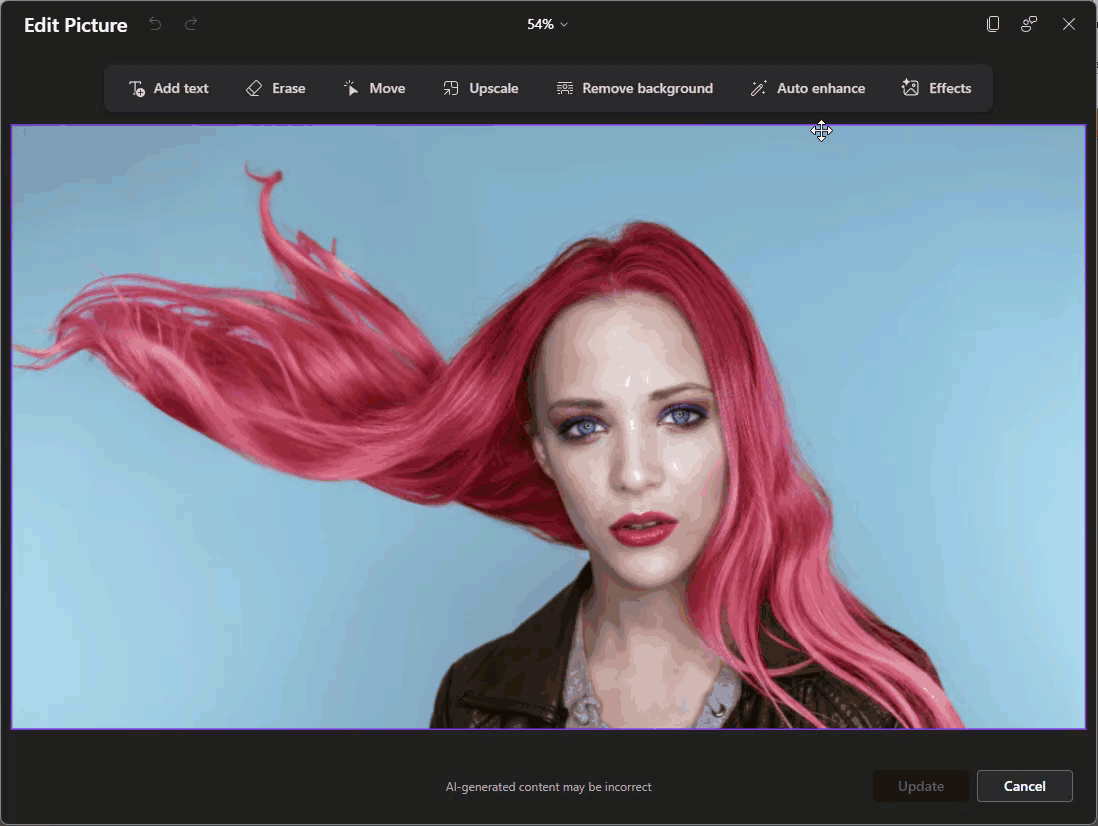
Remove Background: This will auto-select the background and remove it, like the old Remove Background feature that’s been in PowerPoint for quite some time, but AI-powered (and a lot less clunky).
Auto Enhance: Using this will do an automatic photo touch-up. However, for better or worse, there are no customization settings, just one click, and it’ll enhance the image. This feature also uses the before and after slider so that you can see what was changed.
Effects: These are special effects that we’ll be going into more detail in a future blog post.
Now you might be thinking this is all powered by Microsoft’s flagship AI, Copilot. Technically, it’s not. While Copilot acts more as a “Project Manager” within the Office ecosystem, the Edit Picture feature is actually a two-part system:
Ultimately, this update isn’t just about cool AI photo editing tricks. You can think of it more as maintaining your workflow momentum. Every time you must minimize PowerPoint to open another app, it can make you lose focus. By bringing these image editor tools directly into the ribbon makes it easier to stay in the flow. Of course, these tools won’t replace the touch of a professional graphic designer, but for quick image fixes and touch-ups, they can really help keep you in the zone.
-The TLC Creative Services design team
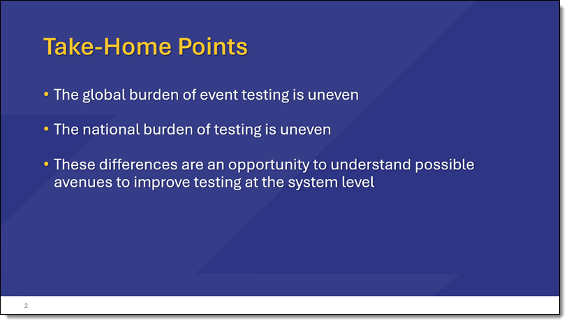
At a recent conference, one presenter did something that immediately caught my attention – and apparently everyone else’s too! You know how most talks end with a “Take-Home” slide? It’s that tidy little 2-4 bullet point summary that tells you, “Here’s what you should remember, even if you forgot everything else.” It’s usually labeled something like Summary, Key Takeaways, or In Closing, and it usually shows up near the end of the slide deck – when everyone is already thinking about lunch.

But this presenter? They put the Take-Home slide as slide #2. Right after the title. No warm-up. No agenda slide. No rambling intro. Just – bam! – “Here’s what you’re going to walk away with.”
And honestly? The audience loved it.
Most presentations have an Agenda, Roadmap, Outline, Table of Contents, or Navigation slide to cover the structure of their talk. It’s familiar, it’s expected, and it gets the job done. But leading with a Take-Home slide does something a little different: it sets expectations, not just structure. Instead of saying, “Here’s what we’ll talk about,” it says, “Here’s what you’ll get from listening.”
It reframes the whole presentation from a content list to a value promise.
And that tiny shift, from outlining the journey to highlighting the destination, changes how the audience pays attention. They know exactly why it matters, right from the start.
Just another idea for the next presentation you are designing. 😊
-Troy and the TLC Creative Services Presentation Design Team
When using dynamic PowerPoint transitions there is a hack to giving the transition a custom middle color! For example, on this Reveal transition below, we see the slide background during the transition effect. It’s black or white by default, according to the Background Style of the master slide assigned. In this example the slide background is set to white, which is the mid-transition color we see.
![]()
However, there is a transition hack for PowerPoint’s dynamic transitions – the background color in the middle of the transition can be customized! To confirm, this is dependent on which transition is in use, and it will not work with all transitions (see transition types below).
For example, the Reveal transition above uses the CURRENT slide background color, which is white, as part of the transition. By default, this is the Background Style assigned to that Master slide (almost always white or black).
TIP: Use caution when changing Background Styles! Changing a Background Style has a lot of tangent updates that can change slide content.
![]()
For example, create 2 slides, and set the first slide to a blue background and the second slide to an orange background. This must be the true slide background setting – it will not work if you add a blue or orange box to the slide – the background must be set via Format Background > Solid Color.
To set the slide background color, click on the Design tab and then the Format Background button to the right of the toolbar (or simply right-click off the slide and select Format Background).
![]()
![]()
With the SOLID FILL button selected, click on COLOR to change to blue for the first slide and orange for the second slide of the presentation.
![]()
Now the Reveal transition has a subtle fade from blue to orange, which is like getting a bonus, custom visual effect!
However, the slide backgrounds are only going to be seen during the transition effect. To demonstrate this, let’s add our full slide images from the first example to our blue and orange slides (an image on each slide that “covers” the assigned color background).
![]()
The result: instead of the slides flashing to white during the transition, there is now a blue-to-orange color shift during the slide transition!
![]()
In addition to setting the background with a solid color, other options are supported, like gradients, and image backgrounds – if they are true embedded background images set in the Format Background dialog.
As an example, here the same Reveal transition is used. In the first slide, the background is the default black background. The second slide has a background image of colorful glitter. The Reveal transition adds the colorful glitter image as part of the transition!
![]()
Unfortunately, this transition hack doesn’t work on all transitions. Transitions indicated below with a (✓) use the slide background color as part of the transition effect, and the color can be modified as we described above. The transitions, noted with an (x) use a black between color – that cannot be changed. And the transitions without a symbol do not have a “between color” for the transition.
![]()
Enjoy these PowerPoint transition hacks to further customize your presentations!
-The TLC Creative Services design team
Hi, Troy from TLC Creative Services. I recorded this video to demo a PowerPoint feature I discovered (eg. it was there, but I did not know of it!) – and it is pretty great!
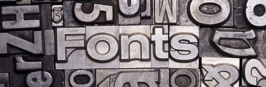
Fonts are critical! Well… words are more critical, but because words are displayed using fonts, that makes fonts critical. Of course, over the course of each year, working with literally thousands of presentations created by thousands of different authors, I can confidently say that fonts are one of the pain points of working with presentations. It is not uncommon to encounter various font issues due to the diversity of presentation authors, their work environment (e.g., app and device), and their font choices. Managing these differences can be challenging, as presentations are often shared across multiple devices, platforms, and even presentation applications, each with its own default font and font availability.
Ever wonder what the absolute default font is for an application? For example, when you open the app and create a new presentation from scratch…what font is waiting for you to start working with?
Well, here is some helpful information for everyone who works with presentations – a list of the default fonts for these presentation applications.

PowerPoint Desktop/Web/Mac: Aptos
Aptos is a Microsoft font and will automatically install on all devices and operating systems (Windows, Mac, Android, desktop, tablet, or mobile device). The only caveat is if, by chance, Aptos is not currently installed on the device, then the device will need to be online when the presentation opens for the auto-installation to happen.
Apple Keynote: SF Pro
SF Pro is a Mac OS system font. It is automatically available on all Apple devices running Mac OS (desktop, tablet, phone). But note, this font cannot be installed on non-Mac OS devices (e.g., convert a Keynote presentation to PowerPoint, open that PowerPoint file on a Windows computer, and the SF Pro font is not going to work! PowerPoint will randomly assign a replacement font, which may or may not maintain the text alignment).

Figma: Inter
Inter is a Google font and will automatically install on all devices and operating systems (Windows, Mac, Android, desktop, tablet, or mobile device) when used in many programs. Note: PowerPoint is not one of these applications that trigger Inter to automatically download and install. But if using PowerPoint on Windows desktop or Mac desktop (where custom fonts can be installed), Inter can be downloaded from Google Fonts and installed on the device (tip: install the OTF version of the font, not the variable font, .VTF).

Canva: Canva Sans
Canva Sans is native to Canva and is the default font when no other Canva template is applied. Canva Sans will not automatically be installed if a presentation created in Canva is downloaded and opened in a different application. Canva Sans can be downloaded from third-party sites for use outside of Canva.

Google Slides: Arial
Arial, used by Google Slides, is a Google Font, and will automatically install on all devices and operating systems (Windows, Mac, Android, desktop, tablet, or mobile device) when used in many programs. PowerPoint will automatically use the Microsoft version of Arial for seamless use.

Beautiful AI: no specific default font
Beautiful.ai takes a different approach to fonts with no true default font. When creating a presentation, the user selects a presentation style that sets the font (which becomes the default font for that presentation). Beautiful.ai leverages Google fonts, so they will automatically download and install on all devices and operating systems (Windows, Mac, Android, desktop, tablet, or mobile device) when used in many programs. Note: PowerPoint will not automatically download and install Google fonts, but PowerPoint on Windows desktop and Mac desktop (where custom fonts can be installed), allows Google fonts to be downloaded and installed on the device (tip: install the OTF version of the font, not the variable font, .VTF).

Gemini (AI-created presentation): no specific default font
Gemini also does not have a designated default font; rather, based on the presentation options, a font is selected, and that font becomes the default font for that presentation. All Gemini presentations leverage Google fonts, so they will automatically download and install on all devices and operating systems (Windows, Mac, Android, desktop, tablet, or mobile device) when used in many programs. Same note: PowerPoint will not automatically download and install Google fonts, but PowerPoint on Windows desktop and Mac desktop (where custom fonts can be installed), allow Google fonts to be downloaded and installed on the device (tip: install the OTF version of the font, not the variable font, .VTF).

Adobe Express: Source Sans (when no template with fonts specified is applied)
Source Sans is the default font in Adobe Express when no template (which specifies a font) is applied. Source Sans is an Adobe Font and will automatically load for Adobe apps, including PDFs. While Adobe Cloud fonts cannot be downloaded, they can be installed on any device through the Creative Cloud app, and other applications, like PowerPoint, will recognize and use those fonts.
Now you know 😊.
-The TLC Creative Design Team
As each year is a trip around the sun, Jake from the TLC Creative presentation design team created a PowerPoint animation celebrating New Years around the world!

Want to make your own PowerPoint animations? Check out some of our posts on creating animations within PowerPoint!
The TLC Creative team wishes you a Happy New Year!