Use Picture Fill for Vector Art in PowerPoint
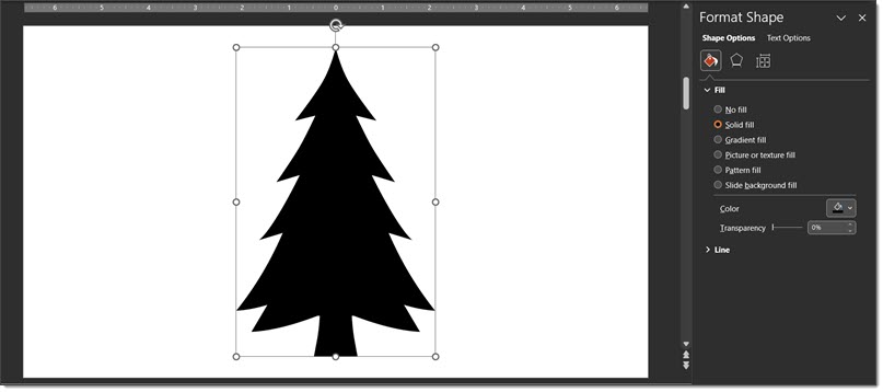
One of the hidden design features within PowerPoint is the PICTURE FILL option. I use this in combination with PowerPoint shapes and inserted vector art to create custom art elements for slides. Because it is Christmas time, my example is a Christmas Tree slide.
- Add the Christmas Tree “icon”/vector art (I recommend .svg file format) to the slide
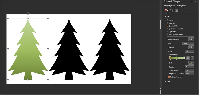
- Vector art can have different effects added; color fill, gradient fill, pattern fill (ugg – do not use any PowerPoint provided pattern!). For example, 1st is a gradient fill that can be adjusted to any color, direction etc.
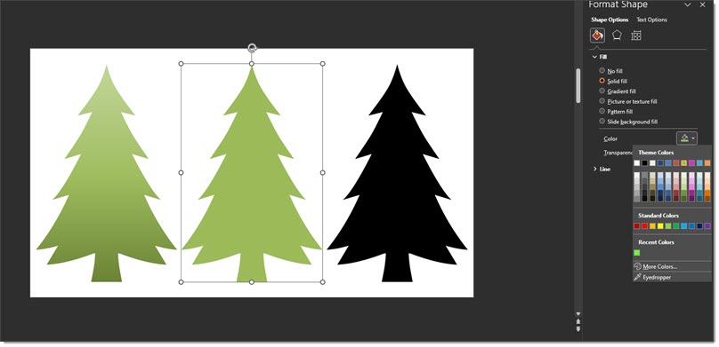
- Or here, the second tree is updated from the black art to a solid green fill.
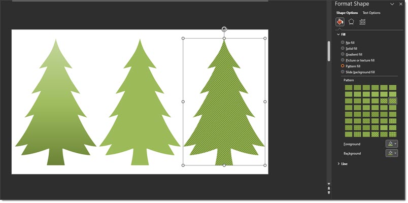
- Or, here is an example with the third tree using a PowerPoint pattern fill. Note: on pattern fills, the lines and background colors can all be customized to make them less horrible…
- But the real trick is using the PICTURE OR TEXTURE FILL option! Select the tree shape > open the FORMAT SHAPE dialog > select PICTURE OR TEXTURE FILL > locate the image to use
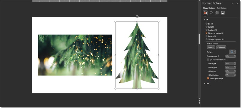
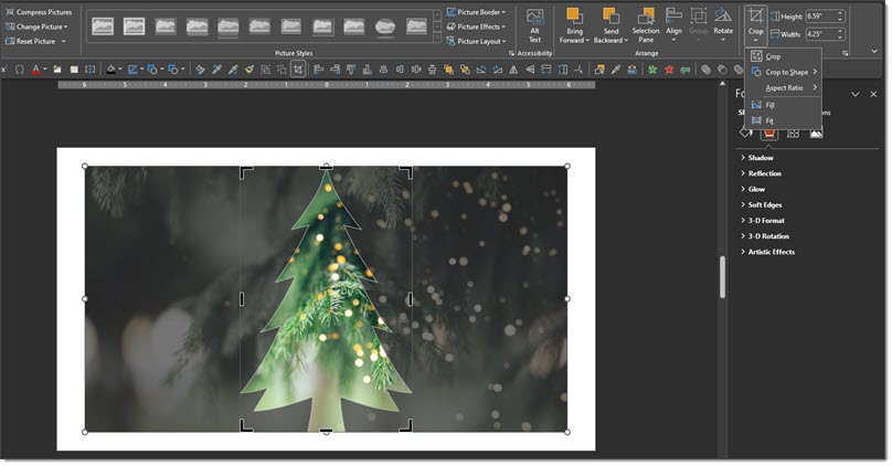
TIP: you can also paste an image in by using the CLIPBOARD button – if you have the image you want inserted already copied. - Important: The inserted image is distorted to the size of the tree. The solution is the CROP tool. Select the tree > click the crop tool > adjust the width of the fill image with its size/shape points. I made the fill shape much wider and positioned to show some of the real tree branches in the fill image.
- And here is the final slide, which can be downloaded here.

Troy @ TLC (with special thanks to Christie on the TLC Creative team for the screen captures!)